Obama's $60 million dollar experiment

Dan Siroker
On Oct. 21, 2010 President Obama visited Palo Alto to raise money the good ol’ fashioned way: a $30,400-per-plate fundraising dinner. This tried and true fundraising technique is a great way to raise money if you can get the President of the United States to show up to dinner. But how can you raise money if no one has heard of you and all you have is a website? Back in 2007, when Obama was running for the nomination and trailing by double digits in the polls, that’s pretty much all we had.
The experiment
As Director of Analytics for the Obama 2008 campaign, my job was to use data to help the campaign make better decisions. We started with just one simple experiment back in December of 2007. This experiment taught us that every visitor to our website was an opportunity and that taking advantage of that opportunity through website optimization and A/B testing could help us raise tens of millions of dollars.
This experiment tested two parts of our splash page: the “Media” section at the top and the call-to-action “Button”
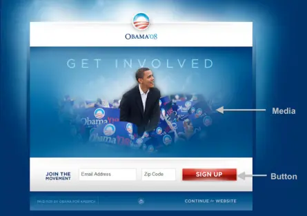
We tried four buttons and six different media (three images and three videos). We used Google Website Optimizer (now Google Optimize) and ran this as a full-factorial multivariate test which is just a fancy way of saying we tested all the combinations of buttons and media against each other at the same time. Since we had four buttons and six different media that meant we had 24 (4 x 6) total combinations to test. Every visitor to the splash page was randomly shown one of these combinations and we tracked whether they signed up or not.
Before you scroll down and see the results, which Button and Media do you think had the highest sign-up rate?
Button variations


Results
The metric we used to measure success was sign-up rate: the number of people who signed up divided by the number of people who saw that particular variation. Since there were a total of 310,382 visitors to the splash page during the experiment that meant each variation was seen by roughly 13,000 people.
Here are the different sign-up rates we observed for each section:
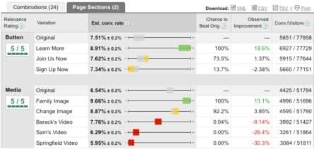
Here are the sign-up rates for the combinations of the different sections:
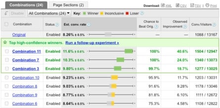
The winner
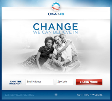
The best-performing combination of button and media was “Combination 11” which was the “Learn More” button and the “Family” image:
Before we ran the experiment, the campaign staff heavily favored “Sam’s Video” (the last one in the slideshow shown above). Had we not run this experiment, we would have very likely used that video on the splash page. That would have been a huge mistake since it turns out that all of the videos did worse than all of the images.
The winning variation had a sign-up rate of 11.6%. The original page had a sign-up rate of 8.26%. That’s an improvement of 40.6% in sign-up rate. What does an improvement of 40.6% translate into?
Well, if you assume this improvement stayed roughly consistent through the rest of the campaign, then we can look at the total numbers at the end of the campaign and determine the difference this one experiment had. Roughly 10 million people signed up on the splash page during the campaign. If we hadn’t run this experiment and just stuck with the original page that number would be closer to 7,120,000 sign-ups. That’s a difference of 2,880,000 email addresses.
Sending email to people who signed up on our splash page and asking them to volunteer typically converted 10% of them into volunteers. That means an additional 2,880,000 email addresses translated into 288,000 more volunteers.
Each email address that was submitted through our splash page ended up donating an average of $21 during the length of the campaign. The additional 2,880,000 email addresses on our email list translated into an additional $60 million in donations.
Lessons learned
- Every visitor to your website is an opportunity. Take advantage of that opportunity through website optimization and A/B testing.
- Question assumptions. Everyone on the campaign loved the videos. All the videos ended up doing worse than all the images. We would have never known had we not questioned our assumptions.
- Experiment early and often. We ran this experiment in December of 2007 and reaped the benefits for the rest of the campaign. Because this first experiment proved to be so effective we continued to run dozens of experiments across the entire website throughout the campaign.
Why Optimizely?
We created Optimizely because we wanted to make experiments like this one easier to do. In fact, Optimizely is the product I wish we’d had on the campaign. We were only able to run a small fraction of the experiments we wanted to run during the campaign because of the time and hassle needed to run experiments with products that existed at the time. If you are looking for an easier way to test your website, give Optimizely a try, and let us know what you think.
About the author