Kyle Rush on Surprising Results, His Major, and the Future [Part Two]
This is the second part of our interview with Kyle Rush of the 2012 Obama for America Digital Team. Click here to read part one.
Cara Harshman

This is the final, ultra-optimized version of contribute.barackobama.com. Every pixel, every word, every dollar sign has been scrutinized, iterated and heavily tested. This page was the portal to Barack Obama’s $690 million online fundraising machine.
This is the second part of our interview with Kyle Rush of the 2012 Obama for America Digital Team. Click here to read part one.
The campaign ran so many tests – over 500 you said. When you reached 300 how did you know to keep going?
That’s a good question. Obviously work on the campaign was really hectic and super fast moving. A lot of people told me that working on a campaign is like flying an airplane while you’re still building it. I thought, that’s a cute little metaphor, sounds interesting but I didn’t really get it until I started. It was very, very difficult to sit down and really make a strategy because things were moving so quickly. By the time we reached 300 A/B tests, we were able to look back and see the impact we had. Obviously at that point the low-hanging fruit was gone but we had so many talented people at the campaign who were all super ambitious. We all came with one goal, to get the President elected. Just the mere fact that there was time left in the campaign meant that we were always going to be testing something.
Timing is everything, especially when testing at campaigns apparently.
Yes, it is a huge factor. At a normal job you might have a generous, extendable time frame, but Election Day is Election Day. There is no moving it; there is no ‘sorry’ on Election Day. It’s there whether you like it or not and when it comes, it’s time to face the music.
Were there any test results that particularly surprised the team?
I think there was a lot of stuff like that where we would change one little thing and it would result in a big lift. Or we would think for sure that something was going to work and it just would bomb.
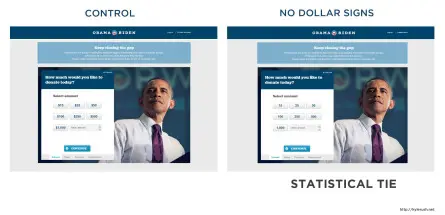
One was inspired by restaurant menu psychology. One of our team members learned that high end restaurants remove dollar signs from their menus because people tend to spend more money that way. So we removed the dollar sign from our donate page. The result was a statistical tie.
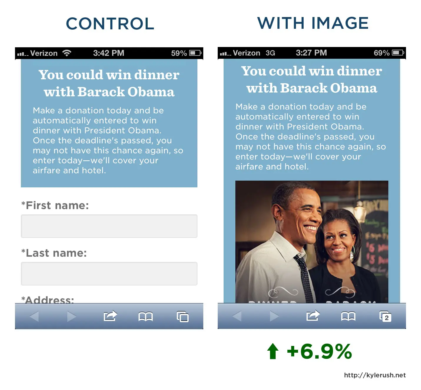
Another surprising test was on our mobile website. We thought keeping the form as simple as possible and removing all unnecessary elements would be best so we decided to remove the image of the President since it isn’t essential to the donation. But when we added the photo of the president we got a 6.9% lift using Optimizely as an AB testing tool.
How do you predict that presidential campaigns will change in the future, specifically around digital teams?
I think the future of campaigning will follow along the same trend we’re seeing right now in the private field of web development where everything is so critically data-driven. It seems like politics is pretty slow to adopt technology, although I think democrats are light years ahead of republicans in that respect. I think that what’s happening in our field right now is everybody is realizing the importance of data and being data-driven. You might have a lot of experience in working with web design; you might have a lot of gut instincts, but if you are not measuring those, then it’s hard to see where you came from and where you’re going – whether it’s a good direction or a bad direction. I think 2008 started that for politics. In 2012 we took that and ran with it and were very, very successful. We were completely data driven; it was a huge part of our operation.
You know that Dan Siroker and many others went off to start companies after working for Obama. Do you see a similar fate for yourself?
Nope, I think that is probably a little more work than I’m bargaining for. Also, Dan had a great idea; Optimizely is a super cool product. I think coming up with an idea is probably the hardest part of that. I could work just as much as I did at the campaign to make sure it was successful, but I don’t really have an idea like that. I just really enjoy working on web apps and using the tools that are available to improve them.
What did you study in school?
I was a political science major in school, which has nothing to do with web development. But web development was always a hobby of mine. I’ve been doing web development since probably junior high – just making websites for small businesses as favors, sometimes to get a little bit of money. I have never taken a computer science class. I learned it all from the Internet, which is an amazing place.
In a blog post you said, “By June of 2012 our donate page had undergone nearly 14 months of optimization, the low-hanging fruit had been picked and it was just difficult for variations to beat the control.” What were some of the low-hanging fruit tests you went for immediately?
Most of the low-hanging fruit had to do with copy and imagery, and I call that low-hanging fruit because it’s got decent ROI. It’s super easy to change. I also think that low-hanging fruit occurs when you inherit a web page from people before you and you can see obvious problems with it that maybe the team could not see before. So by June of 2012 we had ironed out those things. We had ran a lot of copy and image tests, so we knew what was going to work and what wasn’t at that point. You never can know for sure, but we had a pretty strong idea.
Which images did you find worked best?
We found that context was really important in images. In the earlier days of the campaign, we found that a big face of the President was really persuasive on our donation pages. By the end of the campaign, we decided to test a different photo on the donate page, which was actually not a huge picture of the President’s face. The photo is of the President speaking with thousands of people around him, a little atypical for us to use. At that time in the campaign, the atmosphere was gaining a lot of momentum and Obama was kind of taking back the lead Romney had built up. So we thought that picture of him speaking to those thousands of people would really capture that sense of the moment. That’s why we tested an image that strayed from our best practice of showing a huge picture of the President’s face. But it actually worked and is up on contribute.barackobama.com right now, so I’m glad we tried it.
Interview by Cara Harshman
INTERVIEW HAS BEEN CONDENSED AND EDITED.
This is the second part of our interview with Kyle Rush of the 2012 Obama for America Digital Team. Click here to read part one.
About the author