Optimizely’s Coming Out for Mobile Teardown Tuesday
In honor of San Francisco Pride this weekend, we’ll kick off the series with an app that recently launched to the AppStore, Dattch.
Lesbians have lamented for years the lack of an app that speaks to the dating needs of women looking for other women. Dating apps for heterosexuals and men seeking men are plentiful, but nothing has existed for the lesbian market until now. Enter Dattch.
Dattch is a lesbian dating app and social network built around the idea that women date differently than men, and the app itself reflects these needs. A Pinterest-esque layout encourages mingling and low stress chatting. The fact that only females are allowed to use the app (each user is verified through Facebook or the Dattch team) ensures a hassle free environment for like-minded women to meet.
Profile creation is one of the single most important metrics for dating apps like Dattch, Tinder, and OkCupid, that rely on person-to-person interactions. Without profiles, these apps are like grocery stores with empty shelves. It’s highly important for the app to move the user from download, to launch as effortlessly as possible and then prompt her to create a profile—all while maintaining engagement.
The best time to prompt users to create that profile is a decision that Dattch—and any other app that requires login—has to make. This may have been a tough, highly debated question in the past, but add A/B/N testing to the mix and it becomes a simple experiment.
The Test: When Should You Prompt the User to Sign In?
In order to capitalize on each download and convert those visitors to ‘users’, it’s important to test the moment you prompt the visitor to login and create a profile. Apps that require registration prior to using the app lose 56% of their users, a significant number especially when you’re in a niche market like Dattch.
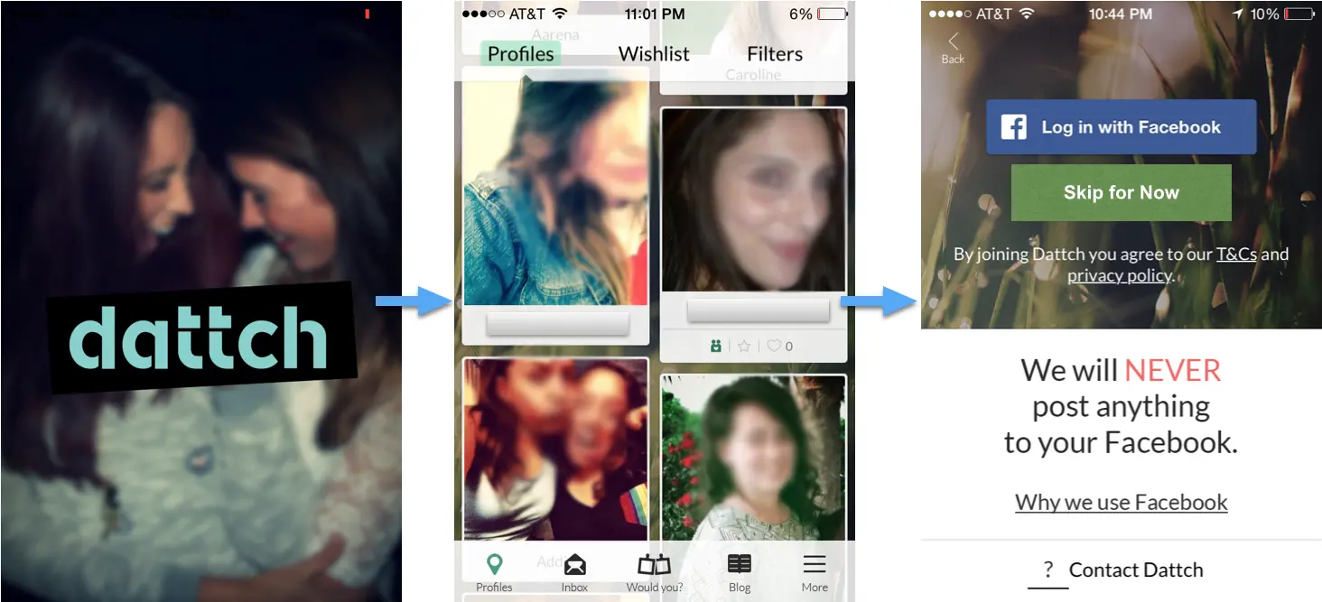
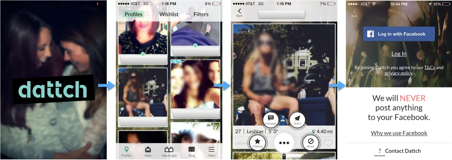
Let’s take a look at the app currently:
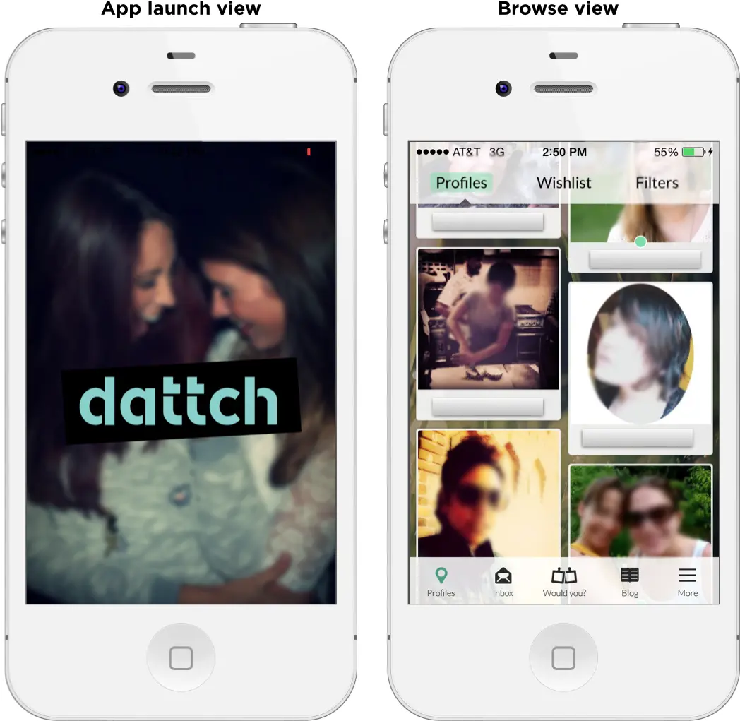
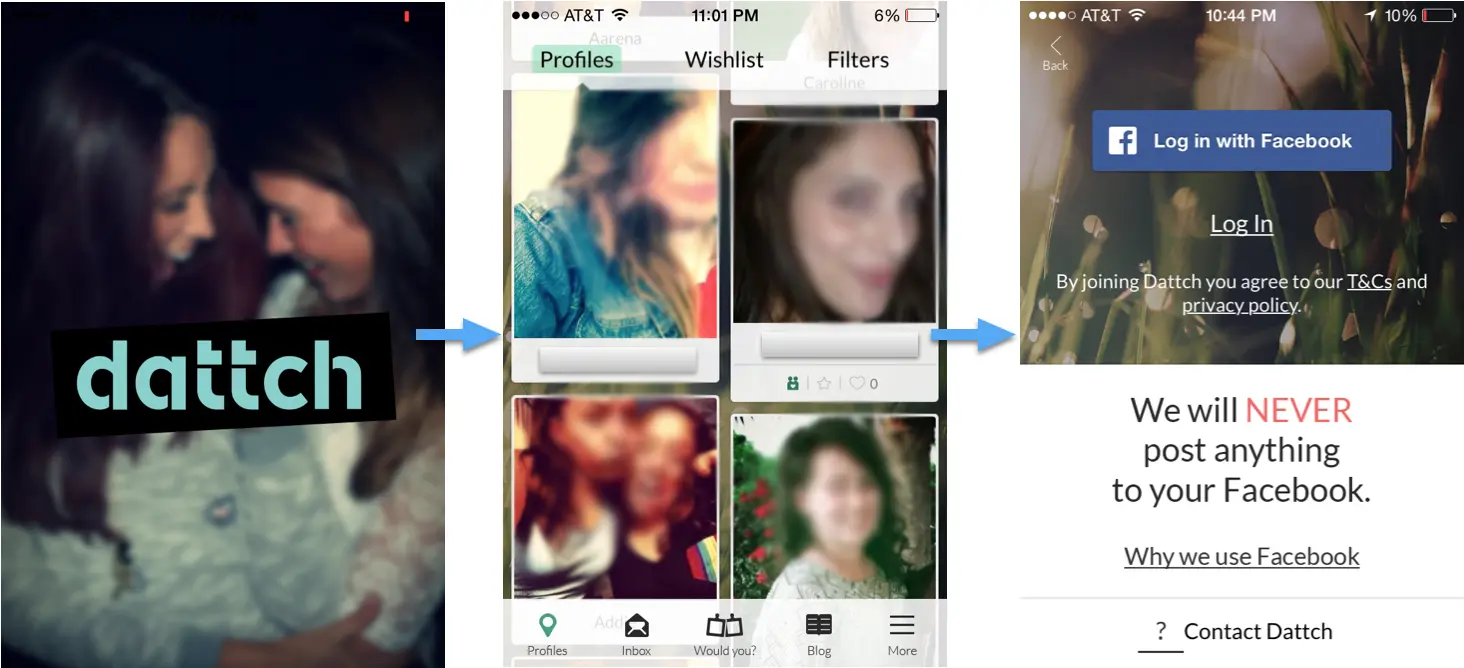
Here’s a scenario…
You’re having a great time here at Pride. Knowing that there will be a huge influx of ladies who love ladies in the city, you open Dattch. Browsing through the profiles, someone catches your eye—so you tap on their picture to learn a little more about them. That’s when you’re hit with this…
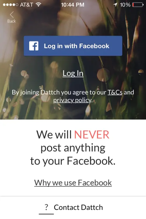
Woah, Dattch. You’re moving a little fast for me. How do I know that that person is interesting enough to warrant creating a profile just to learn more about them? I just downloaded you, Dattch, I’m not sure I’m ready for that level of commitment yet.
To do anything with the app, like filter your search or view a profile, Dattch prompts you to ‘Log In with Facebook’ and create your own profile. Dattch could easily set up a test to measure the impact that requiring login so early in the experience has on new user sign up and at the same time, understand the optimal time to prompt a profile creation. By running this test, Dattch would not have to compromise their core value of keeping the app exclusively female. Here’s a sample test that they could run:
Original:
In order to navigate to any view besides the browse view, the visitor is prompted to Log In.
Variation 1: Sign in Later
By simply adding an option to ‘Skip’ until the visitor needs to be signed in (ie. to send a message), it encourages browsing until they’re ready to make the commitment.
Variation 2: When the visitor selects to message a user
By waiting until the visitor has found someone compelling enough to message, it directly ties their communication to that person with logging in and creating a profile.
Variation 3: After the visitor has opened the app a certain number of times
After the user has launched the app a certain number of times they’re prompted to create a profile and log in.
Will More Up-Front Value Increase Signups?
The hypothesis behind these variations is that perhaps after each of these scenarios, the user is engaged enough and has received enough value from the app that they’ll be more likely to create a profile.
The sign-up prompt test is one that EVERY app that requires a log-in should be running, as the drop-off of users is significant. Each step Dattch puts between me and my dream girl is another opportunity for me to leave the app and, possibly, never come back. It’s tough to get people to download your app—iOS and Android users only download three to five apps per month. That, coupled with the fact that 26% of all apps downloaded are opened only once and then never used again, can be daunting. It’s important to get the user engaged early and focus on making your app sticky.
This is just one example of a way that Dattch and similar apps can optimize their user experience. Our mobile team has previously covered some common mobile app optimization techniques in the past. If you’re interested in learning more about mobile app optimization, check out our more detailed guide, A Blueprint for A/B Testing and Optimization in Native Mobile Apps. If you’re interested in learning more about me, I’ll be out A/B testing at Pride.