How Flipboard Can Keep Users from Flipping Out
You only have one chance to make a first impression. This saying could not be more true when it comes to mobile apps. The first time someone launches an app is often the first interaction that he or she has with the brand and with the company. This is especially true for mobile-first companies that before the app, had no online presence. A great example is Flipboard. Let’s take a look at how Flipboard can experiment with the new user experience to optimize the first impression and ultimately increase loyalty and usage.

This article is part of our Mobile Teardown Tuesday blog series. Each Tuesday, we choose a mobile app and suggest a few experiments the team might consider running to optimize the user experience. Learn more about mobile a/b testing from Optimizely.
Teardown Tuesday: Flipboard
You only have one chance to make a first impression. This saying could not be more true when it comes to mobile apps. The first time someone launches an app is often the first interaction that he or she has with the brand and with the company. This is especially true for mobile-first companies that before the app, had no online presence.
A great example is Flipboard, a digital social magazine that aggregates web links from social networks and displays the content in magazine form on smartphones. Like most app-based companies, the rate at which Flipboard can turn someone who downloads the app into a loyal user directly impacts their growth.
The experience people have on first app launch is part of the holistic experience that impacts whether or not they’ll open it again, let alone become a regular user. Let’s take a look at how Flipboard can experiment with the new user experience to optimize the first impression and ultimately increase loyalty and usage.
Setting Goals
Analytics is a great first place to look when identifying areas to optimize that will really move the needle on important business metrics. Without first identifying the key metrics, it is easy to fall into a trap of knee-jerk reactions and blindly introducing changes with our fingers crossed that they will lead to more revenue.
To determine if changes to the new user on-boarding have a meaningful impact, Flipboard should track micro-goals and macro-behaviors. Micro-goals, like move to the next screen, are important but often not very useful alone because they do not indicate downstream performance. To get the bigger picture, macro-goals that might include frequency of logins, lifetime value and the amount of content consumed are likely more telling.
Page 1: The First Impression
Flipboard’s opening screen provides a highly visual, and simple aesthetic. It is nice to look at, but there is not much information about what Flipboard is or does. Someone brand new to Flipboard may be more likely to proceed if the first screen has some context on the app’s allure.
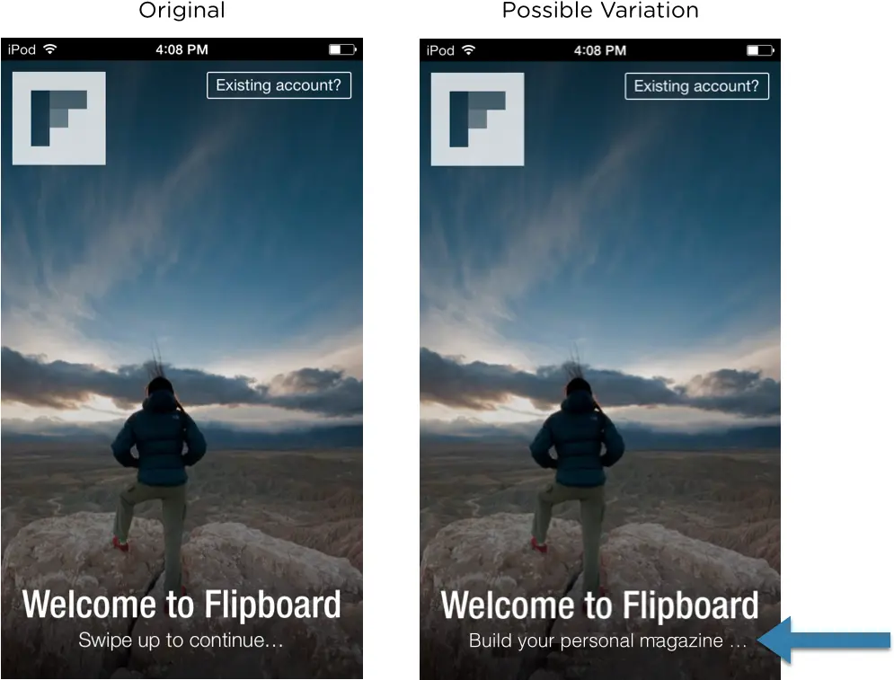
Flipboard can try experimenting with the tagline on this screen to see which one increases successful signups. Instead of “Swipe up to continue,” “Build your personal magazine”, might reassure users that they are going to get something unique and personally valuable. This is also a great opportunity to inform people that personalization is a key component of the Flipboard offering, which makes the next screen less of a surprise.
Page 2: Conveying Value
On page 2, people select their preferred content categories and can connect their social networks. An interesting test to run here would be whether or not value statements compel more people to complete the step.
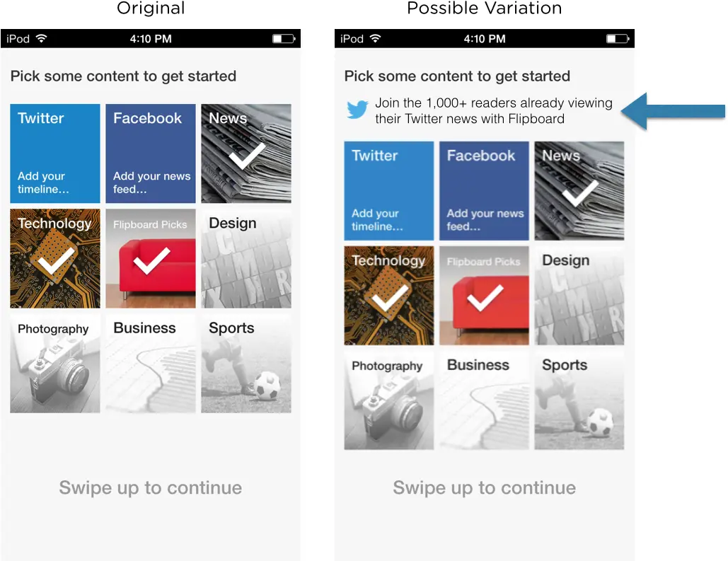
Let’s pretend that Flipboard has data that says people who follow certain topics, or connect social networks, are more likely to be loyal and valuable customers. To encourage more people to connect their Twitter timeline, for example, Flipboard can test adding a social proof message to this screen such as, “Join the 1,000+ users already viewing their Twitter feeds within Flipboard.” This may comfort people who would otherwise be uneasy about connecting their social network and drive use of a feature that Flipboard correlates with more active, and thus more valuable, users.
Deliver value early
Throughout the on-boarding experience on Flipboard, the user goes to the next step without knowing 1) how many steps lie ahead and 2) why they should care. After the landing screen and setup flow described above, Flipboard then asks its new visitor to sign up before giving access to the actual app. What if there was a better flow that generated more sign-ups for Flipboard?
If Flipboard delivers value early on, before someone even signs up, then they might reduce the risk of losing people down the road. A study by the user experience design agency Foolproof showed that 56% of users have chosen not to sign-up to an app or mobile service because the registration process was too long or confusing. (Check out their Slideshare presentation for more facts.)
They could try sending people straight into the product before prompting for sign-up. On first launch, the user could see that day’s “Most Popular Magazine” with access to a limited number of articles and a guided tutorial that reaffirms the value of the Flipboard.
By giving a little taste of something great, Flipboard may be more often able to earn the right to ask for the users personal information in sign up. The impact of this sort of test would be interesting to track across many metrics, from sign-up rates to social network connections, as well as repeat usage and social sharing from within the app.
Conclusion
In running the above proposed modifications as tests, Flipboard has the opportunity to monitor the impact, positive or negative, of the changes their team makes throughout the app. Additional future tests can also be fueled by information from a variety of data sources, test results, user feedback and business strategies.
Through testing, Flipboard can ensure they make educated decisions that support the overall company objectives at each iteration of their app. For a business that depends on obtaining, delighting, and retaining customers within a mobile app, there is little margin for error. Testing in this way fuels continuous improvement, making that all-important first impression better with each iteration and driving the right kind of people to convert into loyal users.