Landing page optimization
What is landing page optimization? (LPO)
Did you know that the average landing page conversion rate can be as low as just 5.89%?
Rather than launching a landing page and calling it good, you can increase the conversion rate on any landing page through the power of landing page optimization (LPO).
Landing page optimization is the process of strategically improving the most important web page elements. When complete, the outcome will be a more engaging user experience for your target audience and ultimately help you drive more revenue for the business.
Landing page optimization is a subset of conversion rate optimization (CRO) and involves technical updates to the page’s infrastructure and using methods such as A/B testing to choose the most impactful copy, images, call-to-action buttons, and anything else that’s causing your bounce rate to skyrocket.
Why landing page optimization matters
Landing pages play an important role in online marketing campaigns because they are light on effort, easy to personalize and provide a better user experience than other tools. Because landing pages are so powerful, you want to make them work as hard for you as they can.
Optimizing a landing page ensures that you reach the highest possible conversion rate as early as possible from the visitors who arrive at that landing page.
An optimized landing page can generate a 160% higher conversion rate for actions like sign-ups compared to other tools, like pop-ups.

You don’t want to miss out on those opportunities because your landing page loads too slowly, your lead capture form is too long, or your CTA isn’t the right one for your personas.
Remember: The cost of a landing page isn’t just in the build of the web page. You’re spending valuable marketing campaign money on PPC to redirect traffic to the page. You want to use your traffic wisely to drive down your customer acquisition costs and improve your marketing strategy performance.
Landing page optimization examples
What makes a high-quality landing page? Let’s go through a few examples live in 2024 to see how brands are implementing landing page best practices.
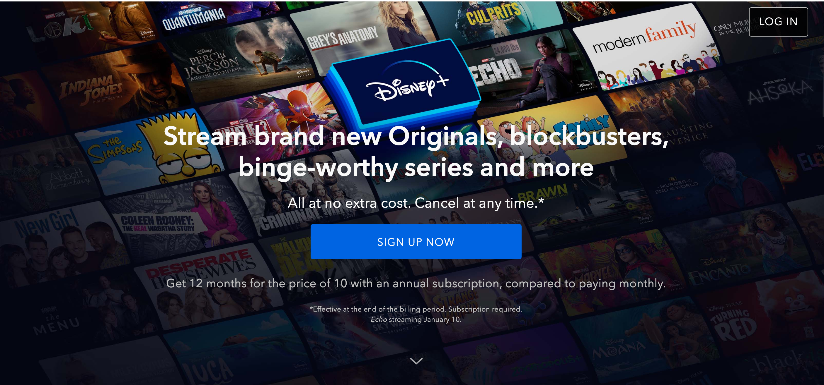
Disney+ sign-up landing page
Looking at Disney’s digital marketing product should always be taken with a grain of salt for the rest of us: Disney never, ever has to explain who they are or what they do.
Even still, their landing page is a valuable example of a sign-up page because it punches quickly with a clear value proposition and obvious customer action: sign-up to Disney+.
Why does this page work so well? It communicates valuable information quickly using both a great headline and a strategy image. The CTA button is prominent, easy to click, and of course, this page is optimized for mobile devices.
Opportunities for experimentation:
- Swapping hero images: What TV shows and movies are most likely to draw in new customers? Disney+ likely used dozens of images before deciding on this choice.
- Price per month or an offer: Is the offer enough to convert? Or do customers want to see the monthly price breakdown in dollars and cents?
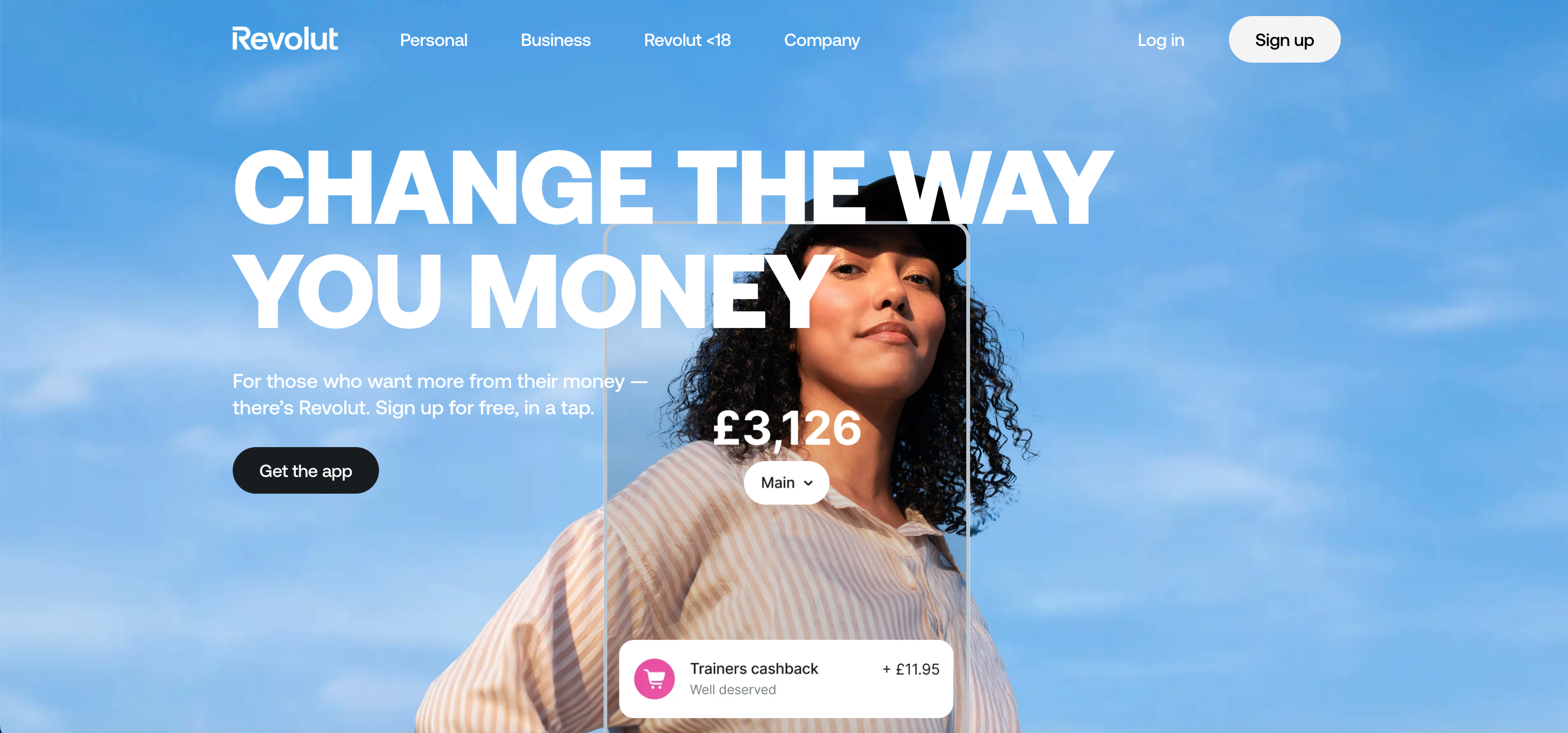
Revolut web sign-up landing page
European fintech Revolut is heavily invested in bringing on new users across all its markets.
Why is this a great landing page (and their home page)? The landing page elements all work together seamlessly to communicate the value of a Revolut account: a great user experience and a cornucopia of features unavailable with the competition. The landing page headline and the choice of images come together to communicate the value proposition instantaneously.
Ways they can experiment:
- Pounds and pennies: What account values are most attractive? Is £3,200 relatable to their target market? Revolut can segment by user groups to serve up more personalized images like a £500 account value to 18-21-year-olds and a more bountiful current account figure for more age brackets.
- Headline changes: Revolut can experiment with different headlines for different user groups. For example, they might target the 50-65-year-old demographic with a headline about how easy it the app is to use.
WorkHuman webinar landing page
WorkHuman’s landing page is the prototypical example of a lead magnet landing page. Traffic arrives via a PPC campaign (Google Ads) and asks for one action: sign up (and attend) WorkHuman’s webinar.
It’s a great example of how simple a landing page can be and the value they offer compared to directing visitors to the site, where they can easily get distracted or even lost.
Simplicity is an art, but there are still places where WorkHuman’s team can experiment to optimize.
Ways they can experiment:
- Image or video: Would more visitors convert if they got a sample of the content in video or image form? How would it compare to the written summary?
- Form fields: The ideal number of forms in a form fill is 5 and WorkHuman includes 9 essential contact information fields for B2B leads. Could they try different variants, such as sacrificing a phone number?

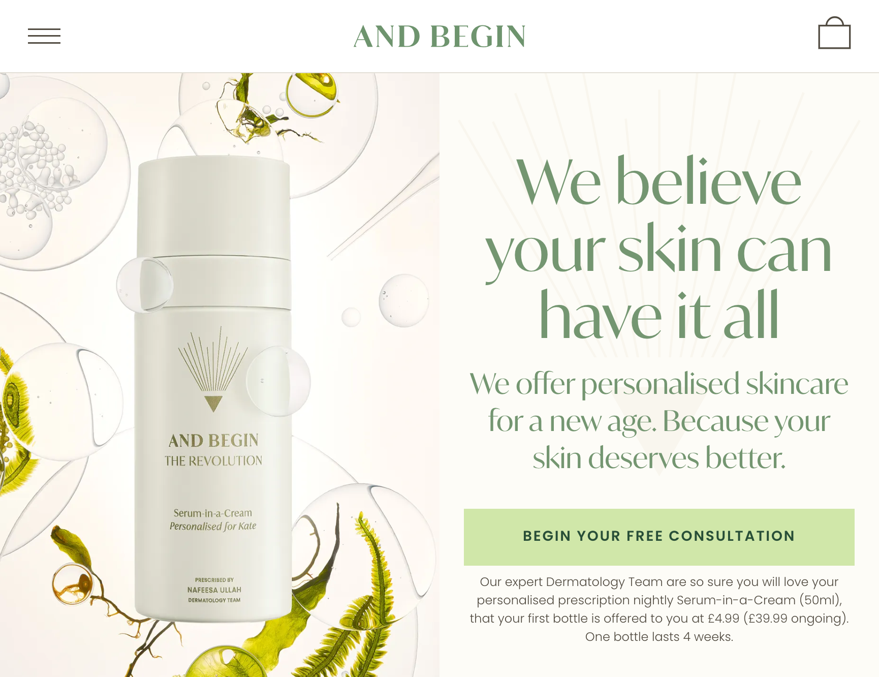
And Begin trial landing page
And Begin is another ecommerce example, but it differs from Disney+. Disney+ will measure their conversion by the number of visitors who sign up for the service; Disney+ needs to chase visitors who don't convert across the web.
However, And Begin can measure success first by the number of visitors who complete the consultation and then by the number who convert. They have even more opportunities to experiment with and optimize their landing page and then use that data to retarget throughout their funnel.
The CTA button on the And Begin landing page reflects those opportunities by directing user behavior: it invites the visitor to learn more about the product and service delivery and begin the experience commitment-free — all before diving into the product itself.
Ways they can experiment:
- Trying product vs. packaging images: Would customers convert more often after seeing the product in action, or will the brand be enough to entice them in? They’ve chosen the packaging for this page
- Swapping headlines and value propositions: They’ve chosen a bold statement that differentiates, but what other copy might draw customers in?
- Swapping landing page elements: The content flows nicely, but are visitors ducking out because the content they’re interested in is at the bottom of the page? And Begin could see what changes if they move their social proof component up a few rungs so it’s seen earlier on the page.
7 landing page optimization best practices to use on every page
Landing page optimization identifies potential problems with the landing page design, content, or functionality so you can eliminate them quickly.
Follow these landing page best practices and try out these potential test ideas:
1. Limit the number of actions on the landing page
Test removing website navigation elements, minimizing form fields, or leaving out other unnecessary functionality. You’d be surprised how much a simple design with a clear call to action and plenty of white space can lead to more conversions.
After all, minimizing the distractions on your page could boost conversions by 10%.
2. Minimize page load time
Page load speed begins to play an important role in user experience. The faster you can make your page load, the more likely you’ll at least get the visitors to your page. And a landing page with a 0-2 second load time will have the highest conversion rate.
Much of the work to be done here falls under the realm of technical SEO and can be identified by SEO tools like Moz but will be completed by a web developer. Typically, you'll look at reducing redirects, improving server response time, using caching to your advantage, and publishing via a content distribution network (CDN).
For marketers and UX teams, it's important to make sure you're optimizing your images for the web, i.e., choosing the right file format and size for each image.
3. Clearly articulate your value proposition — and do it quickly
Test headline variations and call-to-action text that more closely matches the language your visitors use to describe what they’re looking for.
Additionally, be sure that your final landing page copy is tied to your traffic source: mismatched ad and landing page copy will confuse users and tank your conversion rate.
4. Match the expectations and needs of the visitor based on their previous interaction (context)
Test using keywords from ads in your landing page copy. For example, say you run a sock ecommerce business and you are running paid search ads on Google Adwords and promoting pins on Pinterest. If you’re bidding on the keyword [warm socks], then you will want to design a landing page experience that is congruent with the searcher’s intent--specifically describing what temperatures your socks are suitable for and how the wearer might feel in different locations.
On the other hand, a potential customer from Pinterest or another social media platform might be more interested in how they will look in the sock. A high-converting landing page experience for that traffic source could involve a stylish hero image or an augmented reality shopping experience.
5. Social proof offers a small boost
Test adding other customer logos, partner logos, a customer case study, testimonials, or other forms of social proof to the landing page, but don’t expect it to make or break your conversion optimization work.
LPO tool Unbounce says that there’s only a 1% difference in conversion between pages that add social proof and those that leave it behind. However, 1% is still something, and you’d rather have 1% of 100,000 visitors than leave them by the wayside.
Even if you don’t have any of the above, a phone number or Verisign badge for potential customers will help build trust with brand-new customers from their very first interaction.
6. Boost lead generation by offering something of value
Landing pages are the tool of choice for lead generation, but you’ll want more than a web page, even a well-optimized one. Customers expect something in exchange for handing over their information. A lead magnet When the primary CTA is a landing page form that only asks for an email address, potential customers can be more ready to give that up in exchange for some value.
7. Optimize for search engines
Landing pages that are designed for search engine optimization (SEO) often look and feel much different than pages designed for paid media. Search engines are more picky about sending organic search traffic to pages that they don’t believe actually provide value for their users. That’s why gated content rarely ranks on Google. You would want to expose your content to search engines via a resource or blog section and capture leads with exit intent software or other offers.
Manage conversion optimization with landing page optimization tools
Landing page optimization will take you closer to your conversion goals. But you can’t optimize alone: you need data.
To effectively optimize your landing page, landing page optimization tools provide you with the data you need to understand your pages’ performance. When taken together, these tools can tell you:
- Who visits your page and the breakdown of new vs. returning users
- Where your website visitors spend their time via scroll maps and heat maps
- How much time visitors spend on a page and where they arrive from
- What copy, design, and image variations are performing best
Most LPO tools offer these features, but Optimizely goes further because it offers more experimentation features that allow for evidence-based optimization. Plus, Optimizely is integrated with the other data sources you need to put your experiments into context, including Google Analytics, Hotjar, and more.
Optimizely Web Experimentation has a drag-and-drop landing page builder that allows you to:
- Run multiple experiments on the same page,
- Randomize users or build for specific groups, and
- Ultimately understand when you have a statistically significant difference in the rate at which landing page variations are converting visitors.
Landing pages are a high-impact place to focus your optimization efforts — and they’re a great way to kick off your experimentation program.
Learn how easy it can be to experiment and convert with landing pages in our guide: How to set up an experiment in less than 60 seconds.
