Two controversial site redesigns that should inspire you to A/B test
When it comes to making better data-driven decisions, the sooner the better.

Cara Harshman
Often the temptation is to wait until after the redesign is done or the feature is rolled out: “Oh, we’re doing a redesign; we’ll do the A/B testing afterwards.” The fact is you actually want to A/B test the redesign. One story from Digg and another from Netflix show why.
Around 2010, Optimizely co-founders Dan Siroker and Pete Koomen were introduced to the folks at Digg by their new VP of Product Keval Desai to talk about using Optimizely. Their response was, “We are busy working on a complete overhaul of our site. After we do that, then we’ll do A/B testing.”

via Mashable
As Desai explained in an interview, the “Digg v4” redesign was a perfect storm of problems. The company rolled out a new backend and a new frontend at the same time, conflating two different sets of challenges.
“It was a big bang launch,” he says.
The backend couldn’t initially handle the site traffic and buckled on launch day. The frontend did not fare well with the public when it was released, despite positive reviews in usability tests, focus groups, surveys, and a private beta. It became a magnet for negative media attention.
“When you change something, people are going to have a reaction,” Desai said. “Most of the changes, I would say, were done for the right reasons, and I think that eventually the community settled down despite the initial uproar.” But, he said, “a big-bang launch in today’s era of continuous development is just a bad idea.”
“To me, that’s the power of A/B testing: that you can make this big bet but reduce the risk out of it as much as possible by incrementally testing each new feature,” Desai explains.
People are naturally resistant to change, so almost any major site redesign is guaranteed to get user pushback. The difference is that A/B testing the new design should reveal whether it’s actually hurting or helping the core success metrics of the site. “You can’t [always] prevent the user backlash. But you can know you did the right thing.”
From the looks of things today, digg.com is doing just fine—it has a vibrant community of users and is in the top 500 Alexa rank in the U.S. Yet, you can’t help but wonder where they would be without the v4 blip on the radar.
Data speaks truth: A redesign from Netflix
Netflix offers a similar story of a rocky redesign, but with a crucial difference: they were A/B testing the new layout, and had the numbers to stand against user flak.
In June 2011, Netflix announced a new “look and feel” to the Watch Instantly web interface. “Starting today,” wrote Director of Product Management Michael Spiegelman on the company’s blog, “most members who watch instantly will see a new interface that provides more focus on the TV shows and movies streaming from Netflix.”
At the time of writing this blog post, the most liked comment under the announcement is, “New Netflix interface is complete crap.” The interface Netflix released to its 24 million members on that day is the same design you see today on netflix.com: personalized scrollable rows of titles that Netflix has calculated you will like best. So, in the face of some bad press on the blogosphere, why did Netflix decide to keep the new design? The answer is clear to Netflix Manager of Experimentation Bryan Gumm, who worked on that redesign: the data simply said so.
The team began working on the interface redesign in January 2011. They called the project “Density,” because the new design’s goal was literally a denser user experience.

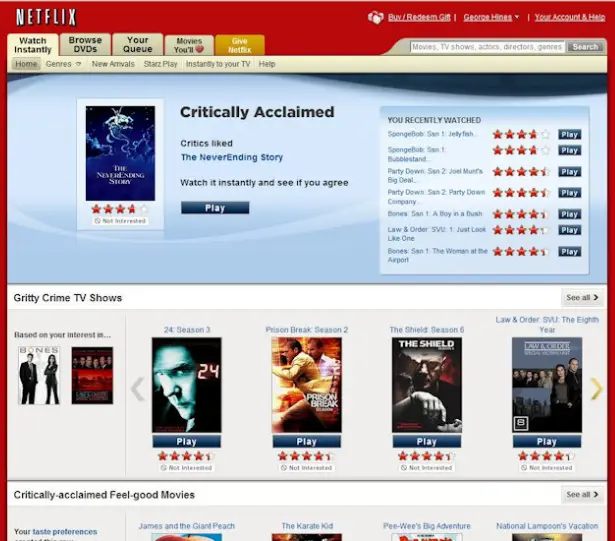
The original Netflix Watch Instantly experience.
The original experience had given the user four titles in a row from which to choose, with a “play” button and star rating under each title’s thumbnail. Each title also had ample whitespace surrounding it—a waste of screen real estate, in the team’s opinion.

The new design of the Netflix Watch Instantly interface.
The variation presented scrollable rows with title thumbnails. The designers removed the star rating and play button from the default view, and made it a hover experience instead.
They then A/B tested both variations on a small subset of new and existing members while measuring retention and engagement in both variations. The result: retention in the variation increased by 20 to 55 basis points, and engagement grew by 30 to 140 basis points.
The data clearly told the designers that new and existing members preferred the variation to the original. Netflix counted it as a success and rolled the new “density” interface out to 100% of its users in June 2011.
“If [the results hadn’t been] positive, we wouldn’t have rolled it out,” Gumm said in an interview.
Netflix measured engagement and retention again in the rollout as a gut-check. Sure enough, the results of the second test concurred with the first: users watched more movies and TV shows with the new interface.
Then the comment backlash started. However, as far as Netflix is concerned, the metrics tell the absolute truth. The vocal minority made up a small fraction of the user base and they voiced an opinion that went against all the data Netflix had about the experience.
“We were looking at the metrics and people were watching more, they liked it better, and they were more engaged in the service,” Gumm said. “[Both the tests] proved it.”
Gumm also made the following very important point: “What people say and what they do are rarely the same. We’re not going to tailor the product experience, just like we’re not going to have 80 million different engineering paths, just to please half a percent of the people. It’s just not worth the support required.”
Despite the few loud, unhappy customers that may emerge, Gumm said that the most critical thing to remember is the data: “I think it’s really important in an A/B testing organization, or any data-driven organization, to just hold true to the philosophy that the data is what matters.”
About the author