How Asana Removed Uncertainty and Boosted Impact from their Website Redesign
Done right, website redesign projects can deliver measurable returns. But many sweat at the prospect of executing these high-stakes, high-visibility projects. After all, site redesigns are usually tied to new technology or company goals. That means a lot is riding on the project’s success. And let’s not forget: redesigns usually involve numerous stakeholders – each

Julie Ritchie

Done right, website redesign projects can deliver measurable returns. But many sweat at the prospect of executing these high-stakes, high-visibility projects. After all, site redesigns are usually tied to new technology or company goals. That means a lot is riding on the project’s success. And let’s not forget: redesigns usually involve numerous stakeholders – each of whom has an opinion about just how the project should go.
So what’s the secret to a website redesign that checks all the boxes without fail? Making experimentation a core part of the process–for a deep dive on this topic checkout our latest eBook, Master Your Next Website Redesign. Here’s the story of how Asana, a company that provides work-tracking software for teams, did just that to ensure a successful website redesign process.
Incorporating Experimentation from the Get-Go
For years Asana’s product and branding had worked well for the company. But it started seeing that its most passionate users struggled to get colleagues on board. In response, Asana went through a major overhaul – including redesign of its brand, logo, product, and website – and experimentation was core to this transformation. Their goal for using experimentation was to identify and mitigate risks, so the redesign team had confidence on launch day, and to be able to measure increases in website performance.
Assembling the Team
The first step was assembling the team to manage a simultaneous rebrand, product relaunch, and website redesign. For Asana, this represented cross-functional disciplines from across the company, broken into three groups: website, design and product. One designated brand consistency lead oversaw all of the groups, making sure all work was cohesive and coordinated.
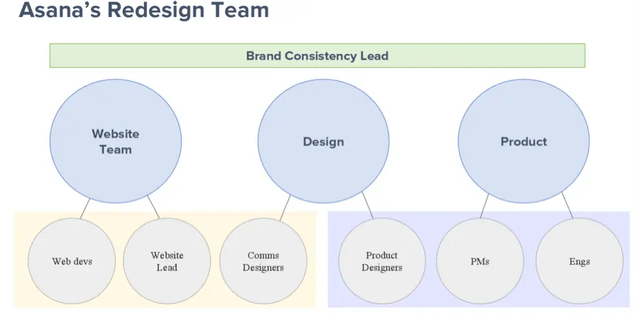
Here are Asana’s tips for assembling and working with a redesign team:
- Convene a temporary, cross-functional group. You need cross-functional buy-in to see such a project through, and bringing in stakeholders from product, marketing and brand design enables bigger conversations.
- Resolve philosophical differences by picking up on pain points. Set goals early in the process and keep conversations focused on those associated with major goals. For example, rather than arguing over colors, instead focus on whether or not a design or iteration will ultimately meet the goal set out for it.
- Share the vision and goals. Make sure everyone on the team is bought into the project vision and understands the goals.
- Empower everyone to make decisions for their areas. Asana supported its team members in making bold choices by enabling them to use test data to reaffirm their decisions.
Defining the Goals
The next step was defining the goals of the website rebrand and redesign. To do this Asana’s website program lead gathered all key stakeholders to work through goals for each page based on the audience for those pages. As part of the process, the program lead and team called upon insights gathered by Asana’s data scientists about the product’s users. The goals this team arrived at were:
- Make the same Asana feel more simple and intuitive to use.
- Set up the product for future growth.
- Offer more clarity to users about the value and benefit of Asana.
- Launch a new website that could convey the new brand while meeting or exceeding the old conversion rate.
Since the goals were defined early on, it was much easier for the Website program lead to maintain stakeholder buy-in throughout the redesign process
Asana’s Redesign Process
Asana’s Product team broke their tasks into two categories: functionality and visual/brand updates. One team launched feature updates within the existing product framework on a rolling basis and tested how each feature change impacted users. The team only released core features once they had performed well with a segment of test users. The rebranding team focused on the ultimate vision and new brand launch, which was rolled out nearer to the end of the project.
While Asana had defined specific goals for its site redesign around audience engagement and conversion rates, it wanted to make sure its new brand would be well received by site visitors. To that end, the design team explored new layouts, structures, and formats for website content. It also ran pre-launch tests on rebranded messaging, homepage organization and signup flows using existing styles. These tests ranged from small copy tweaks on the homepage to full iterations of the sign-up flow and different homepage layouts. All tests stayed within the old site framework so the test was testing functionality and flow changes versus design and look.
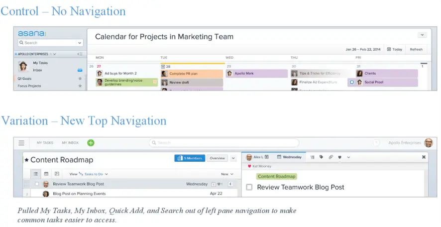
Pre-Launch Test: New Product Navigation
Previously, all Asana product navigation had appeared on the left side of the interface. When Asana tested navigation at the top of the interface, users responded well, giving Asana confidence for the full rollout.
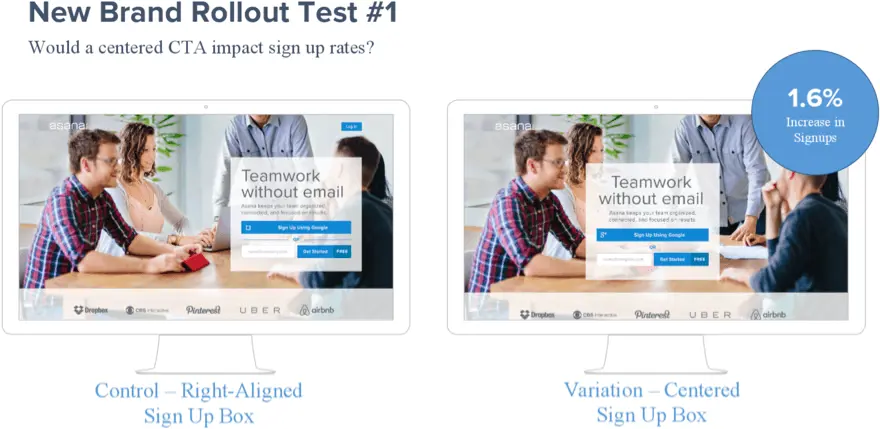
Homepage Hero Tests
The following are a sample of the various tests Asana ran on its homepage hero. Because Asana is a freemium product, a majority of conversions occur on its homepage and it wanted to be sure the new site would not negatively impact the conversion rate. The old homepage design featured a right-aligned call to action (CTA). Testing a center-aligned CTA drove a 1.6% increase in sign-ups. While this was not a big number, it confirmed that a layout change would be okay.
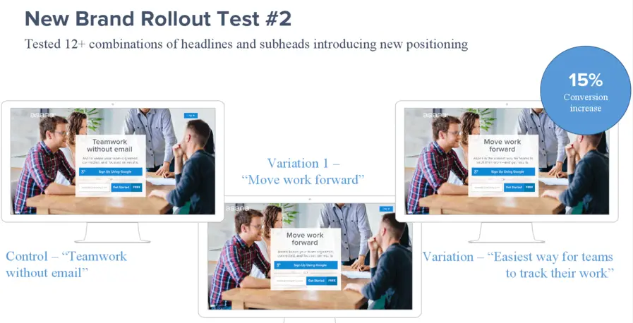
Old messaging on the homepage – “Teamwork without email” – didn’t fully capture Asana’s value. So its copywriters came up with numerous options. The redesign team quickly rolled out messaging variations on the homepage so it could feed the results back to stakeholders and shape the conversation around which messaging and tagline to go with. The ultimate choice yielded a 15% boost in conversion rates.
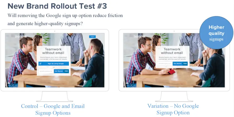
The redesign team also conducted a bold test in the name of simplifying the home page. It ran a simple A/B test to see the impact of removing the option to sign up with Google and only present the option to sign up via email. While the test showed a slight decrease in overall signups when only presented the email option, those that did sign up were more likely to sign up with their business or work email. That made them potentially more valuable to Asana, so the decline in signups was an acceptable tradeoff for the higher quality of leads. The data allowed the company to make that informed decision.
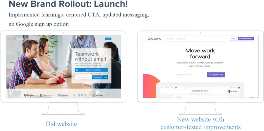
Before & After
At the time of the total relaunch with new branding, the Asana website had already been 50% tested in some way. As the before and after shows, the new Asana branding was a dramatic shift.
For Asana, it would have been huge risk to simply flip the switch on users. But by making and testing incremental changes over a period of months, everyone felt confident on launch day. That meant they could focus on capturing data and celebrating wins rather than having uncertainty hanging over their heads.
Want to handle your website redesign with as much confidence as Asana? Simply download our eBook, Master Your Next Website Redesign, and you’ll be on your way!
About the author