Heatmap
What is a heatmap?
A heatmap is a graphical representation of data that uses a system of color coding to represent different values. Heatmaps are used in various forms of analytics but are most commonly used to show user behavior on specific web pages or webpage templates. Heatmaps can be used to show where users have clicked on a page, how far they have scrolled down a page, or used to display the results of eye-tracking tests.
Heatmaps give data about where users have clicked on a page and how far they have scrolled down a page. For example, a heatmap of a webpage can show you which areas of the page are most likely to be clicked on. Use this information to improve the page design by ensuring the most important elements are located in the most visible areas.
With Heatmaps, you can track user engagement on a webpage. For example, you can use a heatmap to see how far users scroll down a page or how long they spend on each page element. This information ensures the most important content is easy to find and read.
You can make the design and usability of your web pages much better through heatmap visualization. If you are looking for a way to get more insights into how your users interact with your website, then heatmaps are a great place to start.
Benefits of heatmaps
Analytics tools like Google Analytics or Site Catalyst are great at providing metrics to show which pages users visit, but they can lack detail when it comes to understanding how users engage with those pages. Heatmaps can give a more comprehensive overview of how users are really behaving and the actual conversion rate.
Heatmaps are also a lot more visual than standard analytics reports, which can make them easier to analyze at a glance. This makes them more accessible, particularly to people who are not accustomed to analyzing large amounts of complex data.
Good heat mapping tools, such as CrazyEgg, enable analysts to segment and filter the data. Through data analysis, it can be easy to see how different types of users are engaging with a particular page.
Further. attention heatmaps can be used to:
- Visualize a variety of data points, including mouse clicks, scroll depth, and eye movements.
- Identify areas of a page that are most (or least) engaging.
- Test different design changes to see how they affect user behavior.
- Troubleshoot problems with a page's usability.
What are the different types of heat maps?
There are many different types of heatmaps, but some of the most common ones include:
- Click heatmaps: These heatmaps show where users click on a webpage. Identify the integral elements on a page and see how users interact with different features.
- Scroll heatmaps: See how far users scroll down a webpage with this type of heatmap. See which parts of a page are most engaging and how users find the information they are looking for.
- Mouse movement heatmaps: These heatmaps show the path of a user's mouse as they move the cursor around a webpage. Know where users are looking and how they interact with different elements on the page.
- Eye tracking heatmaps: This heatmap shows the path of a user's eye movements as they look at a webpage. Understand where users are paying attention and how they process different elements on the page.
- Conversion heatmaps: Get a view of all the steps your users take to complete a desired action, such as when making a purchase, clicking on the call to action (ctas), or signing up for a newsletter. Use this information to identify bottlenecks in the conversion process and guide users to take the desired action.
Considerations
Like most forms of web analytics, heatmaps need to have a large amount of data before they can be accurately analyzed for data visualization. Analyzing heatmaps based on a small amount of data is similar to ‘calling’ A/B tests too early, based on too few visits or conversions. As heatmaps show trends, it is important to have enough information to ensure that any anomalies do not affect the overall heatmap picture.
When used incorrectly, heat maps can be misleading. They can encourage analysts to make assumptions that may not be correct. It is important to remember that, as with other forms of quantitative data, heatmaps can tell you what has happened on a page, but cannot tell you why that happened.
It is also important to be aware of the limitations of heatmap data. Often, heatmaps will show clicks on a page (known as click maps) but this may only be a part of the story. For example, when looking at a heatmap of a form, it may show that users are clicking on the first field and that there are fewer clicks on the subsequent fields.
This visual representation could suggest that users are dropping out of the process after filling out the first field. What heatmaps do not show, however, is if users have used their keyboard to tab through form fields, rather than their mouse. To correctly analyze form usage, dedicated form analytics tools can be used. These will measure the time spent within each field, rather than just clicks.
Heatmap examples
Heatmaps provide a good way to see, at a glance, how ‘popular’ the elements on a certain page are. This is particularly useful for comparing elements that are given similar prominence on the page. The heatmap below shows where users clicked on a product page of mobile phones:
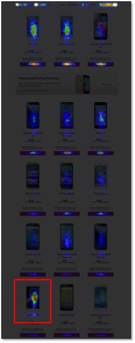
It is clear to see from this that the current order of these phones does not match their popularity. Users are often choosing the highlighted phone, despite it appearing quite far down the list and ‘below the fold’ on most devices. One possible solution to this would be to display the phones in order of their popularity to save users from having to scroll to find popular phones.
Heatmapping can also be useful for differentiating between links when there is more than one link on a page that goes to a particular destination page. Some analytics tools, such as Google Analytics, treat links to the same destination as the same link. This makes it impossible to tell which of the links has received the most clicks.
One example of where this differentiation is useful is determining how many people are using the links in your footer compared with those in your main navigation. This is often more than you’d expect!
Use heatmaps to identify clicks on parts of a page that are not actually links. In the example below, only the ‘find out more’ text is a link, yet users are erroneously clicking on the icons in an attempt to get more information.
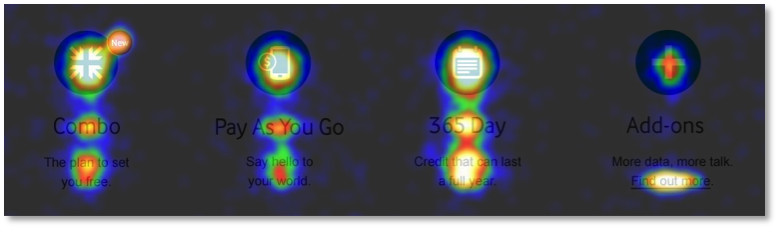
This shows clear user intent and suggests that these icons should in fact link to more information about each of the options.
Scrollmaps show which part of your content is the most engaging and how far down a particular page your users are reading. Scrollmaps won’t show you what users have read but can highlight areas where users are scrolling past (i.e., not reading) content that you may feel is important. If you have a blog and the scrollmap shows that the majority of the time is spent at the start of an article and very little is spent towards the end, then you might want to focus on making your blog posts shorter, or more engaging!
Final thoughts
Website heatmaps will not answer all of your questions about user experience and how users are engaging with your website but they can give insight that is not readily available from other analytics tools. As long as they are used in the right way, and conclusions are not drawn from small amounts of data, then heatmaps can be a highly effective weapon in the web analyst’s arsenal.
Using heatmaps during the discovery phase of your CRO campaign can really help to identify additional areas for testing. It’ll help you increase conversions on your landing pages in real time. The examples provided on this page have all been used to inform A/B tests on changes to page layouts and functionality to better match user intent.
Heatmaps can also be integrated with A/B tests within Optimizely. This means that you will be able to get a clear picture of how users are engaging with your test variations compared with your original.
