Experiments that improve homepages in financial services
Three experiments that show how navigation, design, and copy each play a role in getting visitors to take the next step.
- WHO: Digital, growth & CRO teams
- INDUSTRY: Business & Financial Services
- IMPACTED PAGES: Homepage
Experiment 1: Adding a fixed navigation
Hypothesis: If we add a fixed navigation, we will increase user engagement for that element as well as clicks into the AI Assistant CTA, because the navigation will be visible as users scroll up and down the page on desktop, resulting in increased click-throughs and overall better engagement.
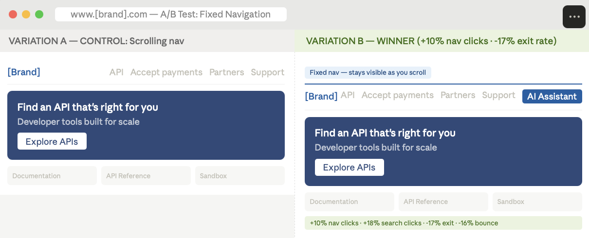
Image source: Optimizely
Results:
Increase in total navigation clicks
Decrease in exit rate
Increase in leads generated
Takeaways:
- There was little change (in this case a slight decline) in clicks on the AI Assistant CTA, indicating that the CTA is of little interest to users.
- The increase in navigation clicks was largely driven by a rise in search clicks, suggesting users may be struggling to find content quickly or are opting to search due to limited browsing patience.
- The fixed navigation led to significant improvements in user engagement, particularly in reducing exit and bounce rates, where results reached statistical significance.
Experiment 2: Redesigning the feature banner and moving the why section up the page
Hypothesis: If we change the feature banner design and content, adding a clear CTA, and move the Why section further up the page, we will increase conversions and successful transfer requests because visitors will find the information and next action to take clearer and more visible.
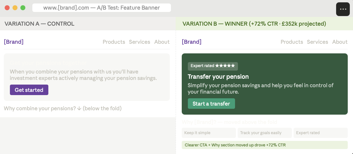
Image source: Optimizely
Results:
Increase in CTR
Projected revenue over 12 months
Takeaways:
- The variant design performed significantly better for CTR and transfer conversions, driving more users through the funnel.
- Transfer Hub homepage to successful transfer didn't perform as well, suggesting visitors might be less informed when reaching the transfer funnel.
Experiment 3: Consistent CTA copy across the page
Hypothesis: If consistent copy is used for primary CTAs, then visitors will be more likely to click, ultimately driving more leads due to improved clarity and expectation setting.
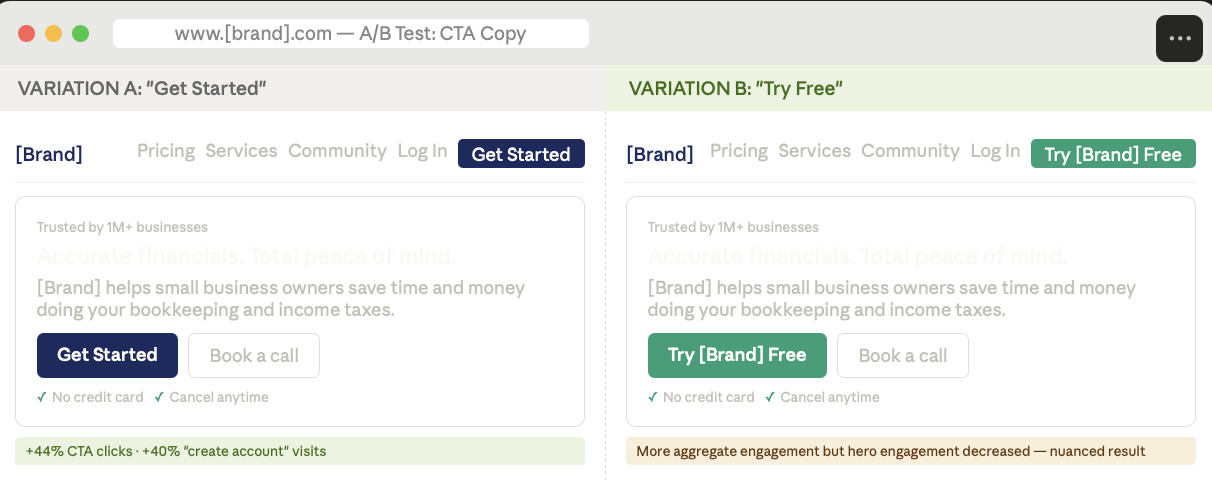
Image source: Optimizely
Results:
Increase in CTA clicks
Increase in "create account" visits
Takeaways:
- "Get Started" CTA messaging drove more engagement across all button placements.
- "Try free" messaging drove more engagement in aggregate, but overall engagement in the hero decreased.
- Both CTAs drove more visitors into the sign-up funnel, however this did not lead to significant traffic increases at the later stages.
Fixed nav or scrolling. "Get started" or "Try free." These are all hypotheses.
Every element on your homepage is an assumption that has or has not been tested. The Experimentation Ideation Agent surfaces what to test and ranks ideas by potential impact, so your team stops debating and starts proving.
Proving it on the homepage is one thing. See what happens when that same discipline runs across the full experience.
See experience optimization in motion
- Sist oppdatert:04.05.2026 11:10:52