Experiments that improve mobile pages in financial services
One experiment that shows how the words on a button can be the difference between a visitor clicking through or moving on.
- WHO: Digital, growth & CRO teams
- INDUSTRY: Business & Financial Services
- IMPACTED PAGES: Mobile page, account page
Experiment 1: Testing copy variants on the account upgrade navigation tab
Hypothesis: If we test different copy variants on the "Add to Policy" tab within the navigation, we will reduce user navigation confusion and increase traffic to the Add to Policy page, because clearer and more intuitive labelling can improve user understanding and encourage clicks to the intended destination.
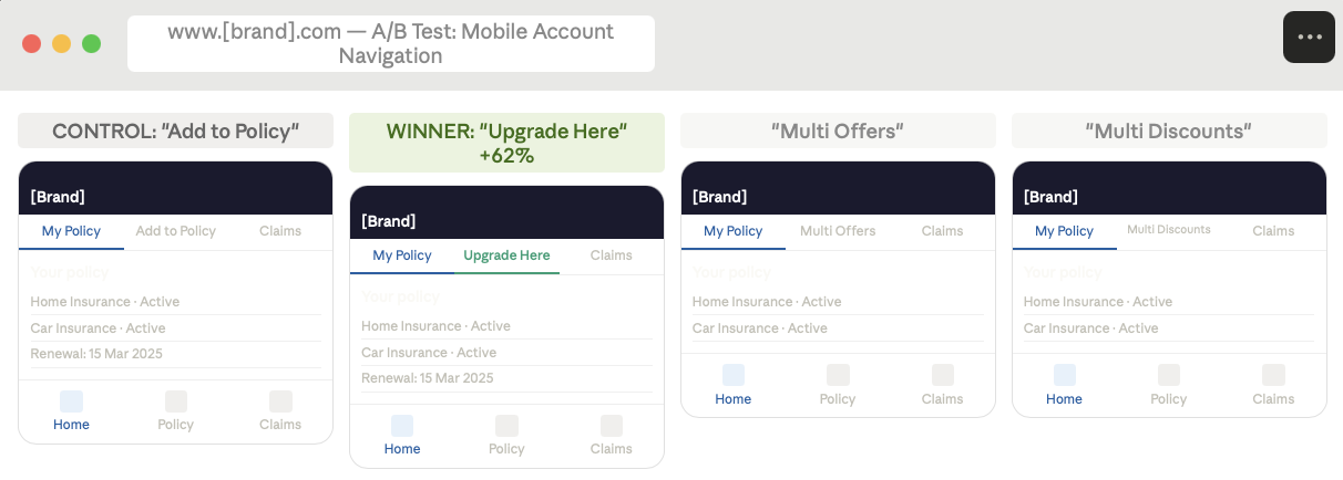
Image source: Optimizely
Results:
Increase in CTA clicks
Increase in quote funnel visits
Takeaways:
- Variation #2 ("Upgrade Here") drove the highest risk conversion rate at 62%, outperforming both the control and other variants by nearly 10%.
- The increase in conversions for Variation #2 was primarily driven by users adding Home Insurance to their existing policies, indicating that the term "Upgrade" resonated with users looking to expand coverage.
- Variations like "Multi Offers" and "Multi Discounts" did not perform as well, suggesting that users respond better to action-oriented and benefit-driven language rather than vague or promotional terms.
One label change could mean more clicks
Mobile pages have less room for everything, which means every word either earns its place or costs you. The Experimentation Ideation Agent surfaces copy, label, and CTA test ideas so the next high-impact change does not need a full redesign to find.
Find one. Prove it. Then see what a program that keeps finding the next one looks like.
See experience optimization in motion
- Sist oppdatert:04.05.2026 11:08:18