How A/B Testing Empowers Relief Efforts in the Aftermath of Typhoon Haiyan
A/B testing is one of the fastest and most effective ways to use data to increase donations in online fundraising campaigns.

Bradley Heinz

The Internet has changed how the world reacts to natural disasters. We live in a new era of online fundraising where relief organizations can use new technologies to raise more money faster for those in critical need. Today, easy to use tools exist that enable campaign managers to make rapid data-driven decisions about their messages, donation forms, and everything that goes into a donation decision.
A/B testing is one of the fastest and most effective ways to use data to increase donations in online fundraising campaigns. We’ve seen this work before. In 2010, our co-founders and early team ran A/B tests on a campaign for earthquake disaster relief in Haiti. After only a few weeks (and just a few variations) we were able to increase donations by over one million dollars.
The tests our team ran for this Haiti campaign were simple and remarkably effective. In fact, they would only take minutes to set up using our platform today.
The ongoing global disaster relief efforts for those affected by Typhoon Haiyan remind every one of us at Optimizely of our shared humanity and has galvanized us to act on our shared responsibility. To do our part, we would like to contribute best we can. To those running online donation campaigns on behalf of those in the Philippines, we’d like to offer free use of our platform. To every reader, we’d like to share what we learned from our experience on the Haiti campaign. We hope these lessons will serve as inspiration for anyone raising donations on the web to get started A/B testing right away.
Within days after the second deadliest earthquake in history struck near Léogâne, Haiti in January 2010, the Clinton Bush Haiti Foundation was established to support the relief effort. The organization quickly got a page up to collect donations from the millions of visitors the site was seeing every day, thanks to a massive media and press campaign.
Their team knew time was of the essence—every website visitor had the potential to impact those in need, and every visitor who didn’t donate was a lost opportunity. They contacted us to help turn this high-traffic time into as many donations as possible . Over the course of three days, we ran a series of tests on the donation pages. Here’s what we learned.
Media matters, but reducing friction is key.
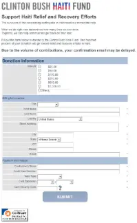
The original donation page consisted of a single, simple form.

The original Clinton Bush Haiti Fund donation page.
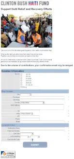
We hypothesized incorporating an image of earthquake victims would add a human element to the sterile form and increase donations. We tested the following variation:

First variation of the page with an image above the form.
Surprisingly, this page decreased our key success metric, average donation per pageview.
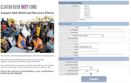
This result led to our next hunch: the addition of a picture was not the cause in the decrease of donations, but the length of the form. We guessed fewer people donated because they couldn’t see the call to action button at the bottom of the form. So, we tried the following variation:

The next variation. What would happen if we adopted a two- column layout and put the image beside the form?
This variation had a clear call to action that visitors could see without scrolling down their browsers. The combination of a personal picture and a clear layout resulted in an 8% increase in donations per pageview compared to the original site. Here we discovered that reducing any friction or roadblock to action is key. Our original “failed” test turned out to be quite valuable. It helped us think of our next experiment, and drew attention to elements of the layout we weren’t initially considering.
Every field counts.
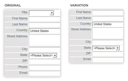
The idea for the next test stemmed from the same theme of reducing friction. We hypothesized that simplifying the number of fields the potential donor had to fill out would increase the likelihood of them actually making a donation. From the original form, we removed “Phone” and “Title”, non-essential pieces of information to collect.

Another variation where we removed “Phone” and “Title” form fields.
A donor’s phone number is surely valuable information, but not necessary to process a credit card payment, and the Foundation was so overwhelmed with their other efforts that they weren’t able to call anybody anyway. Removing these two optional fields resulted in an increase of 11% in average donations per pageview.
The power of a few words.
One very clear metric to measure the success of donation pages is the percentage of visitors who click the donate button. Given that so much rides on one button, its call to action is critical, and one of the most simple but powerful tests you can run on a page. We hypothesized a button that reflected the true meaning behind the click would increase participation. We tested the original button against a new design:

We tried simply changing the text on the “submit” button.
The results were outstanding, increasing average donation per pageview by just over eight dollars.
“With a disaster like the Haiti earthquake, every second counts when it comes to attracting donations, and it goes without saying that every dollar counts,” said Marie Ewald, Director of Online Fundraising for the Clinton Bush Haiti Fund. “In less than 48 hours we tested eight versions of the donation page, and through this experiment we were able to generate an additional $1,022,571 in online revenue.”
Had we not set up these few tests, we would have lost a million dollars. These tests are a testament to the power of the right words, or the right image and layout. But don’t take our word for it, test it out yourself. We recommend setting up experiments to find the best headlines, the best pictures, and the best location, size, and copy of your call to action buttons, for starters.
Contact us for more information on how Optimizely is working with nonprofits and share this post with your colleagues working on online donation campaigns.
