Slik lager du et brukerflytkart for nettstedet og appen din
Et brukerflytkart er et kraftig visuelt verktøy som beskriver brukernes vei gjennom det digitale grensesnittet ditt, og som hjelper bedrifter med å optimalisere brukeropplevelsen og identifisere potensielle smertepunkter. Et godt brukerflytkart kan hjelpe deg med å forstå brukernes reise, identifisere smertepunkter og planlegge for uforutsette hendelser. Denne veiledningen forklarer brukerflyt, hvordan du lager brukerflytkart, og gir deg noen gode råd om hvordan du utformer diagrammene dine
Viktige lærdommer:
- Brukerreisen beskriver hele brukerens opplevelse med bedriften din, mens brukerflyten beskriver stegene brukeren følger i grensesnittet ditt.
- Noen vanlige former som ovaler, rektangler, diamanter og parallellogrammer har velkjente bruksområder i flytdiagrammer.
- Følg beste praksis og bruk ekspertene hos Optimizely til å forbedre den digitale opplevelsen din.
Brukerflyt vs. brukerreise
Selv om brukerflyt og brukerreise har lignende navn og overlapper hverandre på mange måter, bør du være klar over viktige forskjeller mellom disse begrepene.
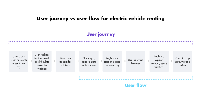
Brukerreisen omfatter alle aspekter av brukerens opplevelse med bedriften din. Brukerreisen begynner når en bruker først blir oppmerksom på bedriften din (eller blir oppmerksom på et behov du kan løse), og slutter med brukerens siste interaksjon med bedriften din. Det betyr at selv om du ikke kan vite nøyaktig når en brukerreise begynner eller slutter, kan du bruke Customer Relationship Management-programvare til å identifisere hvor brukeren befinner seg på reisen, og hvordan du kan flytte dem til neste trinn.
Brukerflyten overlapper med brukerreisen, men den beskriver spesifikt den veien brukerne følger på nettstedet eller i applikasjonen din. En brukerflyt kan for eksempel begynne når en bruker besøker nettstedet ditt for første gang, og ende med et kjøp. Disse aktivitetene er en del av den større brukerreisen, men brukerflyten er mer interessert i opplevelsen brukerne har med nettstedet eller appen din.
Brukerreisen er interessert i brukerens følelser, materielle og immaterielle interaksjoner, løpende kommunikasjon, relasjonsbygging osv. - den "menneskelige" siden av prosessen, mens brukerflyten er interessert i den "teknologiske" siden av prosessen - brukerens klikk, sidebesøk og abonnementer. Brukerflyten og brukerreisen beskriver ulike elementer av det samme forholdet mellom virksomheten og brukerne.
Diagrammer over brukerflyten
Brukerne dine kommer aldri til å se brukerflytkartet, men du og teamet ditt kommer til å henvise til det gjennom hele nettstedets eller appens levetid, så selv om det ikke trenger å være det peneste dokumentet, bør det likevel være tydelig og brukervennlig.
Selv om reglene for brukerflytdiagrammer ikke er hugget i stein, bør du kjenne til noen av de beste fremgangsmåtene og generelt forstå syntaksen for å lage flytdiagrammer.
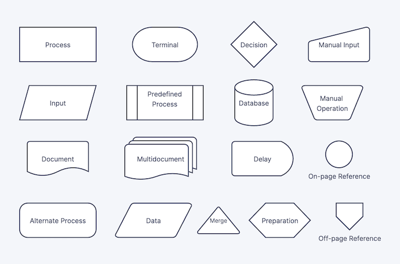
- Ovaler representerer start- og sluttpunktet i flytskjemaet. Avhengig av prosessen din kan brukerflyten ha mer enn ett startpunkt og mer enn ett sluttpunkt.
- Firkanter eller rektangler representerer individuelle sider eller trinn. Generelt kan firkanter og rektangler i flytdiagrammer representere et hvilket som helst trinn i en prosess, men i nett- og appdesign representerer firkanter og rektangler individuelle sider i brukergrensesnittet.
- Diamanter representerer beslutninger som brukerne må ta. Når en bruker for eksempel prøver å logge inn på plattformen din for første gang, kan nettstedet ditt be dem om å koble til en Google- eller Facebook-konto, eller de kan logge inn med en e-post eller fortsette som gjest. Avhengig av hva brukeren velger, kan reisen gjennom nettstedet eller appen din avvike fra hverandre ettersom du leverer en annen opplevelse basert på brukerens valg.
- Parallellogrammer representerer input som kreves av brukeren. Du kan for eksempel kreve at de oppgir et serienummer for å aktivere produktet eller en leveringsadresse for å motta en tjeneste.
- Piler angir retningen på flyten. Flyten kan inneholde sløyfer, veikryss og divergerende og konvergerende veier, så det er viktig å angi rekkefølgen på elementene for at brukerflytkartet skal være lesbart.
Vanligvis er disse fire formene, sammen med piler, de grunnleggende byggesteinene i brukerflytkartet, men du kan alltid bruke flere former, farger eller andre designelementer for å kommunisere informasjon du mener er relevant. Husk at formålet med et brukerflytkart ikke bare er å følge reglene eller krysse av i en boks, men å kommunisere informasjon om brukerflyten. Eksemplet nedenfor viser flere former som andre selskaper har brukt når de har laget flytdiagrammer.
Designprinsipper for brukerflyt
Som med all annen form for kommunikasjon mister brukerflytkart noe av sin verdi når de utelater relevant informasjon og inkluderer for mye irrelevant informasjon. For å utforme et vellykket brukerflytkart må man balansere flere hensyn for å maksimere nytten av diagrammet.
1. Fastsett et visst detaljnivå
Hvis brukerflytkartene er for detaljerte, blir de uoversiktlige og vanskelige å lese. Hvis de ikke er detaljerte nok, er de ikke nyttige. Et viktig første skritt i utformingen av et brukerflytkart er å finne riktig detaljnivå.
Det gylne prinsippet når du skal utforme diagrammer, er å ta utgangspunkt i brukernes behov. Hva slags spørsmål vil de prøve å besvare med diagrammet ditt? Hvilket erfaringsnivå har de? Hva skal de bruke diagrammet til? Ved å svare på disse spørsmålene kan du definere riktig detaljnivå for brukerflytkartet.
2. Vurder alternativer
En av grunnene til at brukerflytkart er nyttige, er at de gjør det mulig for designere å visuelt analysere brukernes reise gjennom nettstedet eller appen din. Gjør ditt beste for å vurdere alle alternativer når du utformer brukerflytkartet.
Hva gjør du for eksempel hvis brukerne legger varer i handlekurven, men forlater den uten å sjekke ut? Hva gjør du hvis en bruker oppgir en faktureringsadresse, men ikke en leveringsadresse? Hva gjør du hvis en bruker ber om en gratis prøveversjon, men deretter kjøper fullversjonen? Brukerflytkartet hjelper deg med å identifisere disse korsveiene og planlegge for uforutsette hendelser.
3. Bruk riktig plattform for digitale opplevelser
Brukernes digitale opplevelse er viktig. Optimizely er en kraftig digital opplevelsesplattform med ekspertverktøy som hjelper deg med automatisering, A/B-testing, innholdsadministrasjon og mye mer.
Et brukerflytkart beskriver kun kundenes reise når de interagerer med det digitale grensesnittet ditt. Selv om et brukerkart kan bidra til å identifisere smertepunkter og visuelt inspirere til løsninger, er nøkkelen til å forbedre kundeopplevelsen å forbedre innholdet på nettstedet eller i appen.
Hvis du er klar til å ta de digitale opplevelsene dine til neste nivå, kan du sette opp et møte med en Optimizely-representantallerede i dag.


- Sist oppdatert:25.04.2025 21:15:14