3 Landing Page Design Best Practices Debunked With Examples (2019)
You’ve heard it all before when it comes to creating high-performing landing pages: “Write engaging copy!” “Get your value proposition right!” and the list goes on. All of these “best practices” can become obvious, and you see everyone writing about them. So have you ever asked yourself, What if these best practices aren’t true? What if they’re actually hurting my landing page conversion rates? I have — and here are three landing page best practices I want to debunk.

 You’ve heard it all before when it comes to optimizing for high-performing landing pages.
“Write engaging copy!”
“Get your value proposition right!”
“The fewer fields, the better!”
“Don’t use orange, use fuscia for your CTA button!”
“Use trust signals!”
“Design around your buyer persona!”
“Offer a free trial!”
“Use more white space!”
“Guide your users with directional cues!”
But all of these “landing page best practices” can sometimes feel like that water that will never stop dripping from your faucet. They’ve become obvious (like that faucet dripping metaphor I just mentioned), and you see everyone writing about them.
So have you ever asked yourself, What if these best practices aren’t true? What if they’re actually hurting my landing page conversion rates? And how can I leverage my homepage traffic and what other tricks to ensure landing page optimization.
9 Actionable Landing Page Best Practices Tricks (Pros and Cons)
No matter what side of the fence you’re on, I hope you can agree with how fast those “best practices” can also be shot down. Let’s take a look:
Write engaging copy? – Where‘s the scale on which I can judge how engaging my copy is? Am I supposed to turn my landing page copy into charming and attractive sonnets? And is engaging optimized for SEO, lead generation, click-through or some other tactic?
Get my value proposition right? – What if I do what 327 other companies do too, and my level of service is “honestly” not what differentiates us. What can I articulate to potential customers that is true and valid?
The less fields, the better? – It’s been proven (time and time again) that adding landing page elements like fields and steps can increase conversion rates and lead quality.
Test call-to-action button colors? – Colors are important, but your button CTA copy can have much higher conversion rate impacts.
Use trust signals? – Adding company logos or press mentions without them being clickable proofs will ultimately hurt your conversion rates.
Design around your buyer persona? – How’s that possible if my PPC search traffic includes everyone and their dog who’s interested my offer? I can’t really slice that pie any other way.
Offer a free trial? – Free trials might be great ways to improve your conversion rates into a trial. But, at the end of the day, people take your product or service more seriously when they have to pay for it. Free trials could hurt your ability to close customers further down the funnel.
Use more white space? – At what point is there too much white space on your landing page design? The opportunity cost with a/b testing around removing elements is quite costly. Are there bigger fish you can be frying?
Try having directional cues? – It might be human nature to follow where other people are looking, but some software products simply don’t make any sense to use photos with people in them. Google.com makes their above the fold experience very, very clear — type in what you’re searching for.
But as marketers, there’s one thing I know we all can agree on — we want things done fast. And that’s exactly the quick, actionable landing page advice I’m about to share.
Let’s get to it.
1) Weak Social Proof Is Killing Your Conversion Rates
A lot of people say that you should use testimonials and/or company logos to increase the social proof, and therefore, increase your conversion rates.
But what they don’t tell you is that this could quickly have the opposite effect of what you intended.
Either your visitors will call BS on your social proof, or they’ll actually believe it. I’ve seen at least 10 separate landing page instances where removing the social proof altogether actually increased conversions.
Derek Halpern from Social Triggers saw that removing social proof increased conversion rates by 102%. (Read the full case study on the KISSmetrics blog.) Joanna Wiebe from CopyHackers shows us how good intentioned social proof might be working against you.
A downside to testimonials is that when you ask your customers to write them, they’re usually horribly written or just not quite right.
“Awesome service!” – Tim K.
“These guys revolutionized my entire business. I’m now making more money this year
than I did all last decade.” – Carl B.“Definitely recommend!” – Ashley J.
You’re often better off writing them yourself and then asking for permission to use them.
Now on the flip side, if you try to use company logos or press logos, then make sure you’re not a small fry company with five employees that touts they worked with Disney. But if you actually have, take it one step further and have a case study to prove it.
And what about press mentions? Have you ever been on a landing page that had something like this?

(Okay, maybe not that many press logos, but you catch my drift.)
If these logos don’t link to something that acts as actual proof, then you’d do better removing them completely.
Weak social proof to look out for on your site:
- Are you not showing your faces and personality on your about page?
- Has your blog not been updated in 6 months?
- Are your social media follower counts abnormally high? or embarrassingly low?
- And most importantly, are you using this woman on any of your pictures?

(92% chance that you’ve seen this woman before)
Her name is Ariane and she’s the most overused stock photo person and has her own Facebook fan page too (crazy right?).
So test these ideas out today:
- Remove all landing page social proof completely and see what it does to your conversion rates.
- Change your social proof to aid in the conversion process by either reducing anxiety, inspiring trust and likability, or showing participation from others.
- Take Angie Schottmuller’s advice and use the Cravens score to calculate how powerful your current social proof is and what you can do to improve it.
You could also take it to a whole new level and add real-time social proof to your landing pages and site where conversion rates have increased 8% on average.
Not sure it’s worth your time to test? Then consider that up to 70% of buying decisions are made before visitors are in contact with a sales rep.
Social proof is vital. Make it strong.
2) Your Offer Is The Biggest Catalyst of Action, Test It
No matter what your landing page offer, value driver, or call to action is, it’s vital to differentiate it from your competitors.
The usual “free quote” or “free consultation” is what all people expect these days, and it could be what all your competitors think is a great idea to offer too.
Direct data from a landing page aggregator shows that changing your offer can increase conversion rates 10x:
“A common trait across all top performing landing pages was this:
They have incredibly unique offers that help them stand out in their respective industries.”
And it makes sense. Your visitors know that you’re a potential solution to their problem, but for them, they want to feel you out before they commit to anything. Consider two things…
- Your PPC traffic is in different stages of the decision make cycle, so some visitors might not be ready to convert by calling you (if that’s your end goal).
- A free demo of your SaaS product might not convert as well as a free PDF guide, followed with an email drip campaign to then get them to sign up for a demo.
When you think of your new offer/CTA, keep in mind some of the five biggest questions visitors have when they visit your landing page(s):
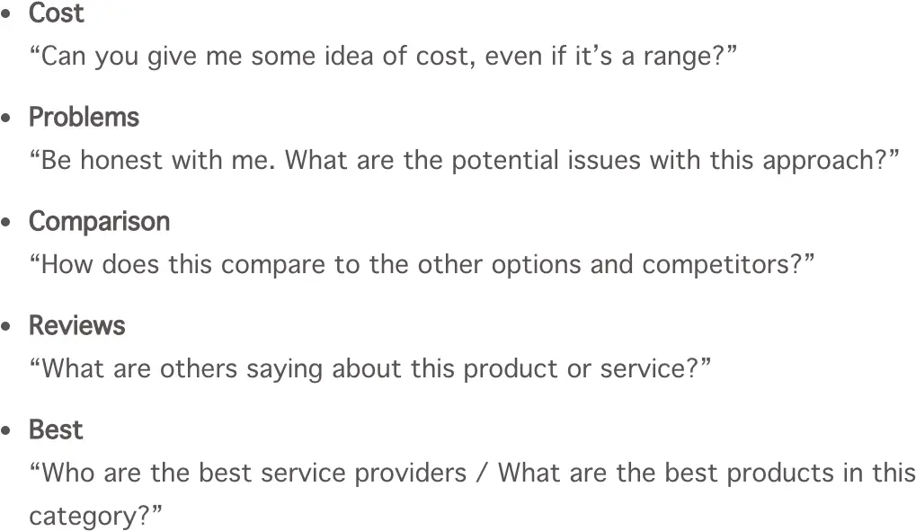
(You could also call these questions; The 5 Biggest Landing Page Elephants)
Answering these questions on the landing page or using them as your offer/CTA can seriously grow your conversion rates.
That’s what happened when Andy Crestodina over at Orbit Media showed how it helped Marcus Sheridan at the SalesLion make millions when he focused his copy and visuals around those types of questions.
So ask yourself this: What changes to your offer can you quickly make to test the difference in conversion rates?And when you do, keep this in mind:
“When everyone has the same offer, no one has an offer”
- Johnathan Dane (aka myself)
3) Adding More Fields & Steps Can Grow Your Conversion Rates
One of the most popular bits of advice for improving landing page performance is simple: remove form fields. And everyone takes it for face value when it’s communicated by the conversion Gods of our world.
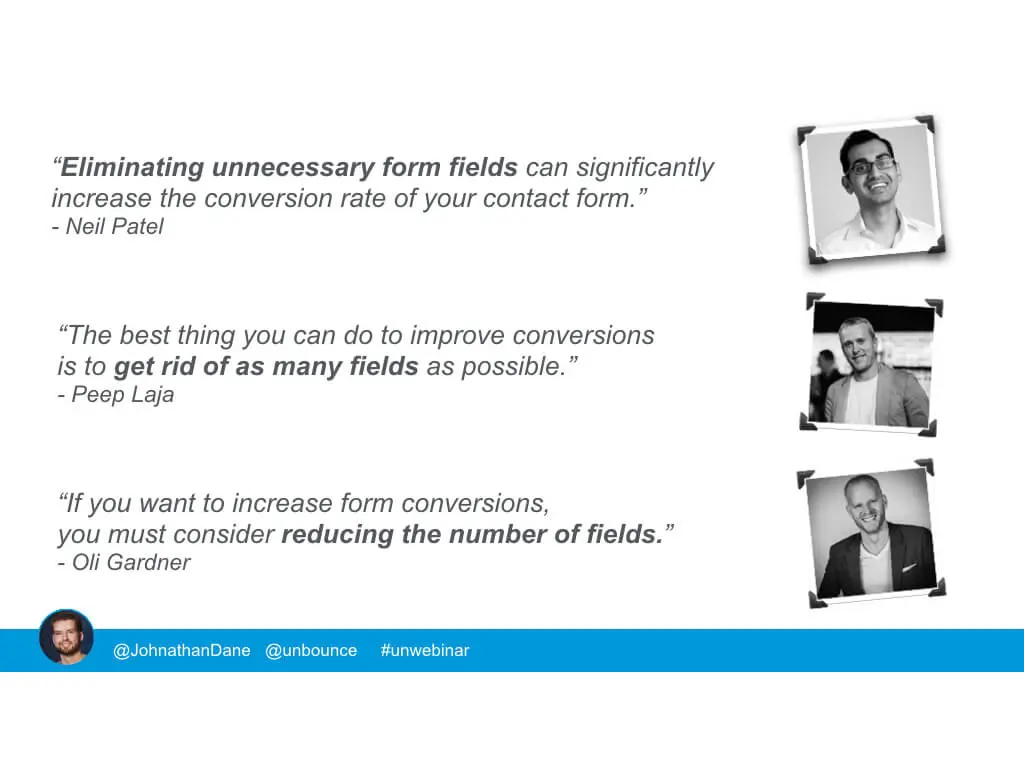
(From Neil Patel to Oli Gardner. Removing form fields is sure-fire way to improve conversion rates, right?)
During a webinar I hosted with Unbounce, I wanted to showcase how the exact opposite can be true and how we base our own conversion funnel at KlientBoost on this secret too.
When you keep trying to remove form fields, you’re essentially left with the fields that are the hardest for a visitor to fill out:
- Name
- Phone
These are the fields you need in order to contact the visitor and give them the offer they converted for, but when countless of your competitors are nothing but a click away, you don’t have the luxury to simplify.
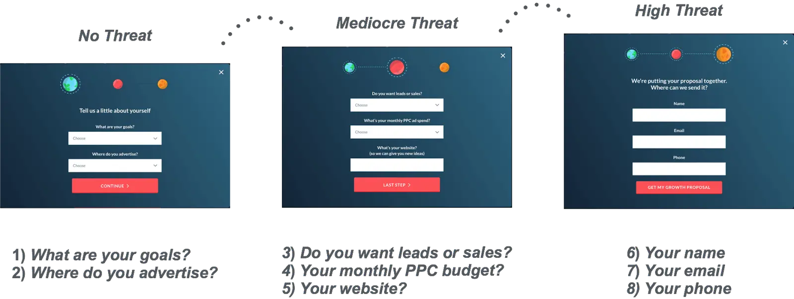
Those three fields also contain the information that’s most threatening for your visitors to give away.
Adding more fields and steps to your landing pages doesn’t only make you more money, or improve your PPC landing page conversion rate, they also give your sales team more info to qualify leads faster so they don’t waste their time on low quality leads.
The secret lies in using your first step landing page with questions that are super easy for the visitor to answer (usually in the form of dropdown fields).
To give you some examples, you’ll want to use your first step landing with questions that relate to your offer.
If you’re generating leads in the loan space, you could ask:
- What’s the loan amount you’re looking for?
- How long would you like the loan to last?
If you’re selling enterprise level software, you could ask:
- How many seats will you need?
- How soon are you looking to implement this solution?
Sometimes, the questions you ask can be completely meaningless to you, but for the visitor, they should act as something that gets them to commit to finishing the first form.
Here’s what we do on our own 3 step proposal conversion funnel (notice how the visitor’s threat level increases as they continue through the funnel):
Here’s another example on this two-step landing page below:
Here’s step one:
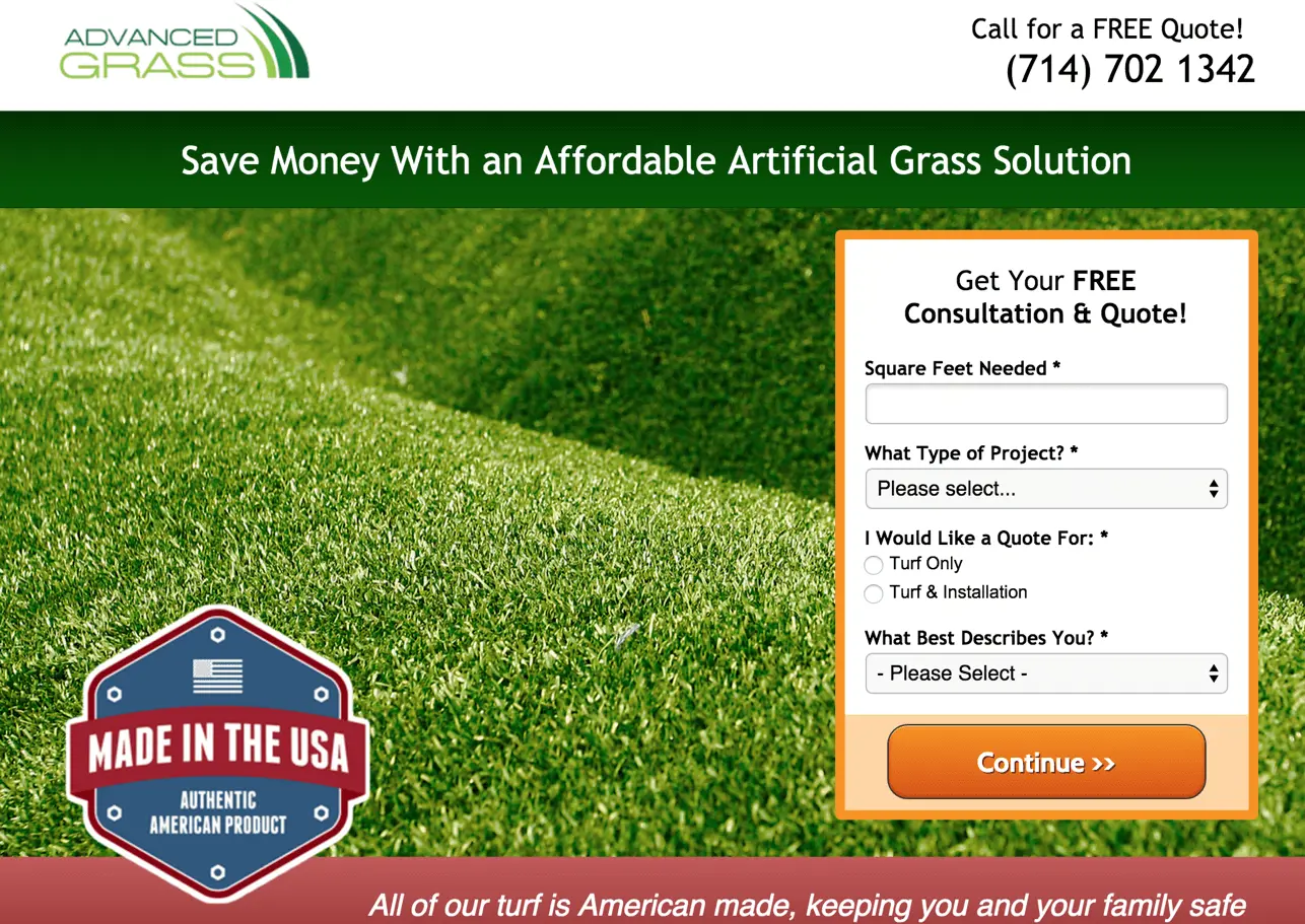
And here’s step two:
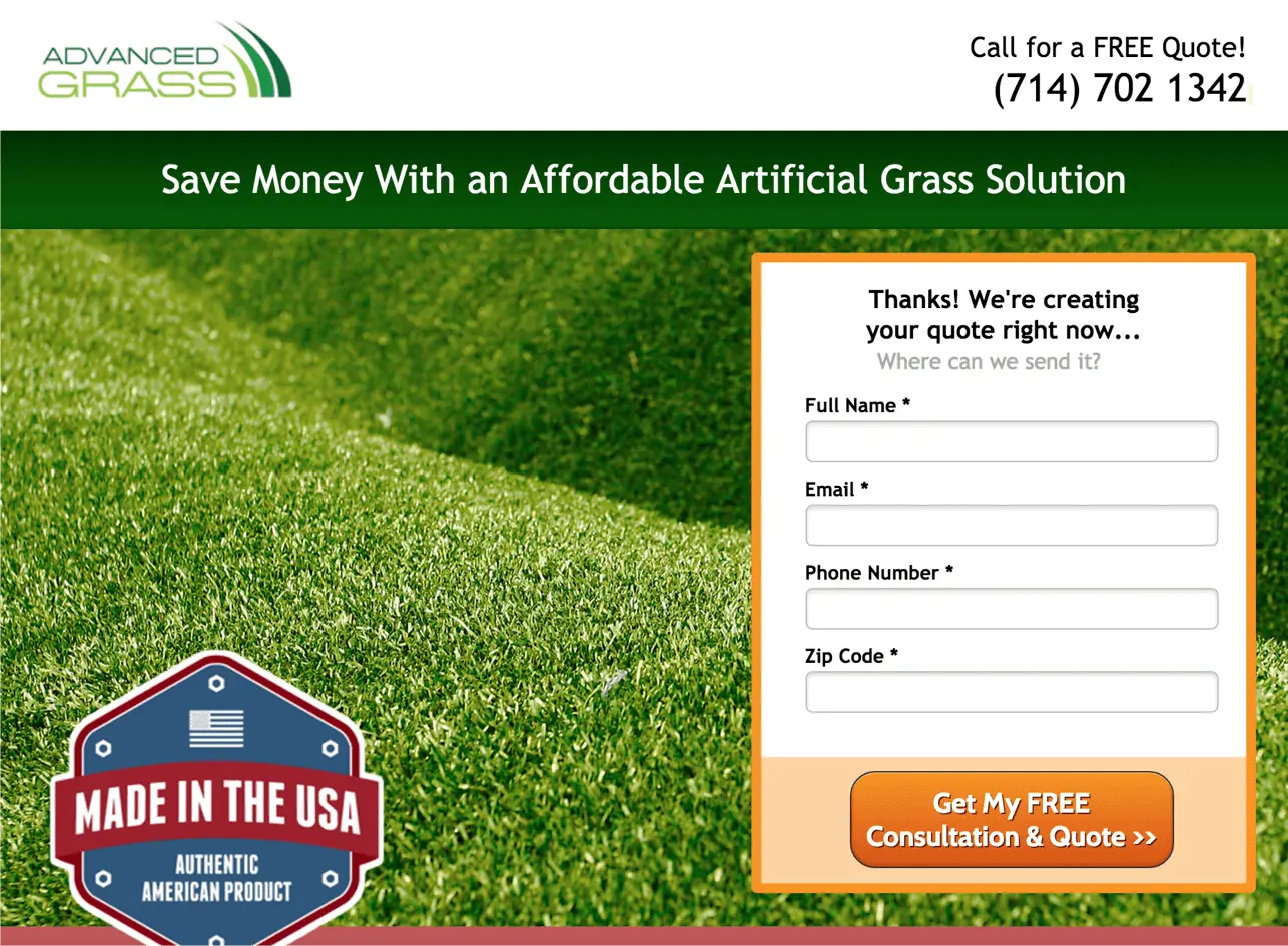
The result?
A 214% increase in conversion rate compared to having all those fields on a single step landing page form.
Once the visitor answers those questions, the last step of filling out the more sensitive fields like name, email, phone number become much easier. “Once we’ve made a choice, we will encounter personal and interpersonal pressures to behave consistently with that commitment.” Dr. Robert Cialdini, wrote in “Influence – The Psychology of Persuasion” :
Consider the opposite of what happens when you don’t add more fields or more steps to your landing page process:
Visitors see that you require their contact information to begin with, and that will immediately trigger the dreaded “sales call fear” so many of them have.
So when you want to increase your conversions rates and get more info to from your leads to score them, consider adding step one questions that get your visitors closer to the answer they’re looking for.
Sometimes, those questions are what your sales reps would ask anyways.
So What’s Next?
One of the biggest hurdles in landing page testing is finding ideas to test. But today you have some new landing page ideas: tests that debunk “landing page best practices.”
You now have three quick tests to optimize your landing page conversion rates without hardly any effort at all.
Let me know what other landing page best practices you’ve debunked and share your test results in the comments.
