When Redesigning a Product Feature, Identify the Need, Then Iterate—A Lot
Earlier this year, we released a major addition to Optimizely’s preview tool: the ability to impersonate visitors.

Before this release, there was no way to preview Optimizely experiments that are targeted to audiences of which you are not a member. For example, if you were in the US and your experiment was targeted to visitors from Japan, then you couldn’t see the experiment. This posed a problem when testing and debugging experiments.
In this post, I will describe our design process and the decisions we made along the way when building this feature to shed some light on how product features are ideated, developed, and released at Optimizely.

Optimizely’s newly redesigned preview tool, used on Wikipedia.com as an example.
Start with the Problem
All new features at Optimizely start by identifying the problem. In the case of impersonation, customers had told us they have a hard time managing their targeted experiments. Specifically, when they have a lot of experiments targeted to various audiences, it’s hard to know what content each audience member is seeing.
A seedling of an idea
With a clear problem in mind, the feature team brainstormed solutions. This process included engineers, product managers, and designers, all of whom were sketching and contributing ideas. We came up with numerous ideas, but the one everyone agreed on was augmenting the preview tool with the ability to impersonate different users (see the sketch below). This feature is a natural fit, since preview is meant to be used for experiment QA and is a place to see all of your experiments running at once.

The first sketch outlining the new impersonate functionality.
Better sketches
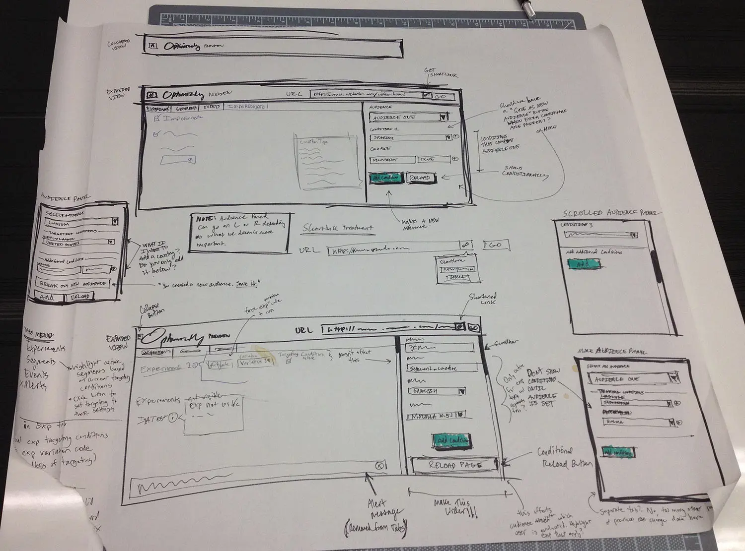
With a basic idea of how this would work, it became my job to fully design the feature. I started by sketching different ways the feature could work. My goal here was to figure out where this new UI would go, and how people would interact with it. It wasn’t meant to think through every corner of the tool — that would come later.

More refined sketches of the new preview tool.
Interactive mockups
With sketches that gave me a path to go down, I moved into high fidelity interactive mockups. At this stage it was important for me to get my ideas into a form that I could actually interact with. It’s one thing to look at a static sketch, but it’s completely different to actually click through and interact with it. I could have sketched more, but I couldn’t be sure of my design decisions until I could use them. My goal with the interactive mockup was to decide the major user interactions that shape how the product works. This would essentially act as a skeleton, to which I’d later add the “skin” of visual design. To achieve this, I coded a static HTML page that looked and acted like the final product, but didn’t actually work. I decided to build an HTML prototype because:
- It’s quick and easy to make changes (for me).
- It runs in the browser, the medium through which actual users will interact with it.
- It can be used for user testing.
- Large portions of the HTML, CSS, and JS can be re-used in the final version.
I proceeded in a very iterative fashion on the interactive mockup. I would identify the worst part of the UI, work on it until it was no longer the worst part of the UI, then move on to a new worst part. Eventually, the original worst part would be the worst again, and I would improve it more. Working in this manner, nothing is ever “done”, and I’m continuously in the mindset of asking, “what can be better?”

This early screenshot shows how prominent the new impersonation feature was.
With such a continuous approach, I can sit with a portion of the UI in an imperfect state while I focus attention elsewhere. I’ve noticed that by jumping around and not spending too much time on one spot, problems naturally surface; some detail I was sweating earlier becomes a distant memory. At this point, I asked our user researcher to do some quick user testing on the interactive mockup to get feedback. This was immensely helpful. Since it’s easy to lose objectivity when designing, it’s great to have a fresh perspective on what I’m building. This helped confirm some assumptions and design decisions, and exposed areas that needed more work.
Ship it!
Once I had ironed out the major issues identified during user testing, I converted my mockup into production code and integrated it with the engineering work to make the feature actually function. Throughout this period, I continued iterating on the UI until it felt done and polished enough for end users.
Post-Launch Iteration
After launching the impersonate functionality, we collected user feedback with Usabilla. We received a range of feedback, with most of the negative feedback focused on the close button (or lack thereof). Originally, I made the assumption that people didn’t need both a collapse and a close button, so I only built collapse. But after it was released, many people wanted to completely dismiss the preview tool. After weighing their feedback, I decided to add it back.
Just a Glimpse
What I described here only just begins to explain the path impersonation took from ideation to completion. A lot of thought was put into every aspect of the UI. Design is often seen as a black box, so I hope this post gave you some insight into the work that goes into designing new features.
