B2B Case Study: A Radical Lead Generation Form Redesign
Dale Carnegie is one of the world’s premiere training companies, offering personal development courses for business, career and life.

Corte Swearingen

When they asked Americaneagle.com for help last year in improving their lead generation and increasing B2B ecommerce sales, we had the perfect solution – a split testing program focused on their main lead gen pages. We used split testing in order to scientifically validate our various test hypothesis in a more controlled way, as opposed to just trying out ideas without testing and hoping for the best (which is usually not a very good alternative).
For Dale Carnegie, a quality lead can transform into a profitable training engagement which is why the Dale Carnegie website contains more than 50 lead gen forms. Prospects fill out their contact info and are able to instantly download a PDF on the topic of interest. A Dale Carnegie sales rep will then make a follow-up call to further engage the prospect and turn them into a customer.
After getting them plugged into the Optimizely optimization platform, we focused immediately on the lead gen forms with the highest value and page views.
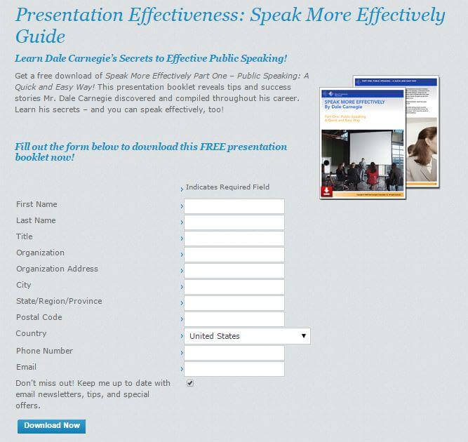
Here is one of the original forms we started with:

One of the original forms we started with.
Because the form had a number of issues and Dale Carnegie wanted fast results, we decided not to go the traditional route of running a long series of iterative A/B tests where we change just one element at a time and measure affect on form submissions. This would have taken several months. Instead, we opted for a radical redesign of the page that delivered results in 2 weeks. The only restriction we had in testing the form was the number of form fields: we could not eliminate any since every piece of information was important to pass along to the Dale Carnegie sales person.
Testing the Form
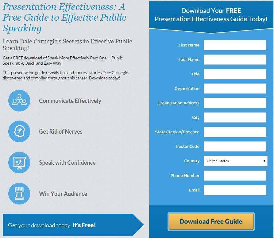
Here is a summary of the changes we made:
- Moving to a 2-column design
- Changing the download button text from “Submit” to “Download Free Guide”
- Placing the Download button directly under the form
- Using bulleted benefit statements
- Reinforcing that the download was free with an arrow pointing to the download button
Here’s how our test variation came out.

Our winning test variation.
Test Results

Our test finished in 14 days and our test variation saw a 17.1% increase in downloads. Over a span of 12 months, this single test is projected to bring in over 1,000 new leads for Dale Carnegie.
But just because a design works on one form doesn’t mean it will work on all forms. Before making the recommendation to switch to this new design across all Dale Carnegie’s form pages, we ran this very same test on several other forms to be sure we would get repeatable results.
Here’s a summary of the form page tests and their results:
| Lead Gen Form Name | Goal | Test Variation Results |
| Secrets of Success | # of Completed Downloads | 12.4% increase |
| Engaging Employees | # of Completed Downloads | 15.1% Increase |
| Conflict Resolution | # of Completed Downloads | 35.5% increase |
| Change Management | # of Completed Downloads | 18.6% increase |
Seeing positive results with these four additional form page tests, Dale Carnegie converted the rest of the pages on their site to this winning design.
Why We Chose the Radical Redesign Methodology
The more traditional way to improve form pages is to change one element at a time and launch multiple test iterations so that we can better understand how each individual change affects conversions. In the case of Dale Carnegie, we decided a radical redesign would provide the results they wanted in a much shorter period of time because the form had multiple issues that we wanted to change.
This initial test only took 2 weeks to complete. Had we taken a more traditional approach and tested 5 different elements one at a time, it could have taken 2-3 months to get similar results. A radical redesign test isn’t always the best option since you lose the ability to understand how each individual change influenced the final result, but we felt it was the right approach for Dale Carnegie. The page can now be tested in a more iterative approach, testing one element at a time, in order to squeeze out additional improvements.
