9 Ways A/B Testing Can Make Gap Inc. Millions
It’s the time of year where companies highlight the major initiatives that will help them grow their market share and increase revenue. (Read our list of big bets for online retailers.) With all the talk of big ideas and trends, it can be hard to know where to actually start.
Which is why I am writing today with some ideas for how online retailers big and small can increase conversion rates—and revenue.
We’ll start this conversation at the same place that many of our e-commerce customers first start testing their sites, their product pages.
Why Gap should test product pages
In reaching the product page, the shopper has finally entered the dressing room of the online shopping experience. Marketing, creative and design all work hard (and spends big) to bring potential buyers here. Product pages are where shoppers visualize themselves wearing or using the item, and often where the decision to buy or not buy is made.
Running tests on product pages is lucrative for any online retailer, but especially for high traffic sites.
Take Gap for example.
Gap Inc. is a multinational retailer operating six widely known brands: Gap, Banana Republic, Old Navy, Piperlime, Athleta and Intermix. Gap Inc.’s prevalence in online retail is evidenced by their sales numbers: $589 million in online sales in Q3 2013. At such high volume, even small, incremental gains will have huge payoffs. If Gap Inc. increased online sales by 1%, they would stand to make more than $5,000,000 in additional revenue.
The following test ideas are designed to help Gap Inc. uncover such gains by testing their layout and calls to action on their Gap brand (www.gap.com) product pages.
Disclaimer: Gap.com, Gap Inc., and affiliated brands are not Optimizely customers and the tests proposed here are purely theoretical.
Test page layout
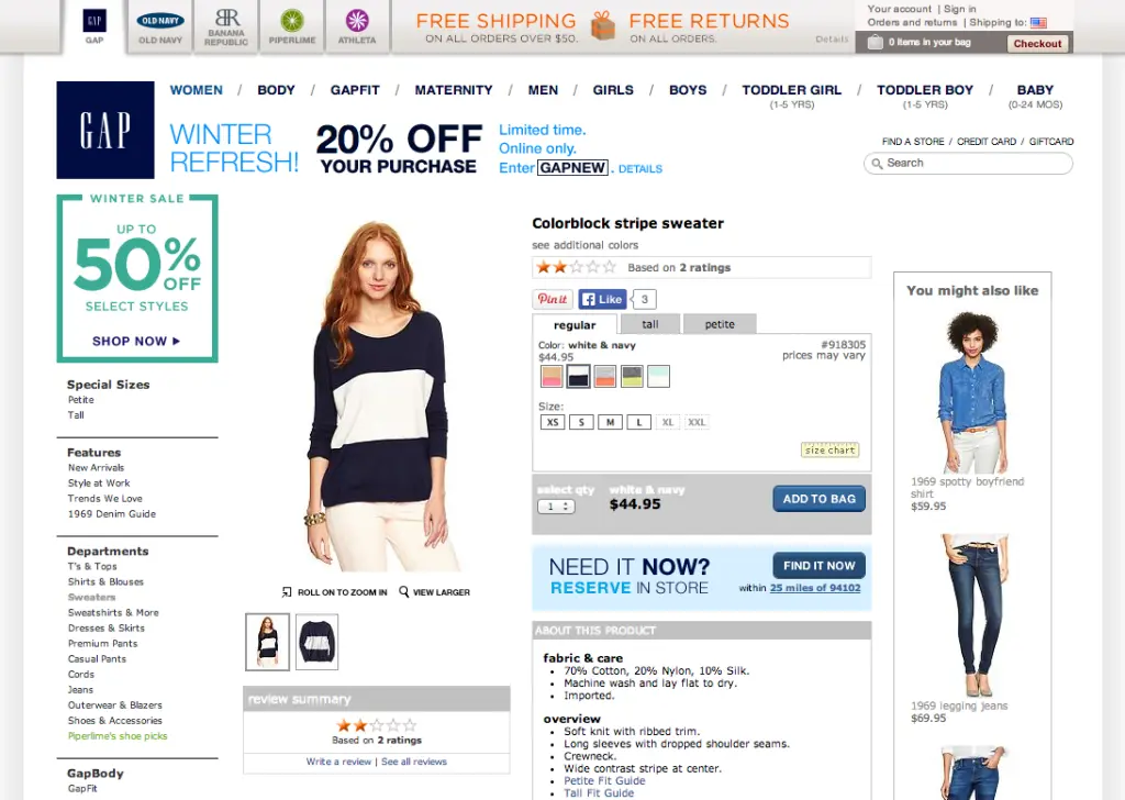
By the time shoppers lands on a product page, both the brand and the shopper themselves are invested. It took a number of clicks to get here. The brand’s goal is to sell this product by providing specific information about it. Gap has many elements in play on their product pages that may or may not be helping to sell the current product. Instead of assuming the current design is doing the best job of selling the product, Gap could test many variations of the design to see which version leads most shoppers to add the product to bag and buy.
To increase purchases, Gap could test…
-
increasing product image size. The product is the reason visitors come to this page to begin with. Is bigger better? Does the location matter?
- different forms of product imagery. Try using model vs non-model photos as the default product image. Gap could test the impact on a sampling of products to determine the impact of changing to non-model photos. Even if they find that the two perform equally, Gap could save money in not having to spend for the more expensive model shots. Gap can also consider testing product videos, 360° images or other types of imagery to determine if it would be worth the investment to make changes sitewide, or for key product categories.
-
modifying (or removing) the “You might also like” display. Right now, the module is in line with the main product information. Gap could test moving the module below the main product information. They could also experiment with the content within the module, such as the number of products, the presence of the price, or the title. Showing related items is intended to increase total sales, but showing the wrong items at the wrong time may do more harm than good. What happens if they remove the module entirely?
-
change how reviews are displayed. Everything about the reviews are subject to experimentation. Should they be present for all items, even if they have only a handful of reviews? Are there advantages of displaying reviews more than once on the page, or is a single showcased, prominent review section more impactful?
Test the call to action
Once a shopper decides she wants the product, the path to purchase should be clear. On Gap’s product page, it’s not immediately clear which the shopper should do first—Pin it? Like it? Find it in store? Read reviews of it?
To increase the number of products added to online shopping bags Gap could test…
-
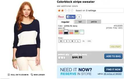
removing all distraction from Add To Bag. Product recommendations, star ratings, “Pin it”, “Like it”, buttons all exist right around the main call to action. Gap could try removing or repositioning some of these elements to call more attention to the main button they want the user to click.
-
distinguishing the main call to action. The user shouldn’t have to search for the “Add to Bag” icon. Can we make it stand out by changing size, color or copy impact conversion rates? With the large volume of visitors that Gap has, even small improvements in these types of conversions can uncover huge revenue gains.
-
making the first step clear. Before proceeding to Add To Bag, customers need first select a color and size. Would displaying these steps as numbered sections on the product page lead to more items being added to bags?
-
call to action language. Gap should not assume that “Add To Bag” is best without first testing, which is easy to execute. Would Gap get more conversions if it was changed to “Add To Cart”, “Order”, “Order Now” or “Purchase” instead?
-
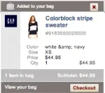
directing users from “Add To Bag” to “Checkout”. After adding an item to the bag, the bag widget on the top navigation updates with the addition and the customer can go back to browsing. Gap could experiment with ways to bring the full bag to the customers’ attention and encourage them to “pay now” or “checkout”.
Both seasoned e-commerce testing veterans and rookie testers alike have a ton to gain by testing on their product pages. Tests like those suggested above provide insight into the customers mental “try on” experience and decision making process, as well as how design and marketing changes can impact customers.
While nobody can predict user behavior with 100% accuracy, testing will generate data to take the guesswork out of deciding what changes should be made to maximize conversions and conversion value. Done right, testing creates more happy customers, as well as happier, richer, retailers.
So what is keeping you from split testing to uncover new revenue in 2014?
