How to set up an experiment in less than 60 seconds
No matter where you are on your experimentation journey, performing A/B and multivariate tests shouldn’t be complicated. So, we made a short video on how to set up an experiment in our platform and listed some experiment examples for you to consider.

Audreyanna Olson

Like many of our customers, you want to maximize ROI and continuously manage digital experiences that are impactful, right? So do we, and that’s why experimentation is embedded in everything we do. The next stop in our How we Optimize series is focused on how we run experiements.
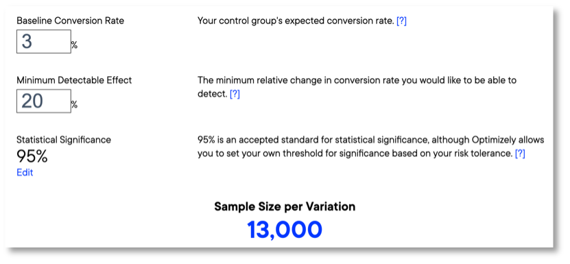
Setting up an experiment can be simple. The more tests you run, the more you can learn. However, it takes volume and time. Our test sample size calculator can help you determine what it will take to get your experiment to statistical significance.
9 experiment ideas & test examples
With experience optimization at the forefront of many experimentation efforts, it’s important to understand your customers, how they behave and what they are most likely to engage with. This is more than button colors and placement—you need data from tests across every digital touchpoint. Consider some areas we’ve tested ourselves.
CTAs
Call to action (CTA) words and phrases are meant to immediately engage users. Where CTAs are placed, what they say and how clickable elements are designed can significantly affect click-through rates and form submissions.
1. Homepage ‘Contact Us’ CTAs
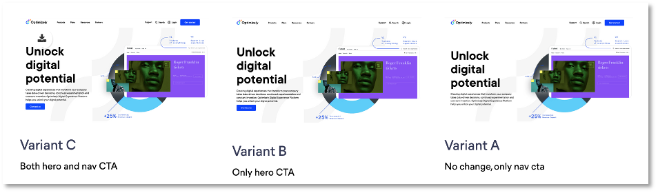
Hypothesis: By moving the main navigation CTA into the hero, we can increase the amount of people contacting us.
Metrics:
- Form submissions
- Navigation CTA clicks
- Hero CTA clicks
Results: Variant C reached statistical significance with +106% clicks on the Nav CTA. With this result we updated our homepage.
2. CTA color block design
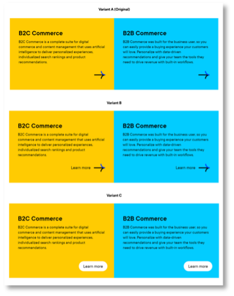
Hypothesis: Based on heat maps and page activity recordings, users don't understand that color blocks are clickable. By adding link designs, we can improve CTR for the color block.
Metric: Color block clicks
Results: Improved click-through rate for the new variants (B +11%, C +8%) at a statistical significance off 33%. With that learning we will update color block CTA designs.
Naming
Word-level changes can have a great effect on things like click-through rates and average order value. Remember not to use terms that are focused on your own internal jargon or sales focus, and instead concentrate on naming that users search for, recognize and understand.
3. Top navigation naming
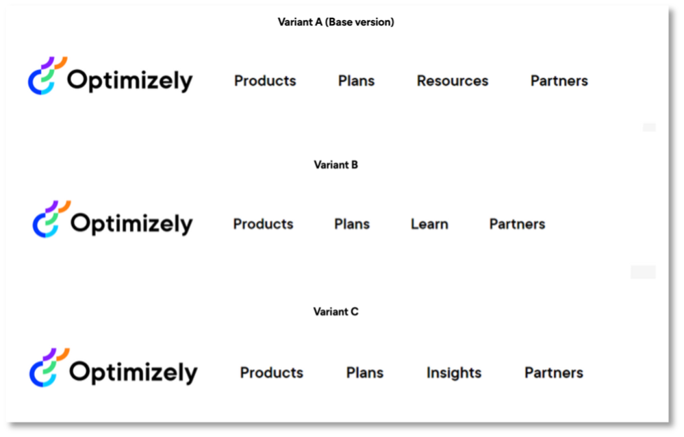
Hypothesis: We store assets under 'Resources'. We can validate what naming causes the most interaction, and hopefully increase menu real estate with a shorter name.
Metrics:
- Navigation clicks
- Page visits
Results: Variant B and C reduced navigation clicks up to 26% with >99% statistical significance. We will keep 'Resources' as label for this section.
4. 'Apps’ vs. ‘Integrations’
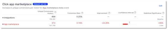
Hypothesis: App Marketplace related tasks are easier to complete with more descriptive menu items. Using ‘Integrations’ instead of ‘App Marketplace’ is more descriptive of what people would look for.
Metric: Clicks on App Marketplace/Integrations
Results: Conclusive drop of -24% at >99% statistical significance when using ‘App Marketplace’. We will replace existing mentions with ‘Integrations’ in menus and add integrations as a term when we mention apps.
5. Plans & Pricing headline
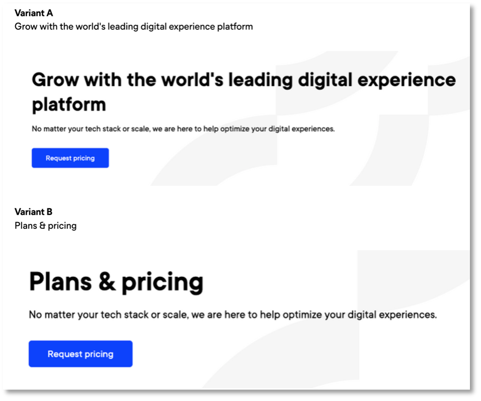
Hypothesis: We see in Hotjar (a heatmapping and user recording tool) that users are not getting what they expect from our plans page. By matching the headline text with its CTA, less people will bounce from the page.
Metrics:
- Decrease in total page visits to /plans/
- Increase in total form submissions
- Clicks on all CTAs (anchors)
Results: Variant B shows +5% clicks on all CTAs with 95% statistical significance. We see that visitors are more likely to interact with content when the heading matches their expectations.
Layout & Design
Whether you are optimizing landing pages or designing your latest app layout, users not only want to be immediately engaged—they want to find what they are looking for, easily. Consider ways to present messaging and visual elements that make people interact with the parts of your site that convert most.
6. Add images to forms
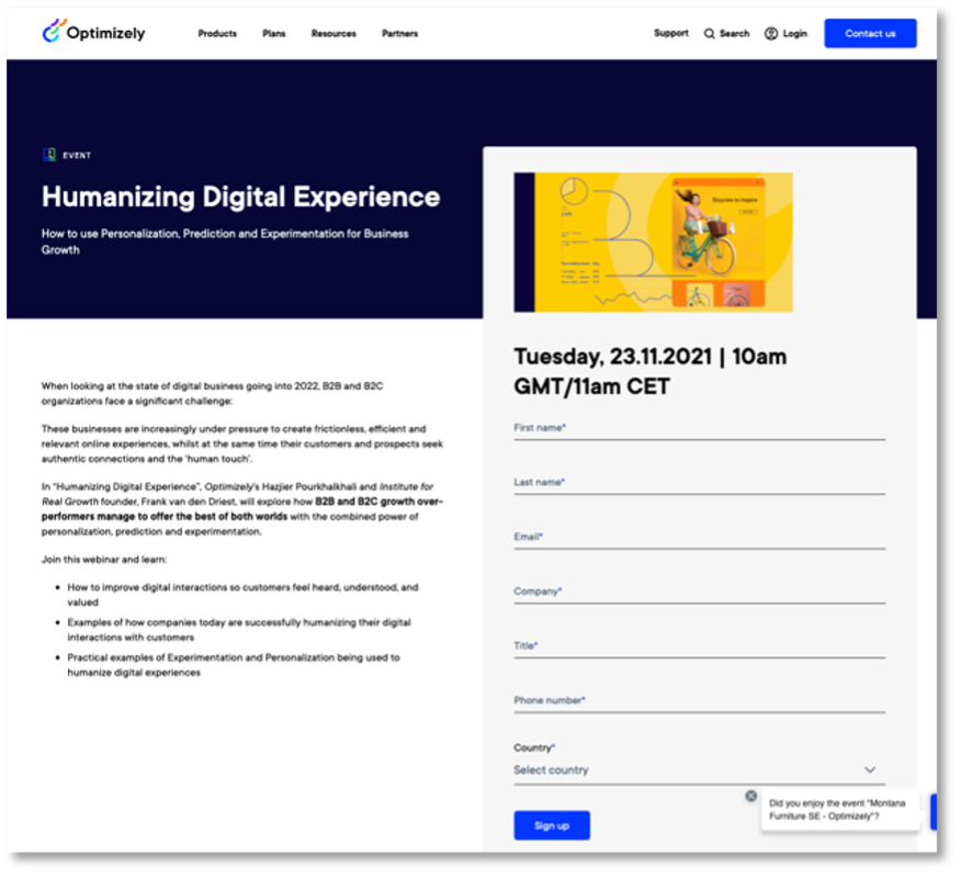
Hypothesis: Goal By adding a preview image before the form we think we can increase conversion rates and make our content appear more valuable.
Metrics:
- Total form submissions
- Total value of form submissions
Results: Increased form submissions (thank-you page visits +47%, actual submissions + 73%) with >99% statistical significance.
7. Contact form Drift effectiveness
Hypothesis: By adding or removing our Drift chatbot from the Contact page, the total amount of leads captured should change.
Metrics:
- Form submits
- Drift meetings
Results: Removing Drift increased form submits by 12% with 52% statistical significance.
8. Login landing page
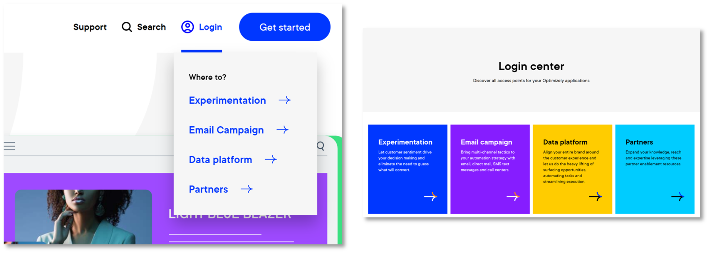
Hypothesis: We want to see how we can impact the experience for users that use the website to login to their Optimizely solution. Replacing the login drop down in our navigation bar with a login landing page will impact sign-in rates.
Metrics: Sign-in clicks
Results: Sign-ins for landing pages reduced by 16% with >99% statistical significance.
9. Product page engagement
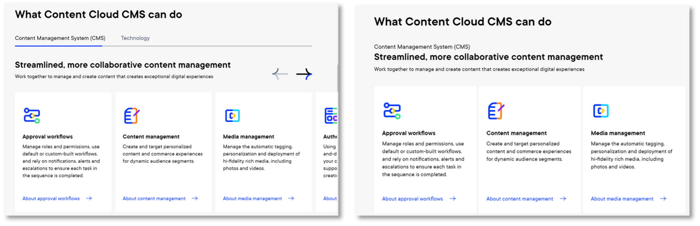
Hypothesis: We show capabilities on product pages as a slider, which leads to not showing all content at-a-glance. By changing the layout of capabilities from tabs to listing we can increase engagement on product pages.
Metric: Capability click
Results: The new list design shows an increased CTR of 10.52% at 28% statistical significance.