The 1-2-3 guide to upping your conversion rate
Learn how to improve your web page conversion rate in three easy steps—use A/B testing, eliminate distractions, and provide a compelling call to action.

Are you satisfied with your website’s conversion rate? Probably not; no business ever is. Fortunately, improving your conversion rate is as easy as 1-2-3. Are you ready to get started?
Key takeaways
- Conversion rate measures the number of conversions on a web page vs. the number of visitors
- To improve your conversion rate, start by employing an A/B test
- Eliminating all distractions on a web page also improves the conversion rate
- Another essential way to improve the conversion rate is to provide a compelling call to action
What is conversion rate?
The Optimizely Glossary defines conversion rate as the number of conversions divided by the total number of visitors. The formula looks like this:
Conversion rate = Number of conversions / Number of visitors
So, for example, if your website receives 500 visitors in a given time frame and makes 50 conversions, the conversion rate is 50 divided by 500, or 10%
How a company defines conversion depends on what action it wants users to take. Depending on the company’s goals, a conversion could be:
- Asking for more information
- Leaving contact information
- Signing up for a newsletter or email updates
- Making a purchase
Conversions need to be quantifiable and measurable. Simply visiting or reading a web page is not a conversion. Making a purchase or signing up for a newsletter is.
What’s a good conversion rate? In 2021, Namogoo gathered data from 2 billion website sessions from the leading e-commerce retailers and calculated an average conversion rate of 2.9%. Conversion rates in different industries may be higher or lower than this.
Tracking conversion rates is a crucial way to discover the performance of your web pages, apps and marketing vehicles. Knowing what percentage of users are clicking through and not just passing by helps you determine what’s working and what’s not. Optimizing your website content can improve conversion rates and deliver a higher ROI on your marketing investment.
How to increase conversion rate in 3 easy steps
What can you do to improve your conversion rate? While there are many things you can do, here are three major action items that can significantly increase the number of conversions generated by your website.
1. Employ A/B testing
When constructing your offer and call to action, it’s always good to have a few different options from which to choose. Perhaps you want to test how a 20%-off offer pulls versus a 25%-off offer. Maybe you’re testing colors for your buy or subscribe buttons. Perhaps you want to evaluate different wording or different products. You can do all of this by employing A/B testing.
You use A/B testing to identify those elements that have the most significant impact on your conversion rate. With A/B testing, you create two versions of a web page or other marketing vehicle and release both to a subset of your total audience. Essentially, you’re setting up a head-to-head competition between two options. The version that pulls the best is the one you should use.
You can use A/B testing on all the different elements on a web page. Just make sure you A/B test just one element at a time. If one of your versions has an orange button with a $5-off price and the other a green button with a $10-off price, you’re not going to know which element made the difference, the color or the discount. Take your time and test multiple elements sequentially to determine which combination of elements has the highest conversion rate.
2. Eliminate on-page distractions
You want to present a clear and concise offer to users. Clutter your page with too many extraneous elements, and you muddy the message.
When a web page contains too much stuff—too many products, too much copy, too many images, multiple offers—customers get confused. Don’t distract the customer. You’ll increase your conversion rate by presenting a clear path to whatever you want the customer to do—so remove every element that doesn’t lead to the button or link they need to click.
What sorts of elements should you avoid? Here are just a few elements that might seem important but are really distractions:
- Links to other products
- Links to social media
- Links to other websites
For example, it might seem important to direct customers to your latest social media posts. In reality, that’s a huge distraction that drives users to a different web page, away from the offer you want them to engage.
3. Provide a compelling call to action
Finally, one of the most effective ways to improve conversion rates is to create a compelling call to action or CTA. There are lots of ways to improve your CTA, and here are a few:
- Keep it simple. A complicated offer confuses customers and causes them not to click. Make your offers and CTAs clear, concise and easy for customers to understand.
- Use action words. The fewer words you can use, the better—and it’s even better if you use action words. If you want customers to subscribe to something, say “subscribe now.” If you want them to buy something, say, “buy today.” Don’t beat around the bush.
- Create a sense of urgency. You want customers to act today, not tomorrow or next week. Use your copy and offer to create a sense of urgency so that customers feel they need to act immediately to get the best deal.
- CTA buttons perform better than links. A CTA directs customers to do something. On a web page, that something typically involves clicking a link to purchase an item, download more information, or go to another page on your website. Research shows that driving users to click a button produces better results than asking them to click a link. Surround the button with details of your CTA if necessary, but give them a big shiny button to click when they’re ready to act.
- Make the CTA stand out from the background. Make it easy for customers to find your CTA. As noted, in-your-face buttons are better than easy-to-ignore links within a text block. Make your button stand out by creating a high contrast between the button color and the page background. Even better, leave lots of negative space around the button.

- Words matter. Wording on a CTA button also affects conversion rates. Research indicates that using “Submit” on a CTA button can actually reduce conversion rates by 3%. Using “Click here” and “Go” perform substantially better.
- One CTA per page, please. To the previous point about keeping things simple, don’t confuse customers with multiple CTAs on the same page. Limit it to just one offer per page, or some users won’t know what to click.
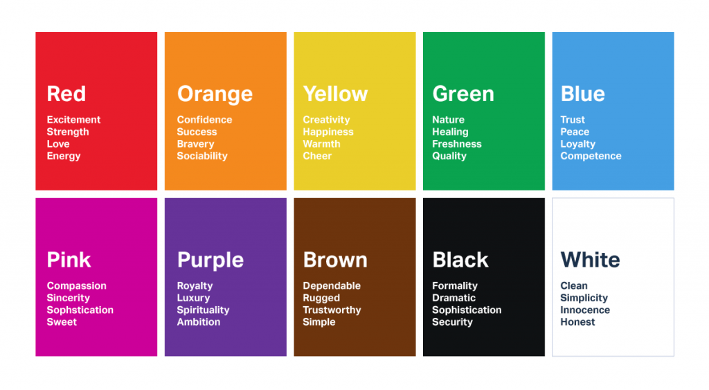
- Color matters. While it might be tempting to stick to your brand’s official color scheme, using a different color for the CTA button might result in more conversions. There’s a detailed psychology of color to consider. Hotter colors like red, orange and yellow tend to produce better results.
Let Optimizely help you optimize your conversion rate
When you want to boost your conversion rate, turn to the optimization experts at Optimizely, the leading platform for A/B testing and conversion rate optimization. Our visual editor lets you easily change a web page without coding. Launch an A/B test with the click of a button, and Optimizely automatically displays different options to different sets of visitors.
Once an A/B test is underway, our sophisticated statistics engine analyzes the results and tells you when the test has reached statistical significance and what option performed the best. You can then make the changes you need to increase your conversion rate—and your profits.
Contact Optimizely today to learn more about optimizing your conversion rate with A/B testing.