Users click, scroll, abandon, convert. Data flows into your UX analytics dashboard.
It may even show "users are dropping off at checkout" but when you ship the "obvious" fix, conversion rates barely budge. Or worse, they tank completely.
You see, without analytics coupled with experimentation in the same warehouse, you miss out on the key insights that push your business forward.
And by the time you understand what happened, you're already building solutions for problems you don't fully understand.
The gap between knowing and improving
UX analytics is the practice of collecting and analyzing user data to understand how people interact with your product. Traditionally, they tell you what happened.
For example:
- Users abandoned your signup flow.
- Feature adoption is declining.
- Support tickets are increasing.
But knowing what happened and knowing what to do about it are two entirely different challenges. You may have user data. But do you have user understanding?
Because user behavior is a complex system, not a simple cause-and-effect chain.
Your users aren't responding to individual elements in isolation. They're responding to the entire ecosystem of interactions, contexts, and mental models they bring to your product. When analytics shows a drop-off at step 3, the real issue might be in step 1's messaging, the user's expectations set by your marketing, or their mental model of what your product should do.
This is why isolated A/B tests often fail to move the needle significantly. You're optimizing individual components within a system you don't fully understand.
So, the real issue isn't the process; it's the assumption that analytics and experimentation are separate activities. Teams that keep data separate see promising UX insights turn into frustration for users, instead of meaningful product improvements.
When analytics meets experimentation: A different story
Most teams treat analytics as diagnostic ("what's broken?") and experimentation as prescriptive ("how do we fix it?").
What if instead of guessing at solutions, you could test your way to insights?
- Analytics identifies the problem → "Our onboarding completion rate dropped 15%"
- Deeper analytics reveal context → "Drop-off happens specifically on mobile, during step 3"
- Experimentation tests hypotheses → Test A: Remove step 3 entirely. Test B: Split step 3 into two parts. Test C: Add progress indicators
- Results provide insights → Test B wins, but only for users coming from social media
- Follow-up experiments → Test different approaches for organic vs. paid traffic
If you're only optimizing for local maxima, you might make the current experience slightly better. So, create a feedback loop where analytics informs experimentation, and experimentation deepens your analytics insights.
Here's how you can get trustworthy insights to optimize every digital experience and prove your impact.
The three-part system that makes UX analytics sharper
Three parts:
Part 1: Analytics that ask better questions
Effective UX analytics requires both quantitative and qualitative data.
Quantitative analytics focus on measurable behavioral data that can be tracked over time, allowing you to monitor adoption trends, identify friction through drop-offs, and quantify impact.
- Activation rate: Percentage of new signups completing defined onboarding actions. Low rates indicate barriers blocking initial "aha" moments.
- Engagement scores: Product interactions measured through active days, sessions, actions taken, and monthly active users. Steep declines signal users struggling to build lasting habits.
- Conversion funnels: Completion rates across user journey stages toward key goals. Pinpoint exactly where UX obstacles cause abandonment.
- Feature adoption: Usage tracking of product modules to identify underutilized or unintuitive features and improve stickiness.
- Page analytics: Traffic sources, bounce rates, heatmaps, and click patterns exposing UX flaws on specific pages.
- Performance monitoring: Load times, crashes, and frontend issues directly impact perceived UX quality and adoption rates.
Qualitative data reveals user motivations, blockers, and the "why" behind quantitative metrics.
-
Direct user feedback: Surveys, reviews, and social listening provide unfiltered insights into user delight or frustration.
-
Session recordings: Visualize every click, tap, hesitation, and scroll indicating confusion with UX flows.
-
User context: Understanding motivations and pain points through techniques that reveal deeper insights into user needs.
However, most analytics implementations are fundamentally flawed. You track what users click. You don't know why they clicked.
You might be collecting mountains of data about user actions, but almost nothing about user intent. You know someone clicked a button, but you don't know why they clicked it, what they expected to happen, or whether the outcome matched their mental model.
The technical reality makes this even more challenging.
Your experimentation platform becomes little more than a traffic splitter, while your analytics tool operates in isolation. When you're trying to understand the nuanced impact of UX changes, this separation means you're essentially flying blind.
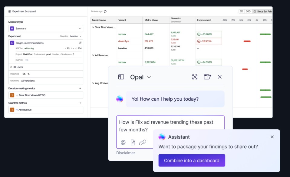
You can see that Variation B won, but you can't easily connect that win to the deeper behavioral patterns that explain why it won. Did it improve user confidence? Reduce cognitive load? Change how users navigate through your product? These insights get lost in the gap between tools.
Part 2: Go from proving you're right to proving you're wrong, faster.
The most valuable experiments are often the ones that shatter your assumptions about user behavior.
When your "obvious" solution fails spectacularly, you've just learned something that your competitors probably don't know.
- Don't just test button colors. Test whether users want that feature in the first place.
- Every experiment should answer a question about user behavior, even if the test "fails."
- Sometimes the most valuable insight comes from understanding why something didn't work.
Part 3: The feedback loop
Each experiment generates new analytics data about a user experience that happened in a given instance. Each analytics insight suggests new experiments to run.
One insight leads to another. One experiment opens up three more questions worth testing.
After running dozens of experiments, you start to see patterns that no single test could reveal. You discover that your users consistently prefer transparency over simplicity, or that cognitive load matters more than visual design, or that social proof works differently for different user segments.