How USA Today Can Increase Pageviews on Free Content with A/B Testing
For media sites like USA Today that don’t require a paying subscription, the challenge is to find ways to make it as easy and compelling as possible to spend more time on the site because engagement (e.g. pageviews) is the key to driving higher revenue. Increased site engagement is the key to driving higher revenue through ad impressions.
There are a few key places publishers with free content, such as usatoday.com, can test to increase pageviews. Let’s dive in.

Ryan Lillis
In part two of our series on website optimization for media companies, we looked at places the Wall Street Journal could test to optimize for subscriptions given that much of its content can only be accessed by paying subscribers.
Here we’ll use USA Today as an example of a free content site. As we noted in our first post, the average reader in the US spends about 2-4 minutes a day reading news online. For media sites like USA Today that don’t require a paying subscription, the challenge is to find ways to make it as easy and compelling as possible to spend more time on the site because engagement (e.g. pageviews) is the key to driving higher revenue. Increased site engagement is the key to driving higher revenue through ad impressions.
Here in part three we will focus on optimizing for discoverability, clickability, and viewing of content on USA Today. There are a few key places publishers with free content, such as usatoday.com, can test to increase pageviews: global elements, homepage content, and article pages.
Disclaimer: USA Today is not a customer of Optimizely and all of these test ideas are hypothetical.
Global Elements
Top navigation links, search bars, and left/right rail content are all examples of global elements—items that appear on nearly every page of a website. Global elements are essential to test because a visitor could enter the site on any page. If the top navigation creates confusion, frustration or deters clicks then the site is missing out on a huge opportunity.
To increase pageviews, USA Today could test the site navigation.
If I click on Sports, I come to the category page, almost a microsite in itself. There is significant empty space between the main main site navigation above and the Sports section’s sub categories. As a reader, I found myself briefly confused as I looked to navigate outside of Sports. Would removing the empty space reduce this confusion and create more engagement?
Original
Possible Alternate
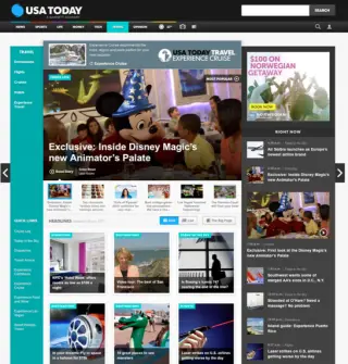
To increase pageviews, USA Today could also test the slideshow navigation. How many times have you been on a site, started reading the headline on one of the slideshow images only to have it disappear before you have the chance to finish or click? It happens all the time. The worst is when you can’t figure out how to get back to that content.
USA Today’s site tries to solve this problem with image thumbnails directly below the image. However with so many images on the page (including repetition of some but not all slideshow content in the right sidebar) and lots of moving elements I still found myself searching for the disappearing hero article.
Original Travel Page
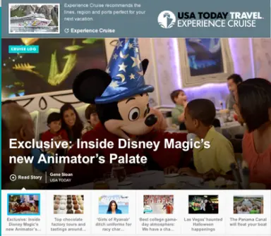
Original – Close up of slideshow section
To increase engagement with the slideshow content, USA Today could test the display of selected stories. They could try making the thumbnail image on each story bigger or more distinctly identifying which story is selected with background color. The selected thumbnails arrow is another testable element. What makes this test great is that it’s easy to setup and could inform a potentially more complex redesign effort down the line.
Possible Alternate
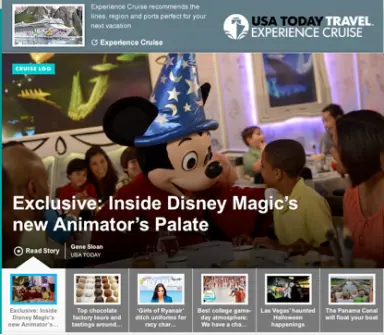
Another test could be on the timing of slideshow. Would more readers click the content with a 3-, 5- or 7- second pause?
Homepage Content
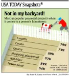
Much of the traffic will inevitably enter the site on the homepage. Creating a compelling first impression there is important. When I think of the print version of USA Today, I immediately think of the “USA Today Snapshots” that always appear in the lower left corner of the front page. It usually looks like this:
Surprisingly however, this content is not on the homepage, yet it is such a recognizable section in the print copy. To increase online readership—especially of avid print readers—USA Today could try publishing Snapshots online somehwere on the homepage in addition to showing it on the print copy of the paper and measuring its impact on readership. If return visits increase, it might be a sign that this content is a huge pull for readers.
Other elements to drive return visitors could be offering usatoday.com bookmarklet to add to the broswer or launching a provocative interative poll during someone’s site visit. Adding this content and the interactive element as well may drive an increase in return visits – exactly what the site is looking for.
Article Pages
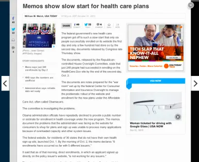
To increase pageviews, publishers want every article page to engage the reader and be a jumping point to more content. It’s important to give readers a way to navigate to alternate content but it’s also important that their reading experiences aren’t too distracting. USA Today uses a clean lightboxing effect to allow the reader to focus his attention on the content at hand.
This layout raises a number of testable questions like,
-
What’s the ideal number of alternate content pieces to show in the right rail?
-
Should the size of right rail images differ from standard ad sizes to make it more clear they’re not ads?
-
How prominent should the “USA Now” title be?
-
Should the arrows on the left and right that allow readers to go to another article have a hover state that displays the headline or another image?
-
What’s the impact of displaying links and images to alternate content in line with the current article?
Besides the content itself, the layout of that content can have a significant effect on engagement.
To increase engagement, USA Today could test…
-
font size. Do hard news articles do better with smaller fonts while lifestyle or entertainment pieces do better with larger fonts?
-
images. Does including more images in articles increase engagement? Even if more images is expensive, if it has a significantly positive effect on engagement it’s worth testing. Is it better to have a paragraph of text before the first image? What size should the image be?
-
highlights. The left side of many articles includes key takeaways. Should the highlights headline or text be larger?
-
text layout. What should the width of the article be? Should the width vary based on the reader’s monitor size or is a standard narrow width good for all?
Consider this: Newspapers and magazines have literally had hundreds of years to perfect their layout. Their mediums were static – producing one version every day, week or month. Their industries saw only a handful of technological advancements over many decades. The audience was often homogenized in its geography, demographics and consumption habits.
Now consider the digital medium: At less than two decades old it’s in its infancy. The medium is fluid and dynamic with new content going live every minute. The software and hardware used to consume digital content changes almost just as often— mobile apps and new touch screen devices are constantly added to the market. The audience is often geographically and demographically diverse and content is consumed at all hours of the day and night.
The game has changed. It’s not known if the paywall model demonstrated by the Wall Street Journal or a free, ad-supported model like USA Today will prevail (or if it will be a combination of the two like the New York Times) or if there’s a space for all three models or something as of yet unknown. What is known however, is that as physical media rapidly becomes a thing of the past and digital media increasingly dominates, the companies that survive will be willing to experiment, make decisions based on their data, and innovate rapidly to keep pace with the ever-evolving world in which they operate.


