A/B Testing for Validation, Not Conversions
As a strategic optimization consultant, it’s my job to help companies generate A/B test ideas that will either increase conversion rates or help answer questions. Sometimes, when I offer a test idea, I hear this reply: “We can’t test that because it would require too much work on our backend,” or “We would never design our page like this variation so we won’t test it.” My response: still test it.

Ryan Lillis
As a strategic optimization consultant, it’s my job to help companies generate A/B test ideas that will either increase conversion rates or help answer questions. Sometimes, when I offer a test idea, I hear this reply: “We can’t test that because it would require too much work on our backend,” or “We would never design our page like this variation so we won’t test it.”
Is this response simply representative of the inherent limits of website testing, or are we missing something? After all, testing can’t immediately simplify your backend systems, so what’s the point of testing a variation if you weren’t actually planning to make that change on your live site?
The point is conceptually validating your ideas. In AB testing, conceptual validation means that you can test your hypotheses quickly and easily without doing all the work you would actually do if you were implementing your variation permanently. In other words, you simulate new functionality that you are not 100% sure you would make permanent on the site and test it to gauge impact before building it to save time and engineering resources.
Testing for validation is like movie magic. To convey the feeling of a fleet planes flying overhead a director hires two planes to fly back and forth and adds a soundtrack overlay which sounds like the thunderous roar of a fleet. The audience in the theater won’t know the difference and the director wins because two planes are cheaper than an entire air force.
A/B testing is like movie magic for your website; you can simulate experiences without the high cost, and gather the insight you need to make an informed decision about whether or not building the real experience is worth it.
Conceptual Validation in Action
Let’s look at a few examples from e-commerce and financial services to highlight this idea.
The first example is a real test from uSell, an online marketplace where—before an A/B test—people could sell used electronics. After an A/B test, uSell became a marketplace for selling electronics and a broad array of other items. Here’s how.
The uSell product team had a broad question it wanted to answer, how would additional product categories affect selling of used electronics? Would adding textbooks, video games, clothing categories increase, decrease or have no change on electronics category? To see what would happen, they used Optimizely to create B, a simulation of what the site might look like with rows of additional categories and tested it against the original site, A.
In order for B to be a viable change to the business, it could not decrease conversions on electronics by more than 5%.
A

The original version with electronics only.
B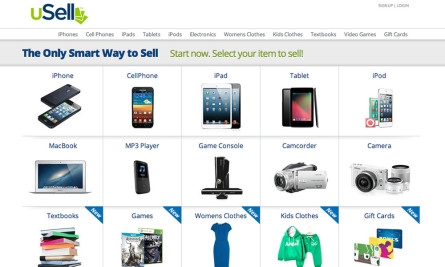

After running the test twice, they found that adding additional verticals to the site had somewhere between a break even and -3% impact on conversions on the electronic business. They had their answer! Adding more product categories did not hurt electronic sales significantly, so they could safely expand their business. The results of this test don’t mean that this specific design is the most optimal. These results are validation, a green light that the concept of a broader product variety is viable. Read the full case study on our blog.
Conceptual validation can be used in many ways. Here are two hypothetical examples of how to conceptually validate ideas through testing. I chose these two sites, Gap.com and Etrade.com randomly—I haven’t worked with these sites and the examples are purely hypothetical.
E-commerce
Example Site: Gap (gap.com), Product Page (or any page)
Hypothesis: Showing logos and links to related Gap companies on the header of every page distracts users from completing their purchase on gap.com. Removing these logos will increase purchase conversions.
Hypothetical Problem: There’s a requirement to show these logos somewhere on every page of the site and with the current design there’s not a great alternate location for them.

Concept Validation Solution: Proceed with the test by removing the logos from the top of the page and putting them on the bottom as part of the footer. For a variety of reasons this may not be the design solution the team ultimately wants to implement. But it’s a quick and easy way to validate if the logos are a distraction and will influence future designs (which should also be tested!).
Financial Services
Example Site: E*TRADE (etrade.com), Open New Account Page
Hypothesis: Users who see a simplified version of the page that only shows account open options for account types they don’t already have will be more more likely to click-through and open a new account.
Hypothetical Problem: This page has no way of knowing what account types the user already has. Passing the account information type to this page, or setting a custom cookie would require IT involvement.
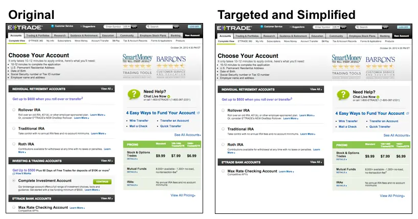
Concept Validation Solution: Create multiple variations of the page that remove one account type per variation. Then target each variation to users who have come from that account type page. For example, if a user has come to the New Account page from the Checking page, that user would be targeted to a version that doesn’t show Checking as an account type to open because he already has that account. This isn’t a long term solution because it only captures a fraction of the traffic that comes to the New Account page. But it will still apply for the users who do enter your experiment and you will be able to validate if involving IT for a more complex targeting option that captures all traffic to the page is worth your time.
About the author