25 Ways A/B Testing Can Optimize The Wall Street Journal’s Paywall
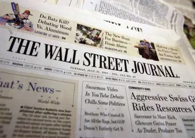
The Wall Street Journal is a well-known example of an online publisher who uses the pay-for-content approach—one of the business models publishers use today to drive revenue online. If you go to wsj.com and quickly scan the top half of the homepage, you’ll see that substantially more than half of their primary articles require a paid subscription to read (as indicated by the key symbol). Here are 25 ideas for A/B tests they can run across two pages to increase subscriptions.

Ryan Lillis

The Wall Street Journal is a well-known example of an online publisher who uses the pay-for-content approach—one of the business models publishers use today to drive revenue online. If you go to wsj.com and quickly scan the top half of the homepage, you’ll see that substantially more than half of the articles require a paid subscription to read (as indicated by the key symbol).
The paywall presents two challenges for marketers trying to generate pageviews on this content. One, how can the WSJ get more readers to sign up and pay for a subscription? Two, how can they keep unsubscribed readers engaged with the content that is available for free?
In our first post in this series about A/B testing on publisher websites, we said that no two paywalls are created equal—there are many decisions to make when designing one. In this post, I’ll share ideas for tests that The Wall Street Journal—or any other publisher with a paywall—can run to find ways to maximize revenue.
A/B testing is an essential tool to discover what works and what doesn’t. Using The Wall Street Journal as our example, let’s examine how this behemoth can maximize revenue through A/B testing.
Disclaimer: The Wall Street Journal is not a customer of Optimizely and all of these test ideas are hypothetical.
Subscription Testing
There are two key pages publishers can and should experiment to increase subscriptions: the paywall page and the signup page.
A paywall page (like the one pictured below) is the page between the headline and the full article that ask readers to pay or log in before viewing the article.
When I click on a headline from the homepage I arrive here at what I want to be an article page but is in fact an article page with the entire article hidden behind the paywall. The goal on a paywall page is for a reader to click on the call to action to subscribe. This page creates dozens of testing opportunities.
The Article
On this page, do you notice the sub-headline? I didn’t. It’s squished between the larger headline text and the call-to-action image. Yet this line of text could be vital to conversions because it’s the only preview I have of the article before deciding if I want to pay to read it. The extra tidbit of information would be the tipping point between a page bounce and a conversion, but none of this matters if I don’t see it.
To increase subscriptions, the WSJ could test…
-
the size of the sub-headline text. Is bigger better?
-
spacing around the the sub-headline text. If there is more space around the text, will more people be enticed to sign up?
-
the amount of content. Does displaying a sub-headline convert as many people as displaying the first sentence of the actual article?
-
a longer article preview. What happens to conversion rates if they tease two-paragraphs of the article?
The Promotion
Again, the conversion goal on a paywall page is to entice readers to click on the call to action sign up or subscribe promotion. Publishers all have different ways to promote their subscription. Here, the WSJ uses a hyperlinked image. This one element on the page is rife with testing opportunities; all the components of how a publisher frames its promotion are testable.
To increase subscriptions, the WSJ could test…
-
the image content. Here’s where the marketer can work directly with the design team to iterate on different graphics. In this specific image alone, The WSJ can try using an image of digital devices instead of the newspaper. Does an image with an iPad work better for users who see this promo on a Mac while a Microsoft Surface tablet work better for users who see the promo from PC?
-
messaging. Testing different messages might be obvious for a publisher who scrutinizes over headlines on stories. Marketers can apply this same rigor to promo messaging and experiment with a few different headlines to see which one leads to more conversions.
-
the pricing positioning. Does repositioning the timeframe or amount of subscription have a positive effect on subscriptions? There’s a lot of room to experiment here. “$1 A Week for 12 Weeks” technically equals” $12 for 3 months”. Which phrase converts more readers to subscribers? And how much information is needed? Is it enough to say “$1 A Week for 12 Weeks”, or does the reader want more information? Maybe a short blurb on how price changes after those 12 weeks will clear up confusion.
-
the button display. Does it stand out enough? Should the button be part of the image or sit outside of it? Would adding a hover state get more users to notice it and click?
-
the button language. Does “Subscribe Now” work as well as “Try it Now”, “Go”, “Continue” or even using the current title text, “Get the Full Story”, as the button language instead?
-
the image itself. Does an image below article content work as well as a simple “Subscribe to read more” link at the end of the content?
Each of these tests could be set up in minutes and answer critical questions about how this page should be presented.
To get the clearest results from any of these tests, I recommend testing one element at a time. Moving too many levers at once—testing different button text and button color simultaneously—can lead to confusion and misinterpreted results.
The Signup Page
After clicking the promo from the paywall page, I’m presented with the following signup page.
It goes without saying but I’ll say it again anyway: There are dozens and dozens of testing opportunities.
The Button
The button is obvious but time and time again testing reveals that subtle changes to button can drive meaningful differences in conversion.
To increase subscriptions, the WSJ could test the…
- button location. Is it more optimal to have two buttons or just one?
- button color. The effects of color can be significant. It’s worth a quick test to see if orange is the best possible variation of the button.
- button text. Does “Continue” work as well as “Continue to step 2 of 2”, “Create Account”, “Next” or “Get Access”?
The Content
Readers who are confused about what they’re buying rarely reach for their wallets and pull out their credit cards. Is the offer clearly communicated on this page? Is it actionable?
To increase subscriptions, the WSJ could test the…
-
pricing description. Does “$1 A Week for 12 Weeks” work as well as “$4 A Month for 3 Months” or “$12 Total for 3 Months Access”?
-
pricing details. The link to see pricing details is currently very small and hard to see. Many users will wonder what happens after the first 12 weeks—are they at risk of being locked in or can they cancel any time? The WSJ can test making the text link larger, turning it into button, or showing the details right on the page.
-
display of the offer types. Toggling between the two offer types, Digital + Print or just Digital on the left-hand side of the page might not be nearly as intuitive as two distinct columns that compare and contrast the choices. (Of course the WSJ would like you to sign up for the most profitable individual option. But the purpose of the page is to drive the most overall profit and more conversions on the less profitable individual choice may drive the most profit overall.)
-
number of bullet points. Perhaps more readers would be more likely to subscribe if they presented only three bullet points of text.
After the WSJ answers some of these basic but critical questions, they can get more sophisticated by using segmentation to identify user segments with unique characteristics and show each segment different content. Segments they could measure might include:
-
Geolocation – Show different pricing for users coming from outside the U.S.
-
Mobile & Tablet vs. Desktop – Show tablet users a promotional image that speaks conveys reading news on the go, and desktop users a image of reading the paper at home on the computer.
-
Browser – Show readers a different message depending on which Internet browser they use.
Other custom defined segments to target by are:
-
Recent Visitors – Welcome recent readers back to the site, try offering them a special promo to sign up.
-
Multiple Blocked – If a reader has attempted to read a number of articles behind a paywall, target them with a message that emphasizes what they’re missing by not signing up.
-
Category Specific – Readers who view science articles might be inspired by a promo that promotes the great, paid science related content.
In briefly reviewing only a few elements on a few pages, we’ve come up with dozens of reasonable questions – the answers to which will drive significant performance metrics on the page.
The New York Times reported earlier this year that daily newspapers have seen a year-over-year decline in circulation of .7% with 20% of all their subscriptions being digital. The paywall media companies that can maximize the value they provide in their digital experiences will be the ones that see their overall circulation numbers move from the red to the black.
Look for our next post in this series later this week on how to keep readers engaged on sites that offer their content for free.


