How My Startup Achieved Huge Business Growth By A/B Testing
As a young marketer, I am always looking for that giant growth opportunity, one that is going to wow the Board of Directors, or my CEO.
Oftentimes, we as marketers fixate on the hope that investing in a new campaign or a building a new process will give us an edge over our competitors. From my experience, I’ve learned that the big changes we’re looking for can actually come from simple A/B tests.
In January, the company I work for, When I Work raised our first round of funding (super exciting times), and we wanted to do something that would knock the expensive socks off our investors. While we contemplated long term investments like hiring a big outbound sales team or investing heavily in online advertising, we decided to start A/B testing right away. Why? With A/B/N testing, we can see immediate improvements on our key business goals unlike any of the other options which require much more time and money.
With that, we began testing out all sorts of crazy ideas with Optimizely. We tested out big things like price changes, and little things like a word here or there in a headline.
Let the Tests Begin
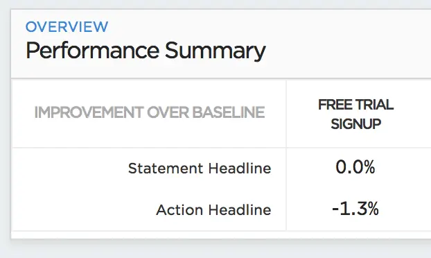
Testing headlines was easy with Optimizely—which is great because the only coding I know how to do is a Code Blue. (I used to be an Intensive Care Nurse.) Testing our headline on the homepage didn’t have the impact we were hoping for though. At the moment in time we stopped the test, the variation was losing against the original. We didn’t let this test run to statistical significance—we took this as an inconclusive test and moved on to other hypotheses.
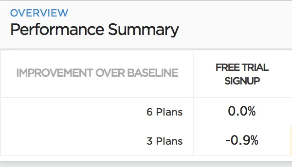
Next we decided to try changing our pricing. This was much more complex, but not because of Optimizely. First, we had to decide on the new prices to offer based on the data and feedback from customers. Then we had to figure out how to display them. In order to show the new display, we designed and coded an entirely new page. When the build was complete, we were able to set up a simple A/B test of each page. The test was to determine if people converted with fewer options—three plan options instead of six. We hoped that if we limited choices it would be easier for people to make a decision and sign up for a free trial. Alas, another bust. Since there was almost no change between the variations, we stopped it before it reached statistical significance.
But even two inconclusive experiments couldn’t stop us! On our next test we found a 48% increase in free trial sign-ups. Guess where we found it… The homepage!
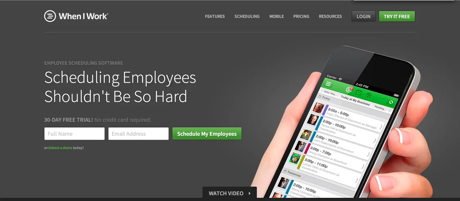
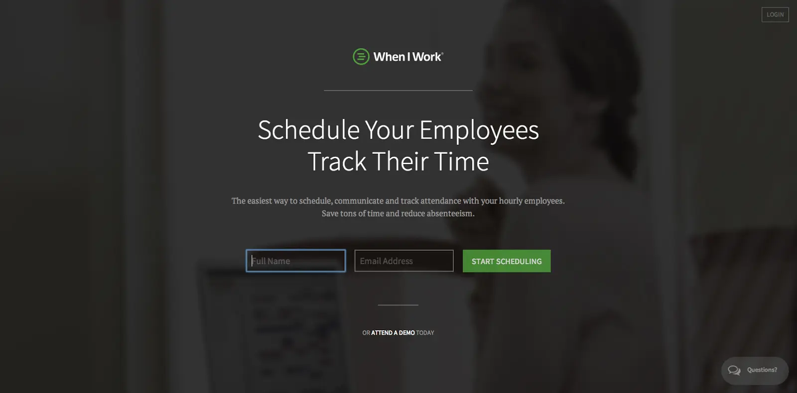
I am a big fan of Occam’s (Ockham’s) Razor, the principle by William Ockham, which more or less suggests that the simplest answer is usually the best answer (or at least the best place to start). Using the science of simplicity a la Occam’s Razor, our CEO Chad Halvorson and VP of Design, Garret Voight, went to work redesigning a stripped down homepage: one that removed a majority of the marketing content cluttering the original page. The new homepage consisted of a “log in” button in the upper right hand corner, a headline that we we had proven successful through other A/B tests, and a form for people to sign up with a basic call to action. That’s it. By scrolling down, users could still see our marketing content smorgasbord, but above the fold we eliminated anything that took the eyes away from the CTA.
BOOM! There it is! The 48% increase in conversions.

Here is the before:
And here is the after:
But none of this is any good unless we learn from it and understand why it worked. What we did on our homepage is an example of simplification for conversions. This method is commonly practiced and discussed by conversion optimizers. I call it Science of Simplicity for Conversions (or SSC for short).
3 Lessons Learned from the SSC Mindset
1. Eliminate anything that is distracting eyeballs away from your CTA.
But how do you know what’s distracting eyeballs away from your CTA? Heatmaps. Heatmap give you a visualization of where people look, click, or scroll on your webpage. With this qualitative information, you can form hypotheses for tests to attract eyeballs to what you really want people to click on—like your call to action.
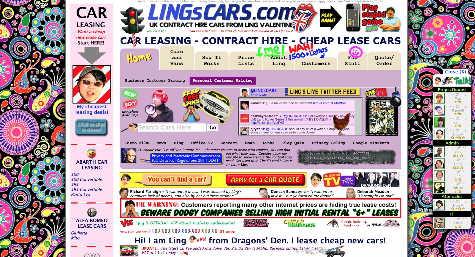
This is obviously the most ridiculous example of cluttered website design that I could find. (Make sure you have your speakers turned up too for a little extra treat, and check out the source code).
Compare that page with the homepage for Zenpayroll.
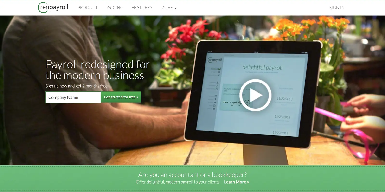
2. Simplify your sign-up form.
When it comes to the Internet, there are few things more annoying to me than being required to fill out a long series of form fields before I can use the product. As a consumer/potential customer, I’m bored before I even start…I see 10 form fields and my mind starts thinking about how I could creatively answer all of those questions without actually putting in any real data.
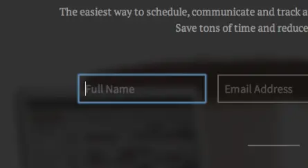
This article by Smashing Magazine contains awesome tips for simplifying your signup form. We only ask for two things on our homepage: your name, and your email address. You should already know the answer to both so you don’t have to think about them, unlike choosing a username or password. Pro tip: automatically loading the cursor in the first form field makes it super easy for someone to start filling out your form without even clicking.
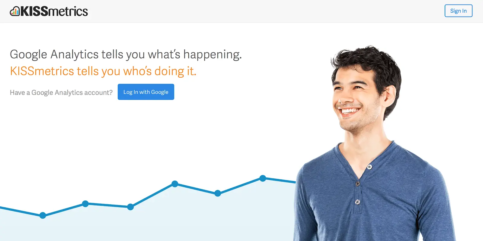
One thing that we haven’t tried yet is social login—giving people the option to sign up using their Facebook, Twitter, or Google ID’s. That will be in the works for us soon I’m sure. KISSmetrics is great about doing this because they chose the login that is necessary for a user to have in order to get value out of KISSmetrics—Google Analytics. It’s perfect—just click the CTA and you’re already halfway signed up and KISSmetrics can take you into the product faster.
3. Test your call to action text.
There are hundreds of articles that talk about this about crafting relevant CTAs. Ours used to be something like, “Try It Now,” a less than exciting, non-descriptive way to incite people to schedule employees—the conversion goal for When I Work.
If you are focusing on drawing as many eyeballs, then shouldn’t your CTA be an ad itself? Shouldn’t it help people instantly figure out what you’re asking them to do? At the time of this writing ours is “Start Scheduling.” From our homepage headline, you know we’re about “scheduling employees” and our CTA tells you to simply “Start Scheduling”. Be creative and test out a few different CTAs on your site and find the one that resonates with your audience.
Reminder: Remember to optimize for your guiding light metrics. What do I mean by that? Make sure you measure which changes have the biggest impact on your key metric. Our key metric that drives our business is converting free trials into paying customers. If a test resulted in more trials but not more customers, then we would need to reconsider our results. Optimizely let’s you connect your experiments directly to your KISSmetrics or your Google Analytics accounts so you can see the impact all of your tests have on your entire funnel.
That’s it! Go out there and find the small changes that are waiting for you to reap big rewards and have fun doing it—it’s a science, but also a very rewarding art.
