How to CRAFT the Perfect Email CTA
We’re excited to welcome Chris Hexton, CEO and co-founder of Vero, to the Optimizely Blog for the first in a five part series on email marketing optimization.

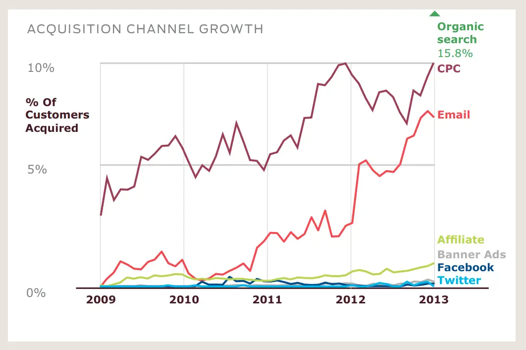
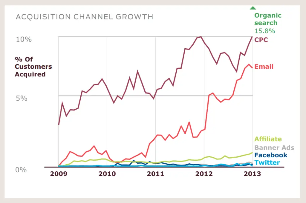
Email marketing is one of most powerful marketing mediums there is in terms of raw return on investment. In fact, a new report from Custora found that over the past four years, online retailers have quadrupled the rate of customers acquired through email to nearly 7 percent. But despite the 294,000,000,000 (yep, billion!) emails that are sent every day, very few businesses invest in reviewing and testing their email marketing campaigns to increase email marketing conversions.

Source: Custora
When optimizing your email marketing campaigns for conversions the place to start is undoubtedly your call to action (CTA). You can get a lot of extra conversions with just a few simple tweaks.
So, how do you nail your CTA? Just use the CRAFT methodology.
Colorful: Your CTA should be eye-catching and stand out from the rest of your email. Making your CTA stand out could be as simple as using the default ‘blue link text’ in a basic rich-HTML email, like so:
…or it could be as dramatic as using big green buttons like Olark:

The point here is to make your CTA stand out. You should make it really obvious.
**Pro-tip:** If you can, use a table element instead of a button image. This ensures your button will show up in all it’s glory even when images are turned off. Here’s an example of a code-based button:
**Bonus:** Here’s a snippet of code you can use for your own campaigns: https://gist.github.com/chexton/5746116
Relevant: Why would the recipient bother to click on your call to action? You need to ensure that your CTA is congruent with the rest of your email and message. A great example comes from LinkedIn’s welcome email:

Rather than just using the term ‘Sign Up’ or ‘Submit’ (which many businesses use by default on their buttons), LinkedIn have put some thought into their CTA and have used the copy ‘Confirm you know Chris’. This is much more relevant and powerful as it is asking the reader to take a very specific action. After all, the person sending the invite obviously knows you so there is a high chance you know them too. That makes this call to action all the more effective.
Actionable: On top of being relevant and related to the message, a good CTA is actionable.
In this instance the term ‘actionable’ means clear, or direct. A great example to explain this in practice is this email from Amazon. Whenever you purchase a book on a Kindle, you will receive an email like this:

You can see that Amazon has broken down the CTA into five deep-linked, granular calls to action. This is extremely actionable for the recipient!
Another somewhat unconventional approach is this example from Zingerman. A great example of an actionable CTA – this email asks the customer to respond with 0-10. This is quick, fast and understandable.

The trick with an actionable CTA is to think outside the box, while maintaining focus on the big picture goal of your call to action. How can you make it super easy for your customer do exactly what you want them to do? This could involve using deep links, a text-based survey, or something else creative.
Forceful: Not a lot to say here, other than don’t be afraid to tell someone what to do. A good CTA should be powerful, persuasive, and effective.
Targeted: Leaving the simplest to last, make sure you have a single call to action.
Keep things targeted. Don’t go crazy and have dozens of images or four different buttons that lead to different pages. Be clear about the message you’re delivering.
Here’s a great example of a focused campaign from Memrise:

Keep things simple. Don’t make your customers think!
This is just the tip of the iceberg of what you can do with an AB testing tool. There are lots of great ways you can increase your email marketing conversions and, with a little focus, you’ll be on the path to increased revenue in no time at all. I’ll cover more email strategy and tips in future posts.
What other great tactics have you seen employed in email marketing campaigns you’ve received? What has worked for you personally?
See you in the comments!

