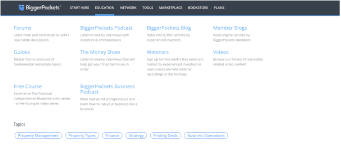
One of our biggest experimentation challenges at BiggerPockets has been testing into a better site navigation. Over the life-span of our company, the website has added a number of features. As we’ve added features, we’ve placed those features into the navigation in the location that made the most sense at the time. Those individual additions strung out collectively over time, resulted in a navigation that was large and clunky. Resulting in a sub-navigation where our users were able to find the correct navigation destination less than 50% of the time.

BiggerPocket’s old sub-navigation
As any responsible data-driven growth team would do, we decided to improve our navigation incrementally with testing, but we quickly ran into a series of challenges. Similar to what we’d learned with retention testing, we realized measuring user response to a navigation change isn’t always straightforward. For example, a decrease in average visit duration could be positive or negative. It could be negative if users are having trouble finding what they’re looking for and bounce. A decrease could however be positive if it indicates that users are finding what they’re looking for faster.
If you’re thinking about how to approach those challenges, it is critical to conduct user research to build quality hypotheses about how your users use your site. Once you have hypotheses about your users, there are three types of navigation tests you can run. Each type of test calls for a different thought process and tactics in answering your hypothesis.
Here are the 3 types of navigation tests:
- Categorization: What are the right high-level categories your users use to think about your site?
- Information Architecture: Once you set those categories, how should links be organized underneath them?
- Layout and Functionality: What’s the most intuitive way for users to interact with your navigation?
Below, I’ll detail the challenges with each type of test and the tools in your toolkit to understand how to better adapt your website to user behavior at each category.
1. Categorization
“Categorization” refers to the top-level categories you might have on your website. At BiggerPockets, ours looks like this:

We have eight top-level categories, based on the different tasks a user might look to perform on BiggerPockets.com. It is hard to say exactly when you need to test your navigation categorization, but we decided to test ours after getting feedback from users that they did not know about several of the key features we have on our site.
Choosing your top-level categorization comes down to two questions: How many categories should we have and what should those categories be?
Although those categories are simple, finding the right ones is not. The paradox of course is that although you know your website better than anyone else, that simple fact actually makes you the last person who should be designing the navigation. You likely think about your website in terms of the different types of functionality it has. Your customer thinks about it completely different. They are coming to the website with a particular task in mind and want to quickly figure out how to complete that task. They frankly do not care if you think about the feature that helps them complete that task as a “network” feature or a “tool”.
Before we dive into how to test categorization, let’s talk about defining the metrics for success at this level of the navigation. Here is what we typically look for in a categorization A/B test:
- A decline in number of searches per visit (this indicates users are having an easy time finding what they’re looking for in the nav)
- A decline in search usage within 30 seconds of expanding the nav (also indicates users found what they’re looking for)
- An increase in avg. session duration (Note: our successful users binge our content. So, a longer visit is typically a more successful visit. A site where users are doing a specific task to solve a problem might look for a decrease in average session duration. E.g. DoorDash might look for lower time per completed order)
So, your job is to come up with top-level categories that make sense to your customers first and that might be counterintuitive to you. Here are some tools we’ve used to help develop and test that categorization.
Tool #1: Card-sorting survey
A card-sorting survey gives your users a list of all of your navigation links and asks them to group them into categories that make sense to them. Users may end up having differing ideas about what goes with what, but at the end you’ll emerge with 3-6 general themes, which you can then use to create categories and test. We use Optimal Workshop to run our card-sorting surveys because we like the depth of their reporting, but there are a number of other tools out there. Optimal workshop recommends getting 50-100 participants to participate in order to have a margin of error which is small enough to make the data useful.
Tool #2: A/B Testing
Once you’ve run a card-sorting survey and created a hypothesis around what your top-level categories should be, you’re ready to split test. At BiggerPockets, we typically run that test to a small percentage (~5%) of our new users and watch to see how their retention compares to the control group over time. That 5% number works for us because it allows us to reach statistical significance in a reasonable time frame (~1-2 weeks) but doesn’t expose a potentially jarring and harmful change to a large percentage of our users.
2. Information Architecture
Once you have your top-level categorization filled out, now you need to figure out which links go under which top-level items. Again, remember that your users have spent a fraction of the time on your site that you have, and think about it differently than you do. This means that before you test anything on your site you need your customers to tell you how they think it should be ordered. Luckily, there’s a fix for that.
Tool #1: Treejack Survey
The treejack survey is another user research tool which allows you to understand how easy it is for users to find something on your website. We also use Optimal Workshop for these surveys, primarily because their reporting has the level of depth that we crave.
You conduct a treejack survey by building an information architecture, assigning tasks to your users, and watching where they go to complete the task. We typically draft up 2-4 different information architectures that make sense to us, and then send them out to our users to let us know which one they prefer. The survey responses then give you two important data points: how often do users find what they’re looking for in the navigation and how quickly do they find it?
For a treejack survey, Optimal workshop again recommends recruiting 50-100 participants. You can recruit those participants from your own list or pay Optimal Workshop to recruit them for you.
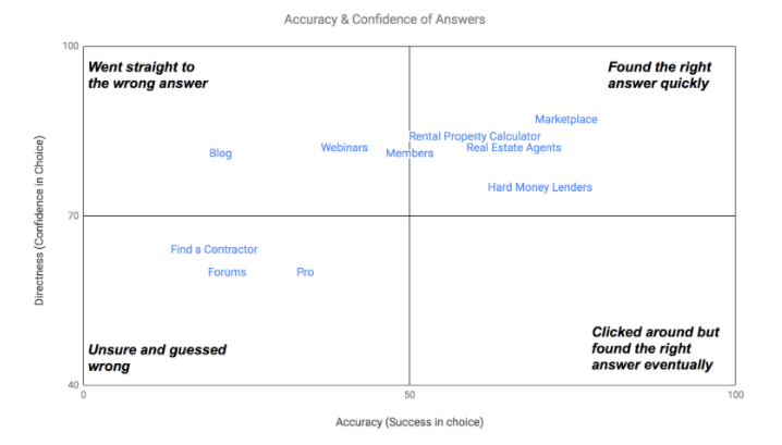
Below is an example of the results summary we generated from our initial treejack survey. The results told us that the Forums, Find a Contractor, and Pro (our paid membership) areas of our navigation were the least intuitive for our users. You can imagine our surprise when we found out users had a hard time figuring out where to go to learn more about memberships! Soon after this, we ran a test which renamed that area of the navigation and increased traffic to our membership types page by 33%.

Tool #2: A/B Testing
Once you’ve given users the opportunity to tell you what information architecture they want, you should still validate that with an experiment. Metrics to look at to evaluate success here:
- Time between first hover and click (how quickly users can find what they are looking for)
- Hover abandonment rate (percentage of people that hovered over the navigation, looked at the sub navigation items, and then left)
- Increase in click rate to more valuable parts of the navigation or parts of the navigation that have been renamed
3. Layout and Functionality
The final piece of the puzzle is getting the right functionality to match your users. This is the next frontier for BiggerPockets, so I’ll share how we’re planning to approach this category. In the upcoming months, we plan to test new functionality in order to get answers to these questions:
- Is it easier to find forum topics if our navigation works as a “tag & filter” or traditional navigation system? (Think of filtering products on Amazon as the “tag and filter” option)
- Should the sub-navigation expand when a user hovers or on-click?
- What’s the optimal number of “tiers” our navigation should have?
- Does making our search more prominent actually help users find what they’re looking for faster than the navigation?
In order to answer those questions, we will primarily be using A/B tests released to a small percentage of our audience.
I would love to hear what creative solutions you’ve developed for testing your navigation! Find me on Linkedin or reach out to me directly at alex@biggerpockets.com to continue the conversation.
And if you’re ready to get started with experimentation, reach out to Optimizely today.
- Last modified: 12/30/2025 8:08:13 PM


