Hero image
What is a hero image?
A hero image is a web design term used to describe the full-screen video, photo, illustration, or banner that welcomes visitors to a webpage. The image always has a prominent place near the top of a webpage, sometimes extending across the full width of the screen.
Otherwise known as a hero header or hero section, it not only serves as a user's first glimpse of your company, but also a key part of the user experience of your site.
The ideal hero image will:
- Grab the user’s attention
- Visually demonstrate your value proposition
- Help the user navigate to exactly the right information

Source: Optimizely
In addition to a high-resolution graphic, a hero image can and should contain your company’s unique selling point (USP). You can also attach it to a conversion goal, such as a signup form or a CTA button.
Dive deeper into the 'whats', ‘whys’ and ‘hows’ of hero images below, including:
-
Why web design should prioritize hero images
-
The different types of hero images
-
3 (big) things to remember when creating hero images
-
Great hero image examples
-
How to test different hero images using A/B testing
-
Hero image testing ideas
Why should hero images be prioritized by web design?
People are highly visual things, so when there's a high quality, full-screen image at the top of their page, it can create a positive first impression.
Choosing the right hero image — whether it’s a high-quality photo, video, or illustration — immediately lets your visitors know that they’re in the right place. Hero images on media sites and blogs can also be used to catch the visitors' attention and draw them into reading the articles on the page.
In addition to being a must for an engaging user experience (UX), a hero image also adds value by directing users towards a desired link or call-to-action or presenting your business’ value proposition at the top of the webpage.
What are the different types of hero images?
Your hero images will help your value proposition stand out to your target audience as soon as they land on the page.
Browse your favorite sites and you’ll see these types of hero images:
- Product photography: For many direct-to-consumer brands and e-commerce businesses, product photography or a carousel is the right choice because it immediately shows your visitor what’s available on your site.
- Sizzle reels: For new products or businesses delivering services, a full-screen video known as a sizzle reel is the right choice. Sizzle reels are the perfect addition to a landing page because they communicate both information and emotion with very little space on the page.
- Product benefit and emotional images: When you’re selling a benefit or feeling that’s attached to your product or service, your hero image might be emotional: it might feature people, places,
- Information-driven images: Hero images and carousels are also a great way to share information about new products and features, limited-time offers, and sales. Typography-only hero images can also be used to share important statistics about your product, customers, or industry.
3 things to remember when using hero images
Given their importance, you want your hero images to work hard for you. But there are couple of things you need to work hard on first.
1) Make sure your images are the right size
If images aren't the right size in your hero section, let's be honest: it will look bad. Given most screen sizes on the market today, a full-screen hero image should be 1280px by 720 pixels at an aspect ratio of 16:9to ensure they won’t damage load time. You should also ensure they are hosted on a fast CDN. When choosing your mobile-optimized images, you’ll aim for 800 x 1,200 pixels.
But it's not all about the how it looks on the page. The time it takes to load, for both mobile and desktop, is super important to user experience too. Based on research done by Google, it's proved that increasing page load speeds from 0.4 to 0.9 seconds can reduce traffic by 20%. All the power of your hero image is lost if it ultimately drives traffic away before it's even loaded.
Consider having your design team create hero image templates, where you can 'color between the lines' on any image.
2) Choose visuals that add value to the customer
Whether you choose product imagery, a sizzle reel video, or a stock photo, your image should convey the message you most want your customers to receive. Try to avoid irrelevant or ambiguous imagery.
If you’re ever unsure or in a stalemate with your colleagues, the best way to determine whether you’ve chosen the right product images is to test them. We’ll cover that in a second.
3) Make your hero image stand out
Your hero image should add visual interest to a page. You know, make the people that see it feel something. Whatever medium you choose, your imagery should stand out on the page and differentiate your site from your competitors.
A simple way to do this is to make sure you’re using overlays, gradients, and typography to prevent an image from laying ‘flat’ on the page. But there’s always room to go the extra mile, whatever your budget.
Remember that a sky-high budget isn’t a prerequisite for a high-quality hero image. While you want to avoid stock images where you can, using them doesn’t disqualify your site from appealing to customers. You could even use Adobe Photoshop to add a creative spin to even the most basic stock images. Even something simple as adding filters to the stock photos you choose will give a more cohesive look across your site than using those images as they exist — and you can even do this in a simple tool like Canva.
5 great hero image examples
If you're stuck for inspiration, we've chosen some great hero image examples to show you how other companies are doing it. Check them out!
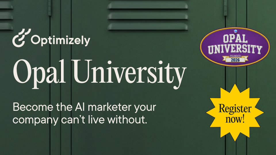
Target
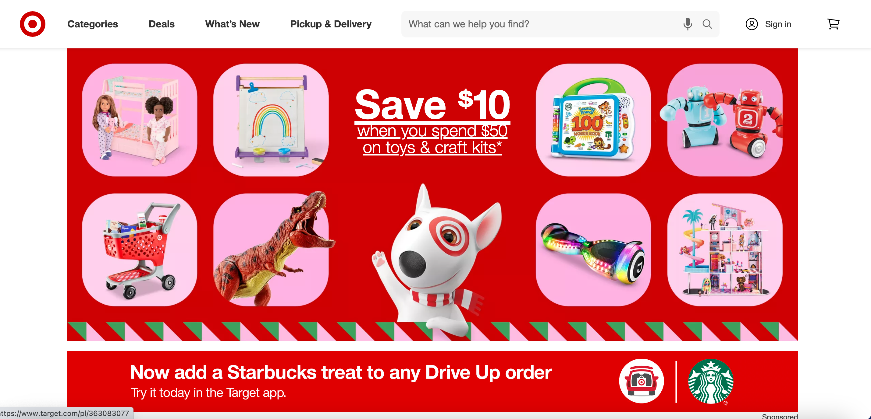
Known for clean design in all areas, it’s no surprise that Target’s hero images on its web property tick all the boxes for strong design and clean communication.
We love this hero image because it’s balanced, imaginative, and clearly on brand. By presenting the possibilities of real toys included in the offers with a clear call to action in the center, it alerts and undoubtedly converts.
In fact, this image captures the attention of the viewer so well that the Target web design team threw in a sponsored bar from Starbucks just below. The design even complements the hero image and in our opinion is even more powerful.
Chase
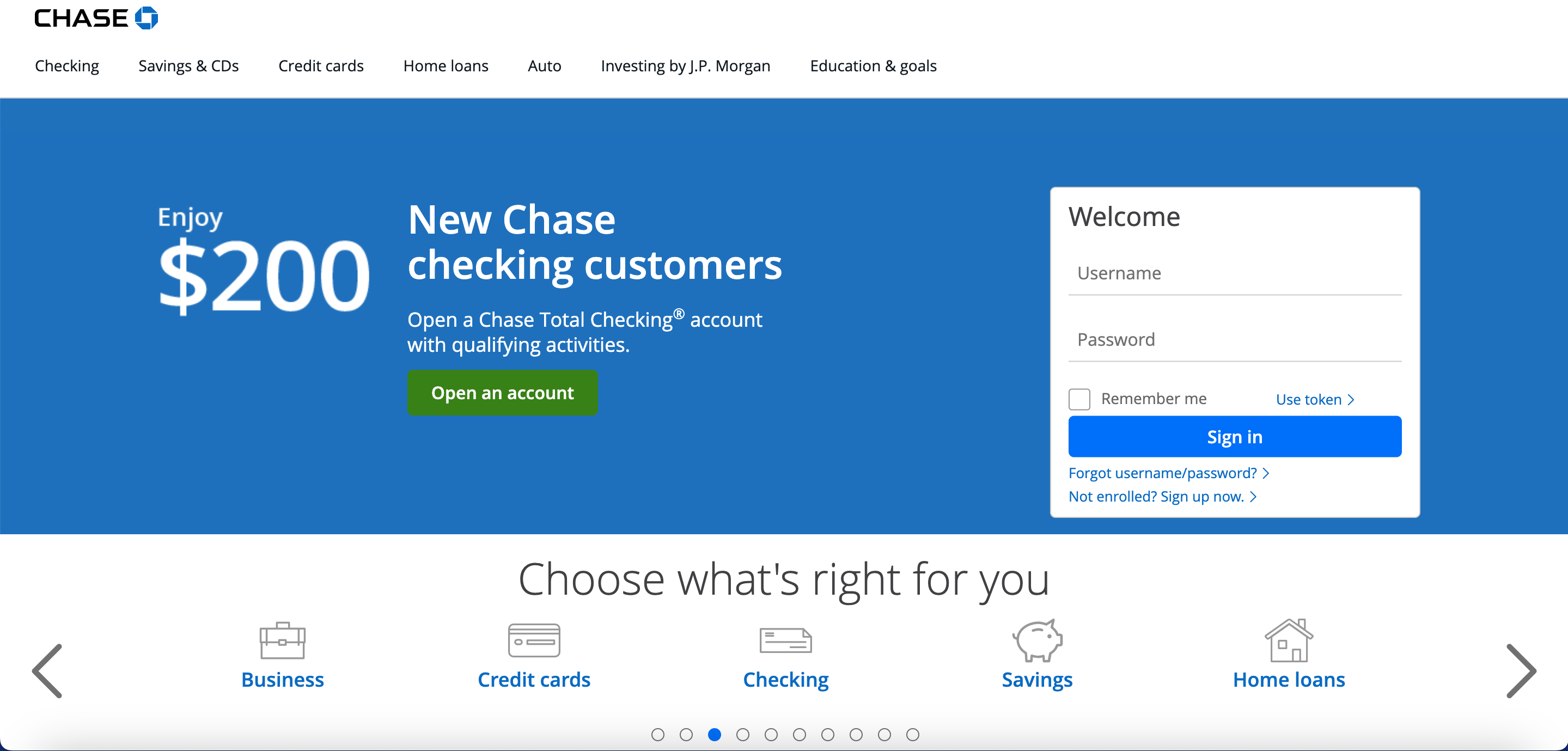
Traditional banks aren’t well-known for stellar UX design or particularly creative website design, but sometimes functionality is everything. In this sense, the hero image on Chase’s homepage ticks all the boxes, even if it means leaving behind some compelling design trends.
The value proposition is clear; the image is clean. It’s also a great example of an overlay by keeping the sign-in for existing customers. While this is an expected feature (who wants to scroll to log in?), it’s also a great idea to mimic for conversions. For example, existing mono-line customers might see the value of this offer and move their checking account to Chase.
This is also a great example to mimic if you’re working with limited images or videos and stock photos simply won’t cut it.
Delta
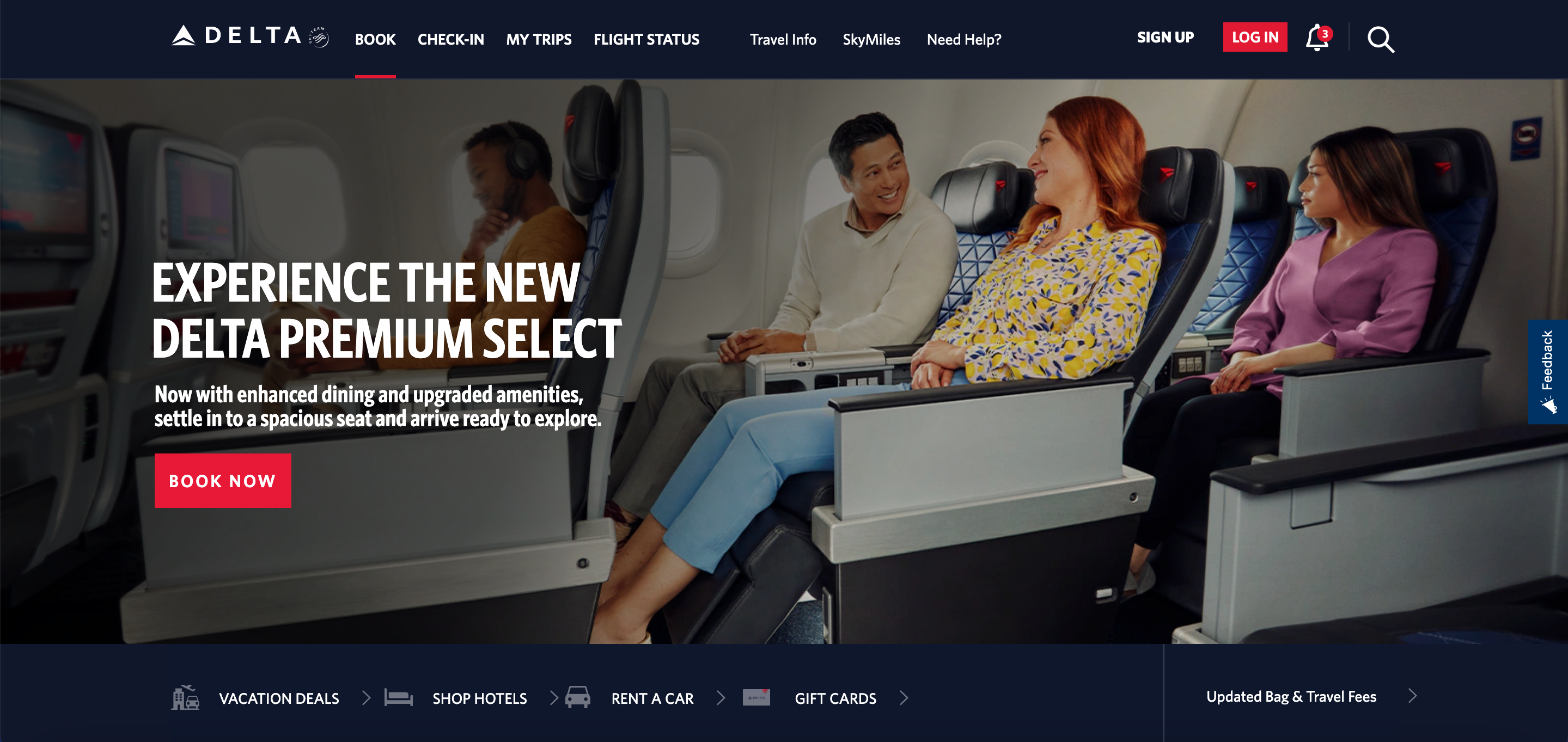
Delta’s homepage hero image also departs from recent design trends but it follows a similar road to chase.
The value proposition here is clear: Delta has upgraded its product and wants to convert customers and bring back customers who perhaps decided that there wasn’t enough value in the product in the past.
Although the image draws the eye away from the written text, it’s not necessarily a bad thing because it refocuses your attention right on all that legroom - a rarity outside of business class. Your attention span journey moves from the legroom to the image and is emotional, even if the image isn’t overtly manipulative. It causes you to think back to your last flight and pause to consider trying it again. The CTA ‘Book Now’ button is almost trickery because it’s the button used to book any flight, but you’re already in the mood to give the new premium offering a chance.
Roxy
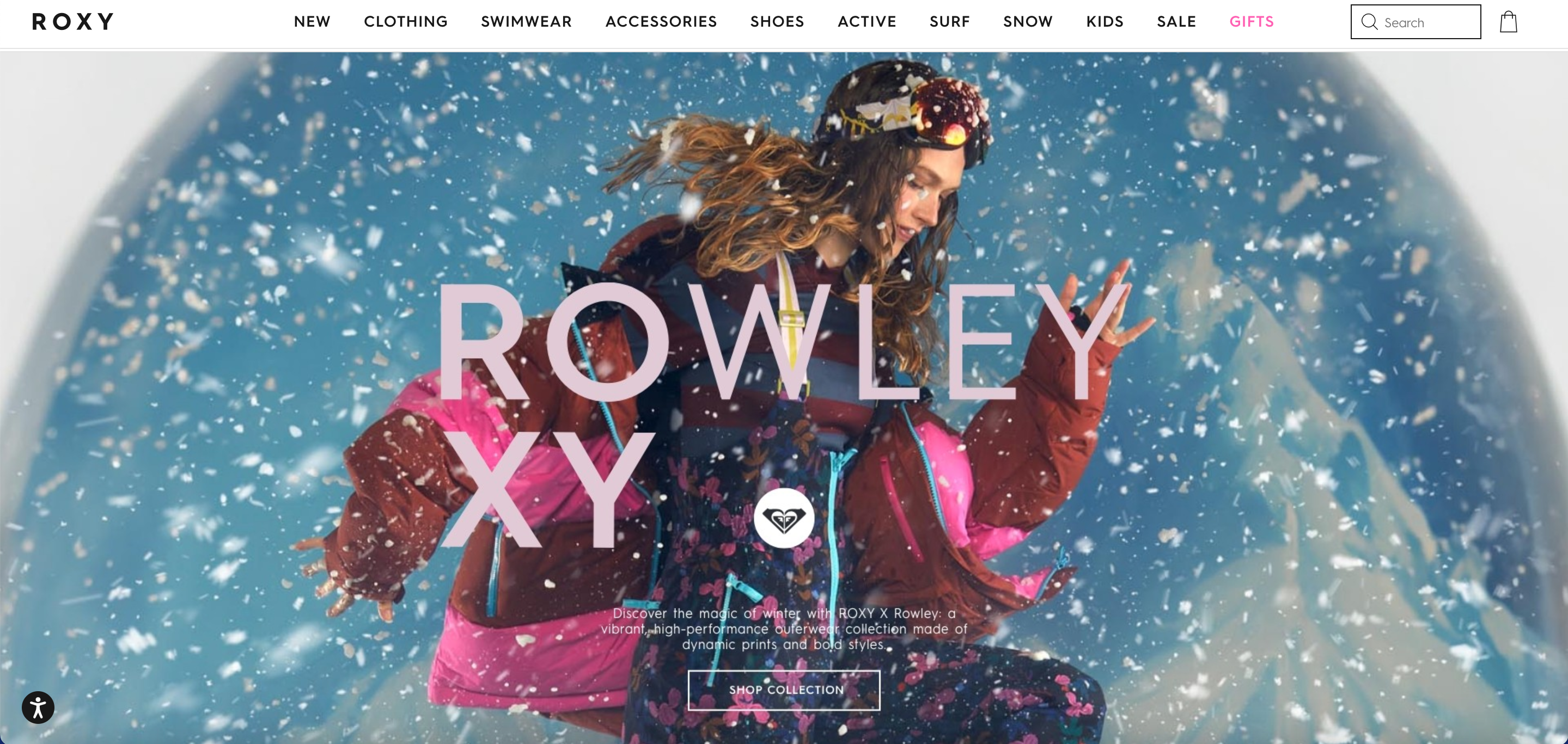
With our final image, we’ve looking at a smaller but focused brand: Roxy. For those unfamiliar, Roxy is part of the Boardriders Group, a global retail dynasty made up of seven brands with distinct identities.
The hero image we chose is a powerful that conforms to the trend we described earlier: the focus is on the center of the page. At first, it seems busy but the edges of the image bring the eye back into the center to focus on a powerful product image with a distinct CTA inviting site visitors to Shop the collection.
It’s a bold choice for an image, and it will certain divide designers, but it is more interesting and emotional than a typical product image and sometimes this kidn of vulnerability can win the day.
Atlassian
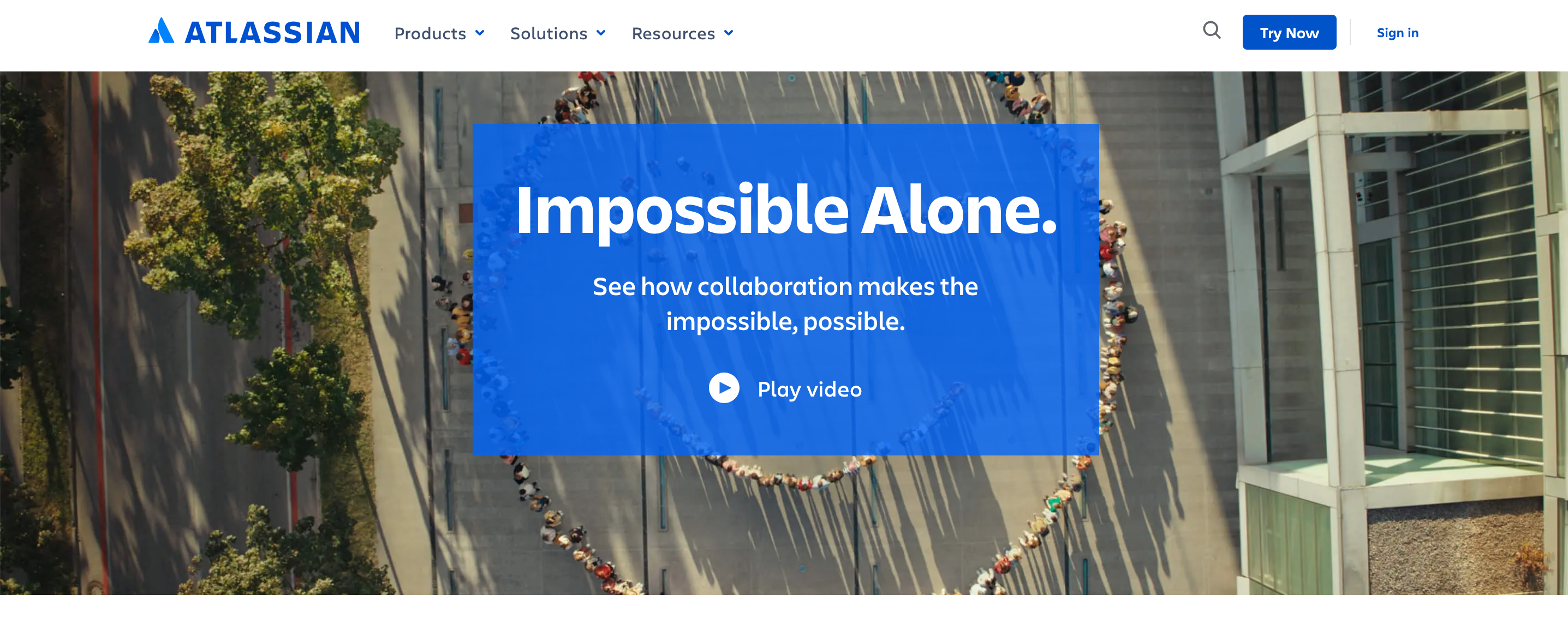
Our final hero image example comes from B2B SaaS innovator and Optimizely client Atlassian.
Atlassian’s hero image is, in fact, a marketing video. Atlassian took the emotional, product-benefit track to center their brand as the place for team collaboration. It’s a stunning video that covers Atlassian’s entire portfolio and brand value proposition.
Is it engaging? It could be! But the only way to have certainty is to test it with A/B testing.
How to test different hero images using A/B testing
How do you know whether your hero images are making an impact on your site? Short answer: You test them.
The results of these tests are some of the richest data you can get from your website because of their prominent placement. So, we recommend using A/B testing to determine the strength of any given hero image.
A/B testing is a method of testing websites where 50% of your traffic is shown the original version of your page, and 50% is shown the new variation. By showing a random sample of your visitors different versions of your page, you can use data to determine which version of your page converts better.
If a challenger page doesn’t surpass an original page, you can always test new hypotheses, with variations in imagery, copy, and CTA. You can also personalize your experiences by showing different segments of your visitors different hero images.
By continuously testing different images you can improve your conversion rates and website experience over time.
Hero image testing ideas
Are you ready to get started? Some ideas for optimizing hero images include:
- Still image vs. moving image: There could be value in discovering whether users find your visuals engaging, aesthetically pleasing, or informative, or if they find them distracting. Testing a still graphic against a moving graphic, such as a .gif or HTML5 visual could provide insights into your users' preferences.
- Interactive play video vs. auto-play video: It’s becoming more and more common online to hear embedded audio playing without having to activate it. It’s useful for sites that use video messaging to measure the importance of video content by testing whether users are clicking to activate the content, or if playing video automatically is the way to go.
-
Value proposition: Do different images create different emotions in your users and cause them to behave differently on your site? You might be surprised at the answer. E-retailer Missguided used experimentation to see if in image would cause customers to ‘shop the look’ videw 360-degree spings, or hover over images. Their data helped them generate a significant increase in conversions.
-
Object focus: Does the main subject of your image create a positive feeling for users that generates actions that contribute to the end business conversion goal? Or is it off-putting? Why not test it! This is a great experiment to run on images like the Roxy example above.
Tip: Remember you can also test different versions of your selected hero images on social media to add even more depth to an already rich data set.