
Most product teams face a common challenge: understanding which metrics and behaviors actually drive their key outcomes. You might ship a feature that moves your north star metric, but without systematic analysis, it’s hard to know whether you’re measuring the right things or if the features you’re building are having the impact you expect.
Typically, answering perennial questions like "which metric best predicts retention?" or "which user behaviors correlate with conversion?" and deciding where in the experience to run your next experiment (and to whom) requires either educated guesswork or dedicated time from a data scientist to run correlation analyses.
The Influence Exploration lets you answer these important questions confidently without requiring a background in statistics or days of waiting. Whether you're a PM, Experimentation Team, or Analyst, the Influence Exploration Template allows you to see correlations between important metrics quickly and clearly.
The questions you’re actually trying to answer
“What causes the business results we care about?”
Is it total hours watched or number of titles watched that predicts 6-month retention? You could guess, or you could know.
“Who are our users and how do they differ?”
Are users who complete profile customization more likely to become power users than those who connect social accounts? The difference matters when you’re prioritizing roadmap.
“What happens after users do something important?”
What behaviors cluster around sharing a referral link in the following 7 days? Understanding this tells you where to double down.
These aren’t abstract questions. They determine what you build next and whether it’ll work.
How it works
The Influence Exploration analyzes relationships between behaviors, cohorts, and metrics on your actor dataset such as users, accounts, whatever or matters to your business. It supports nine different analysis types by combining any target (event, cohort, or metric) with any test (event, cohort, or metric).
The template surfaces four key measures:
- Likelihood impact:How much more likely actors who did the test event are to hit the target event. +50% means they’re 50% more likely to convert, retain, or whatever outcome you’re measuring.
- Metric impact: The percentage difference in average metric value between actors who did something and those who didn’t. When this shows +45%, actors in the test cohort have 45% higher metric values.
- % of actors who did test event: Reach matters. A behavior that impacts 2% of users is different from one that touches 40%.
- Correlation (R²): How tightly two metrics move together, from 0 (no relationship) to 1 (perfect relationship). At 0.64, the test metric explains 64% of variation in your target.
The template answers two core questions: If a user does X, how likely are they to do Y (and how many users does this touch)? And how strongly does one metric predict another?
What this looks like in practice
1. Finding what actually drives purchases: Events → Event (Direction is set to Causes)
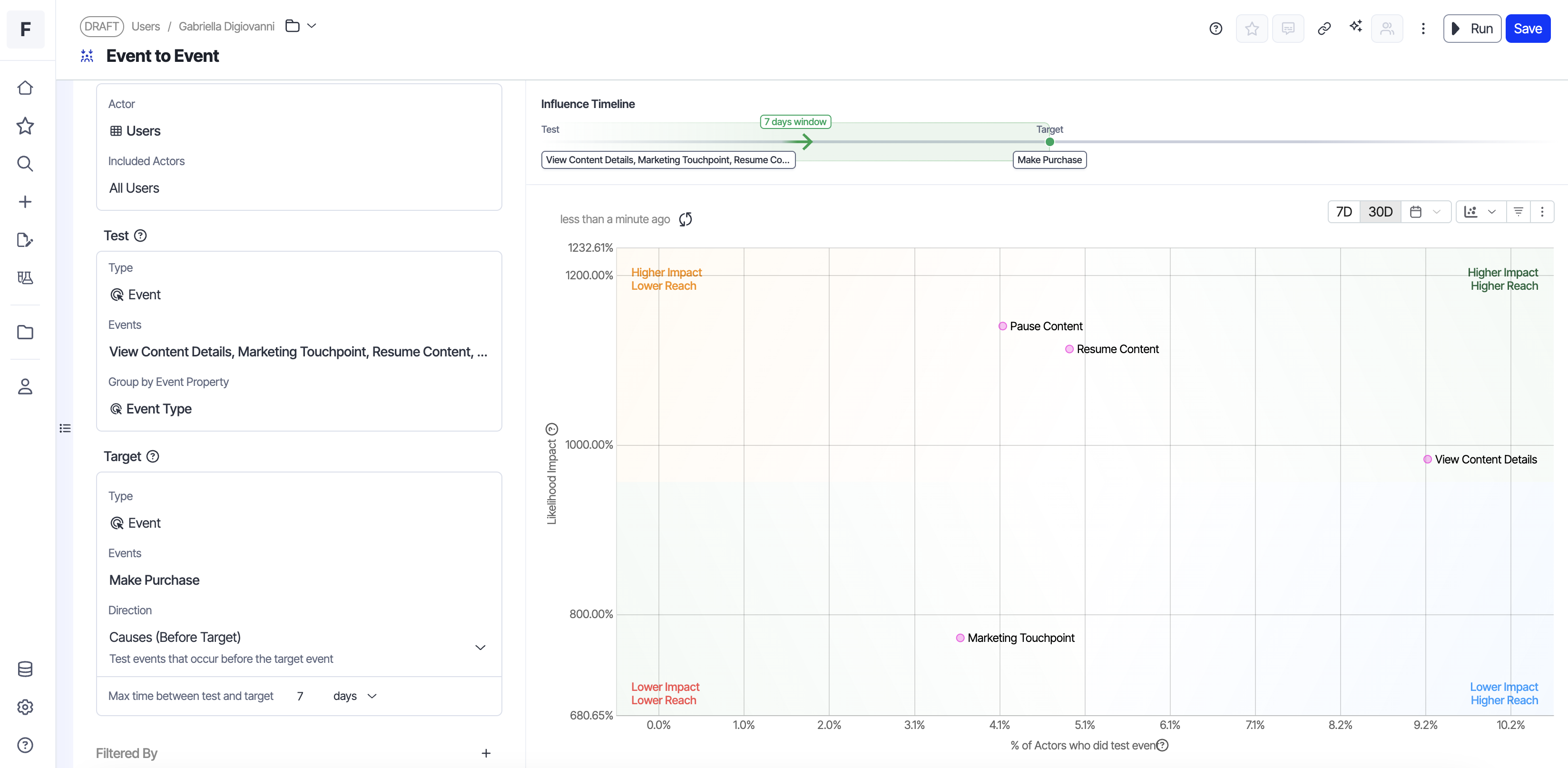 Image source: Optimizely
X-Axis: % of actors who did test
Y-Axis: Likelihood impact
Which user actions predict making a purchase?
The data shows users that did the Pause Content event have the strongest likelihood impact value, underscoring that users who pause are highly likey to make a purchase. That said, only ~4% performed this action in the last 7 days.
Meanwhile, users who did the Browse event, have a 25% lower likelihood impact value, but a reach that is more than 2x greater.
Next step: Dig into what users do before and after browsing (filters used, items viewed, time spent, exits). Identify friction and high intent moments, then design experiments to improve the browsing experience. The Influence template doesn’t tell you what to change. It tells you where to look.
2. Understanding revenue drivers: Metrics → Metric
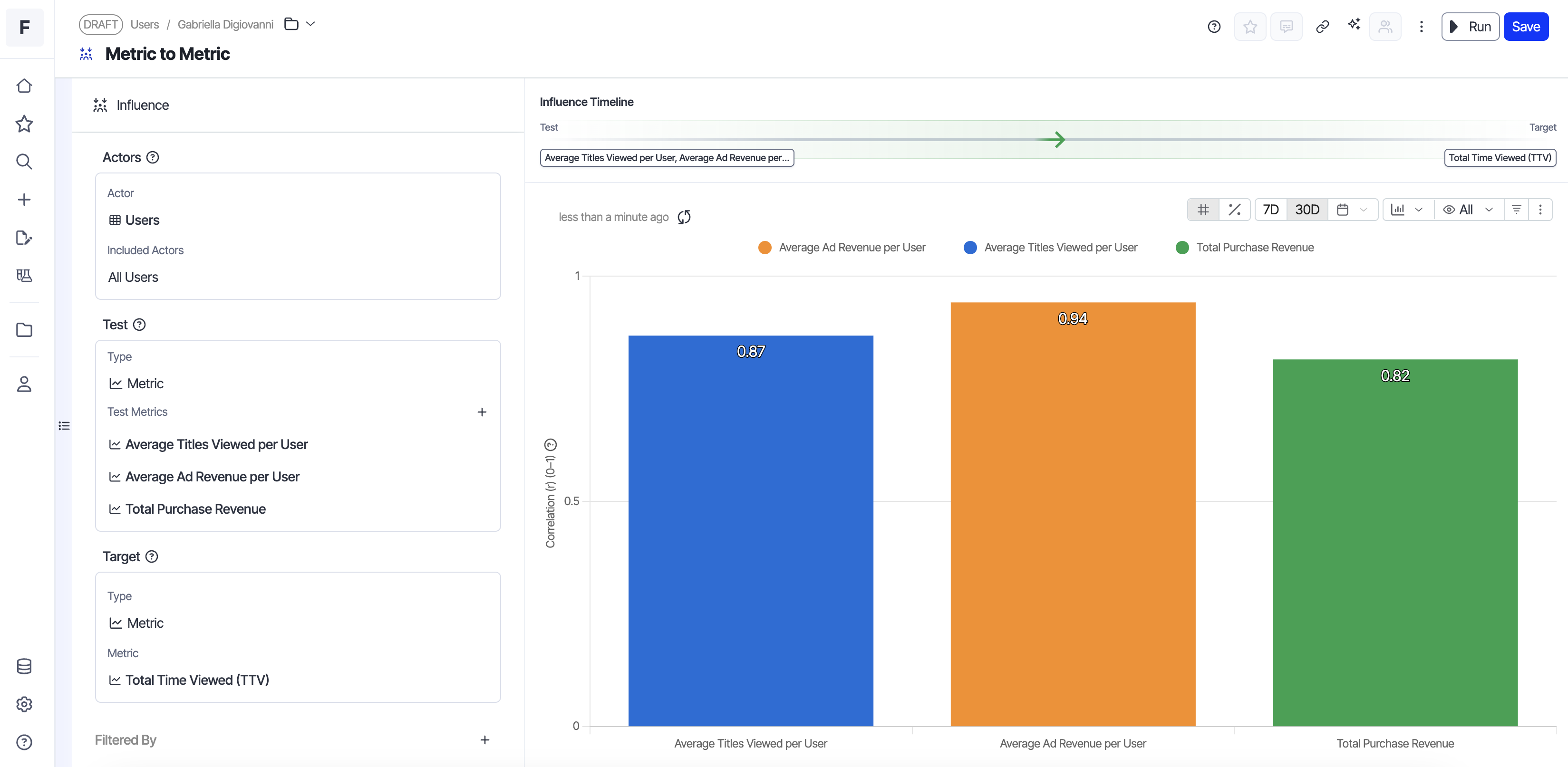 Image source: Optimizely
X-Axis: Correlation value
Y-Axis: Metric name
Which metric actually predicts revenue?
The template shows average ad revenue per user tightly correlates with total time viewed (R² of 0.94).
The decision: This means your monetization engine is working.
Users who watch more content generate proportionally more ad revenue. Instead of optimizing ad placements or experimenting with ad formats (which would matter if correlation was weak), we should prioritize features that increase viewing time: better recommendations, reduced friction, and improved content discovery. This is a growth lever, not an optimization problem.
3. Identifying your high-value segments: Cohorts → Cohort
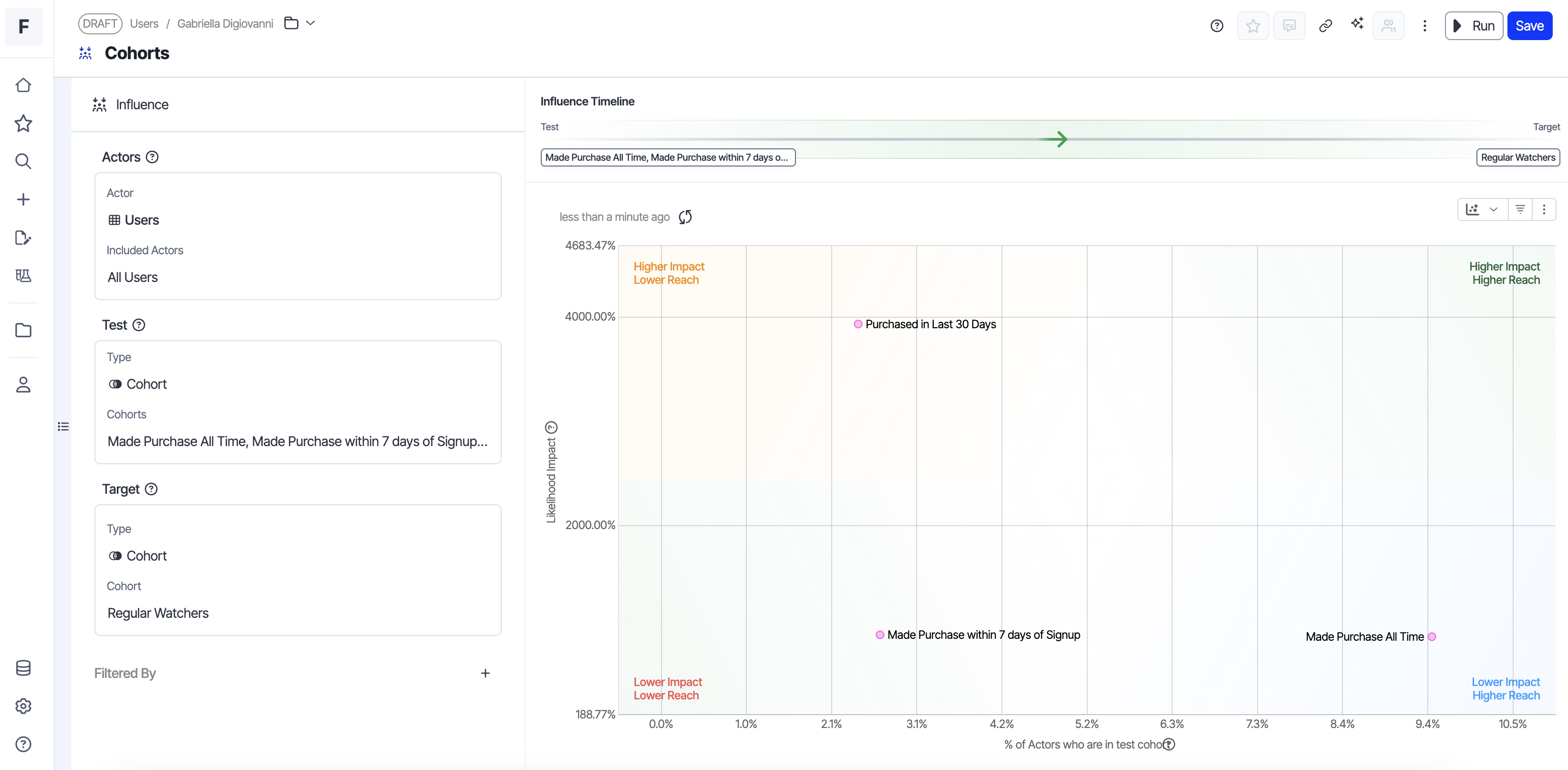 Image source: Optimizely
X-Axis: % of actors who did test
Y-Axis: Likelihood impact
The “Viewed Recommended Content” cohort shows 3.2x higher likelihood of joining the “Loyalty Program” cohort compared to users who don’t engage with recommendations.
The decision: There is an opportunity to invest more heavily in our recommended content module as a direct path to increase the number of users that are members of our loyalty program (which in turn increases our subscription revenue.
4. Discovering what happens next: Event → Events (Direction is set to Effects)

Image source: Optimizely
For Event → Event analysis, you can also control direction: look at behaviors that happen before the target event (what causes it) or after (what are the effects). This temporal control helps you distinguish leading indicators from downstream consequences. In this example, our direction is set to effects.
X-Axis: % of actors who did test
Y-Axis: Likelihood impact
Resume is a high-frequency action (40% of users). Users who resume playing content are likely to view content details afterward, giving this pattern high reach.
Decision: Here, the correlation between resuming and viewing details suggests these behaviors are linked for a meaningful portion of our user base. Build contextual recommendations on the content details page based on what users just resumed. If someone paused a cooking show and resumes it, surface related recipes or similar series when they navigate to details.
What this enables
The Influence Exploration changes how product teams approach measurement and prioritization:
- Identify the right metrics to set goals against: Understand which metrics actually predict your north star before setting team objectives or experiment goals.
- Prioritize high-impact work: See which behaviors correlate with conversion, retention, or revenue, ranked by both impact strength and reach , so you can focus on what matters.
- Understand your user cohorts: Identify which cohorts drive your key outcomes and how different user groups behave.
- Diagnose metric movements: When a metric shifts, quickly see which behaviors or cohorts changed to understand what’s driving the movement.
The template automatically ranks results to surface the most meaningful relationships: by impact strength and reach for behavioral analyses, or by correlation strength when comparing metrics.
The Influence template is available now in Optimizely Analytics. Find out what's actually driving your outcomes.

- Last modified: 3/3/2026 3:46:07 AM