comScore Increases New Leads 69% by Adding a Customer Logo
Social proof is a topic talked about frequently in online marketing. It is widely agreed upon that showing off logos of happy customers and testimonials on the website positively affects sales. But how do you best use testimonials to turn more new visitors into leads? Learn how comScore A/B tested to discover a design that increased leads from product pages by 69%.
Social proof is a topic talked about frequently in online marketing. It is widely agreed upon that showing off logos of happy customers and testimonials on the website positively affects sales. But how do you best use testimonials to turn more new visitors into leads?
Ferry Gijzel, Director Web Marketing at comScore, an international digital measurement and analytics company that provides marketing insights to the world’s largest enterprises, publishers and agencies, wanted to answer this question through the process of A/B testing.
Since Ferry’s team is responsible for driving new leads to the sales team, he is always looking for ways to optimize ComScore.com to turn more visitors into sales qualified leads.
Ferry ran an audit of demo requests to the comScore sales team to see which lead forms generated the most requests. He found out that the number of leads coming from forms on product pages was lower than expected.
Armed with these analytics, Ferry started hypothesizing on how to optimize the product pages to increase leads.

Original product page showed the testimonial vertically with a grey background and the quote attribution at the bottom.
Each product page includes a description of the product, a selection of testimonials from existing clients and a call to action to request a demo. Ferry hypothesized that featuring the client testimonial more prominently on the page would lead to more demo requests. If new visitors saw a familiar brand on the product page, then they would be more prone to schedule a demo to learn more about what comScore has to offer.
Ferry created three variations of the product page to test his hypothesis about social proof. Each variation tested orientation and logo placement of the client testimonials. Ferry and his team used Optimizely as an A/B testing tool to test the effect these changes had on the conversion rate.
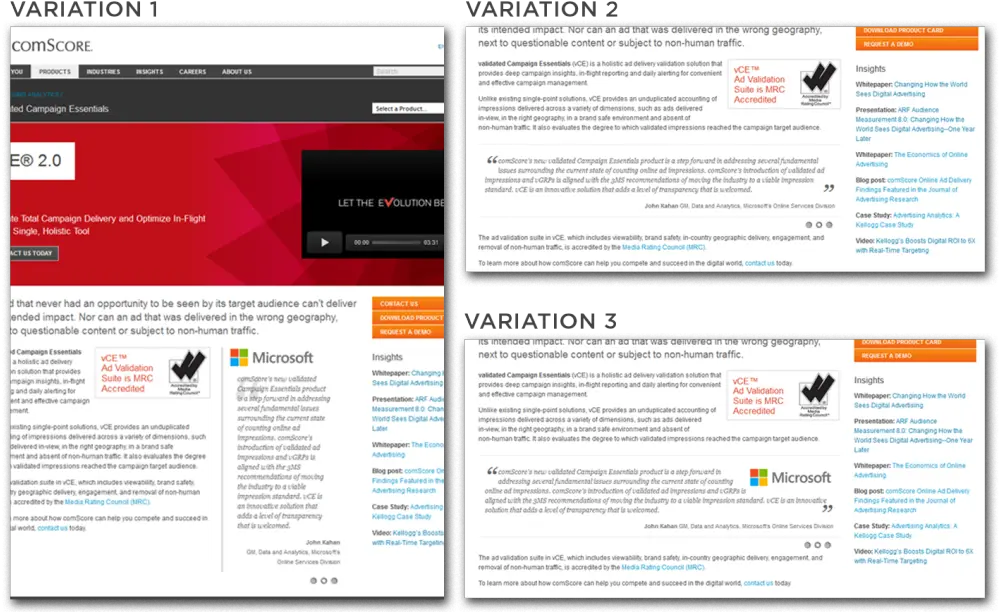
Variation 1 included a logo of the customer in the testimonial, variation 2 was placed horizontally below the product description, but contained no logo and variation 3 displayed the testimonial below the product description, but this time included a logo. Click to enlarge.
As this test was aimed at driving new leads to the sales team, Ferry wanted to include only new visitors in the experiment and exclude all existing clients. To do so, the team integrated Optimizely data with one of comScore’s tools, Digital Analytix, to make use of comScore data. Through this integration, Ferry was able to zoom in on the results for this specific target group.
Generating new leads was the conversion goal in this experiment. To measure the number of leads each variation created, Ferry tracked the number of page views on the “Demo request confirmation” page—the page visitors land on after they fill out a form to receive a product demo. He also monitored how the 4 different variations would impact engagement and clicks to other pages.
They tested 2,500 visitors in the experiment and soon saw that variation 1 was the winner, outperforming all other variations and beating the control by a wide margin. Using a vertical layout with the client logo displayed prominently on top of the testimonial increased the conversion rate of the product pages by 69% compared to the original.
![]() This is part two of an optimization case study with Secret Escapes, a flash-sale luxury travel company.In part one we covered how Secret Escapes used Optimizely to experiment on their iOS app onboarding flow, double signup rate, and generate positive ROI from paid mobile marketing.
This is part two of an optimization case study with Secret Escapes, a flash-sale luxury travel company.In part one we covered how Secret Escapes used Optimizely to experiment on their iOS app onboarding flow, double signup rate, and generate positive ROI from paid mobile marketing.
In this post, we’ll dig into another series of experiments that are driving continual increases in new user signups and revenue. In both experiments, Secret Escapes is testing the impact of personalized experiences.
Experiment 1: Personalization for PPC Landing Pages
The company had high click-through rates on their search marketing campaign ads and directed all of this traffic to a single Pay Per Click landing page. They saw an opportunity to convert more paid traffic on this page.
Tom Evans, a product manager and A/B testing lead at Secret Escapes, hypothesized that mirroring copy on the landing page with the copy on the ad would improve conversion rates. In other words, they tested the impact symmetric messaging between ads and landing pages had on the rate of new user signups.
The test stems from the idea of matching user intent with expectation. Entering a search in Google is a clear display of user intent. The hypothesis is that a symmetric experience from the ad to landing page —one that clearly matches that search intent — will make people more likely to take the desired action on the page.

Secret Escapes “spa” PPC ad in Google.
Tom ran this test for their “spa” AdWords group first. He tested two different personalized pages against the control landing page with no personalized elements: