10 A/B test examples that work (From our analysis of 127,000 experiments)

A/B testing can feel like a scam... until it's not.
Only 12% of experiments win on the Primary Metric.
So why does everyone tell you to "always be testing?"
Because they're testing the wrong stuff. Most teams are obsessed with running TONS of tests instead of the better ideas. They trust opinions over evidence. They guess instead of knowing.
Let's fix that. We analyzed over 127,000 experiments across retail, SaaS, B2B, and travel industries.
Here are the 10 best A/B testing examples that drove real results and how to make them work for you.
10 A/B testing examples that work (and why)
Here are 10 examples of A/B testing that consistently move the needle:
1. Specific CTAs outperform generic ones (and why "Learn More" is killing your conversions) ☀️
Action-specific buttons vs. vague call-to-actions. Replace generic "Learn More" or "Click Here" with CTAs describing the next step. What users get vs. what they need to do first. Test action-oriented copy like "Get the Full Guide" or "Start My Free Trial." Show the next step, not the end goal.
Example 1
If you are a newcomer (like Harry's) competing against a well-entrenched competitor who owns 50% of the market (Gillette), you can try a compelling CTA for your product page.
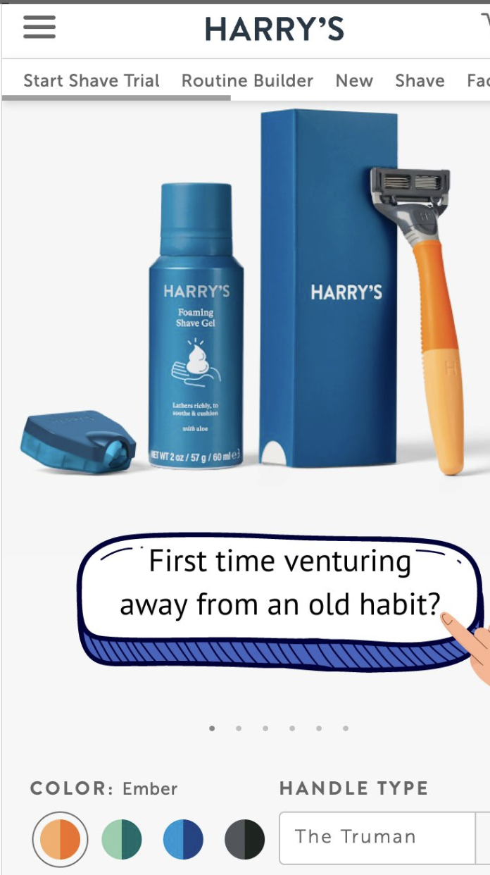
Image source: Harry's
Example 2
Very few visitors enter your site intending to buy. Casper's mattress page has a comparison table that compares the mattress you're looking at with Caspers’ higher-end model.
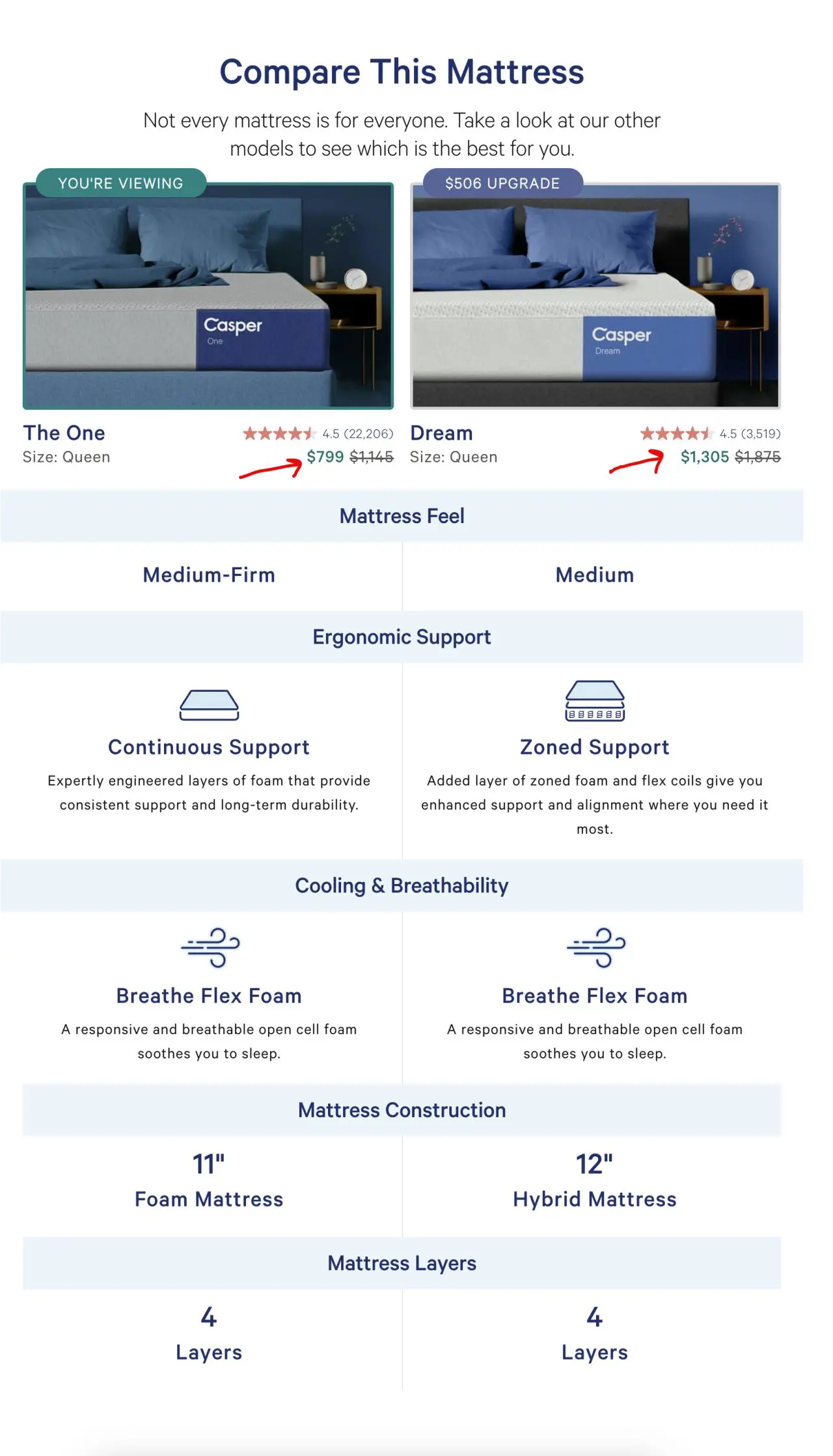
Image source: Casper
2. Personalized experiences drive higher engagement (but most teams do it wrong) 🎯
Contextual content based on referral source vs. generic one-size-fits-all messaging. Test personalized recommendations and content against generic alternatives based on your personalization strategy.
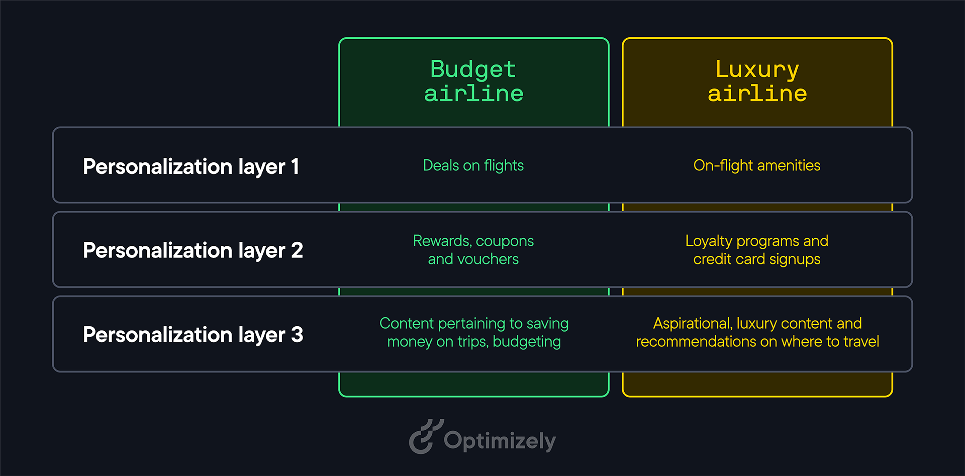
Image source: Optimizely
- Why it works: Relevance can dramatically impact engagement. When visitors see content that matches their intent and source, they're more likely to stay and convert.
- How to implement: Cold ads ≠ warm email clicks. Customize landing pages based on traffic source (Google Ads, email, social media). Show different headlines, offers, or content based on how visitors found you. Use UTM parameters to track sources and display relevant messaging.
3. Short value props win over feature lists (why less is more) ⏪
Single clear statement vs. detailed feature breakdown. Test simple, outcome-focused messaging against comprehensive feature descriptions.
- Why it works: Visitors want to know the outcome first. Too many features create cognitive overload.
- How to implement: Lead with the main benefit, then support with proof points. Save feature details for later in the funnel.
For example, most people haven’t bought seafood online. Maine Lobster Now presents a simple visual on their product page.
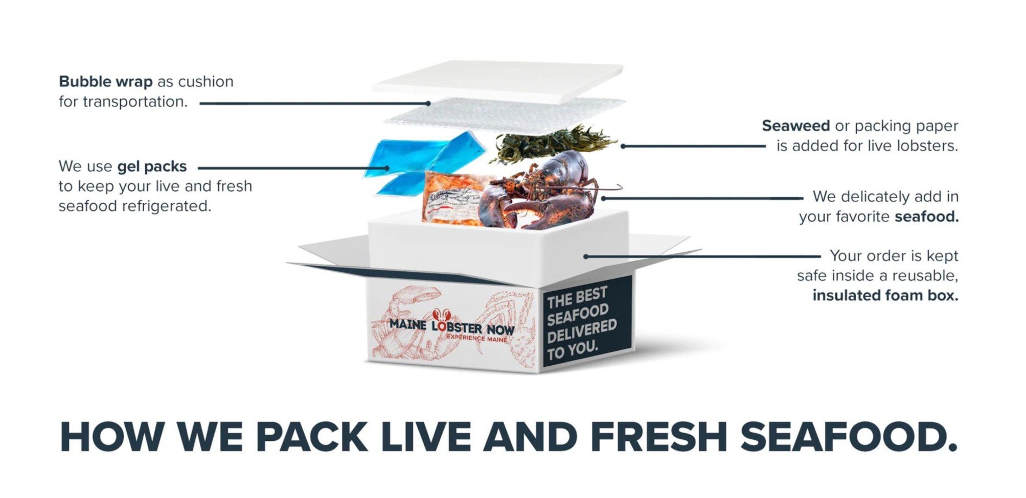
Image source: Maine Lobster Now
4. Testimonials beat customer logos (and the data will shock you) 💰
Logo grids vs. specific customer stories with results. Replace customer logo displays with detailed testimonials that include metrics and context.
- Why it works: Logo walls are vanity. Testimonials with results build trust. Test “This saved us 40%” over “Look, we work with Google.”
- How to implement: Use testimonials with specific outcomes. For example, "Reduced costs by 40%" or "Increased leads by 200%" with customer details.
5. Fewer form fields increase completions 📝
Essential fields only vs. comprehensive data collection. Reduce form fields to the absolute minimum needed for the next step in your process.
- Why it works: Each additional field creates friction. The more you ask for upfront, the fewer people will complete the form. One test found that reducing from 11 fields to 4 increased conversions by 160%. Cut ruthlessly. Ask yourself: “Do we really need a phone number here?”
- How to implement: Only ask for what you need immediately. Collect additional information later in your relationship.
For example, you can get Sahil Bloom’s newsletter straight to your inbox with just an email address.
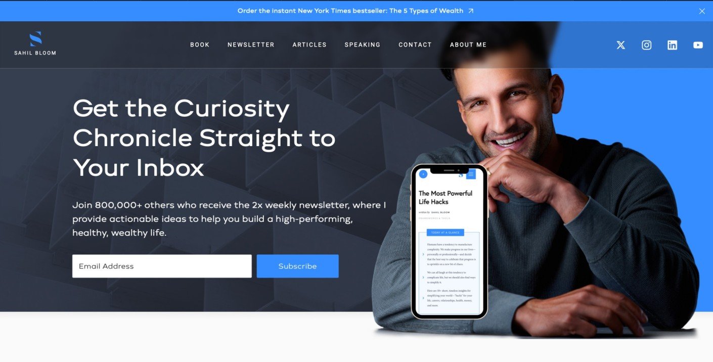
Image source: Sahil Bloom Official
Further, if you want to win first-time customers, certain e-commerce websites allow you to shop using a guest account.
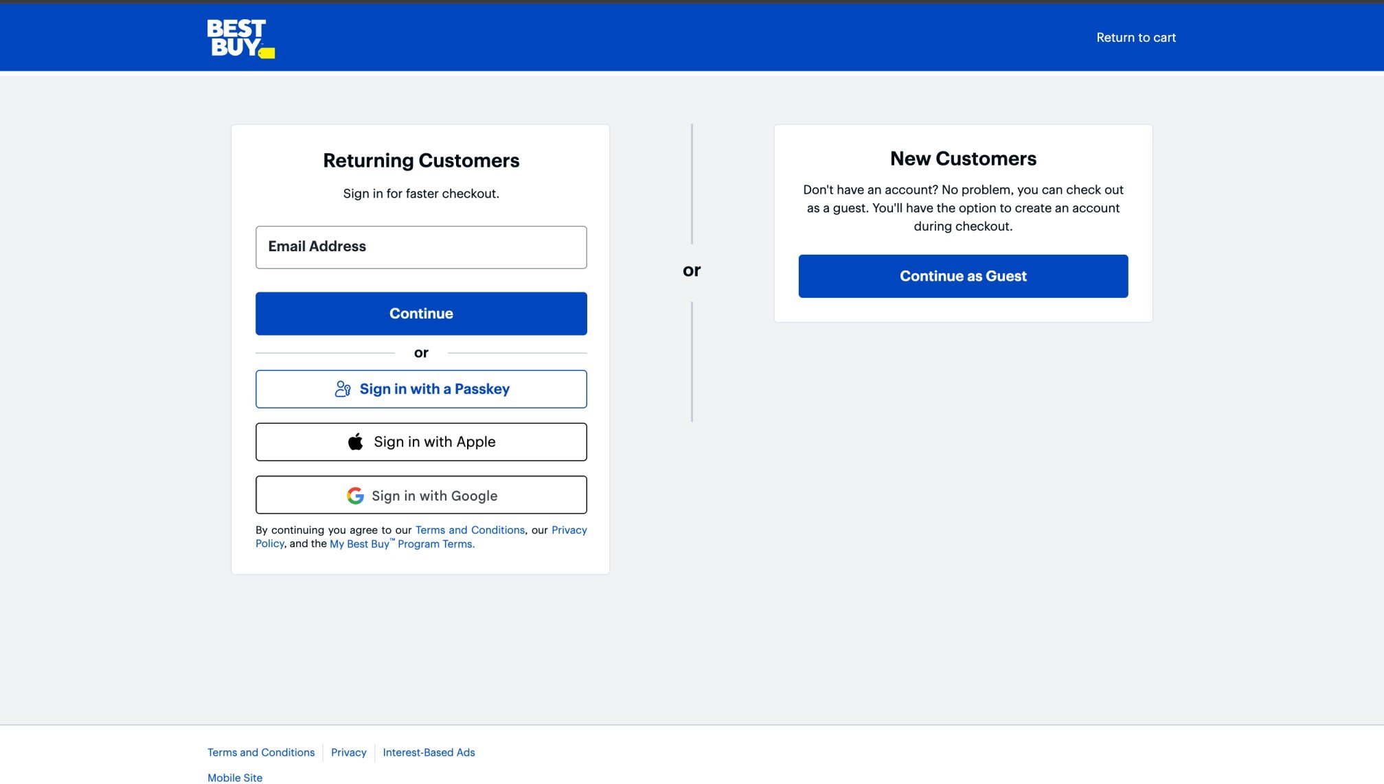
Image source: Best Buy dot com
6. CTA hierarchy guides user focus (when everything's important, nothing is) 🎯
When everything looks important, nothing is. Make your #1 action impossible to miss while making secondary actions less prominent (links).
- Why it works: When everything looks equally important, users get confused about what to do next. Clear hierarchy drives action.
- How to implement: Use size, color, and styling to create a visual hierarchy. One primary button, and secondary actions as text links.
Image source: Calendly customer story
7. Strategic promotion placement drives attention (location changes everything) 🚀
Different banner locations and sticky functionality for key offers. Test promotional banners below the navigation, under hero sections, or with sticky scroll behavior.
- Why it works: Well-placed promotions capture attention without being intrusive. Location affects visibility and conversion.
- How to implement: Test sticky banners that stay visible during scrolling but ensure they don't block important content. Sticky promotional banners increase click-through rates while maintaining user experience when positioned correctly.
8. Search assistance improves discovery 🔍
Basic search vs. guided search with suggestions and auto-complete. Add popular search terms, suggestions, or contextual pre-fills when users interact with the search.
- Why it works: Helping users find what they want faster reduces frustration and improves conversions.
- How to implement: Show relevant suggestions based on current pages or popular searches. Make discovery effortless.
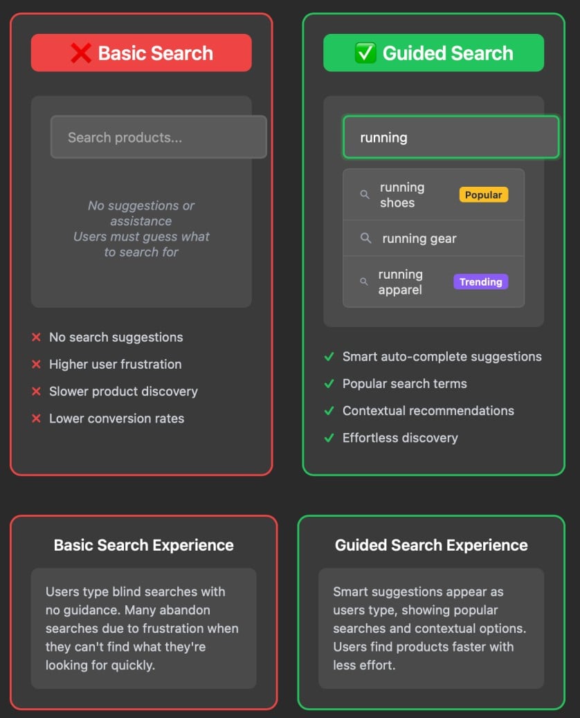 Image source: Optimizely
9. Product images in context increase purchases (studio shots are hurting your sales) 🖼️
Studio product shots vs. lifestyle images showing products in use.
People don’t buy products... they buy themselves using the product.
Lifestyle images significantly convert better in some verticals.
- Why it works: Lifestyle images help customers visualize themselves using the product, creating an emotional connection.
- How to implement: Show products in realistic settings with people using them. Help customers imagine ownership.
For example, Toyota’s website shows how different seat covers would look in their car.
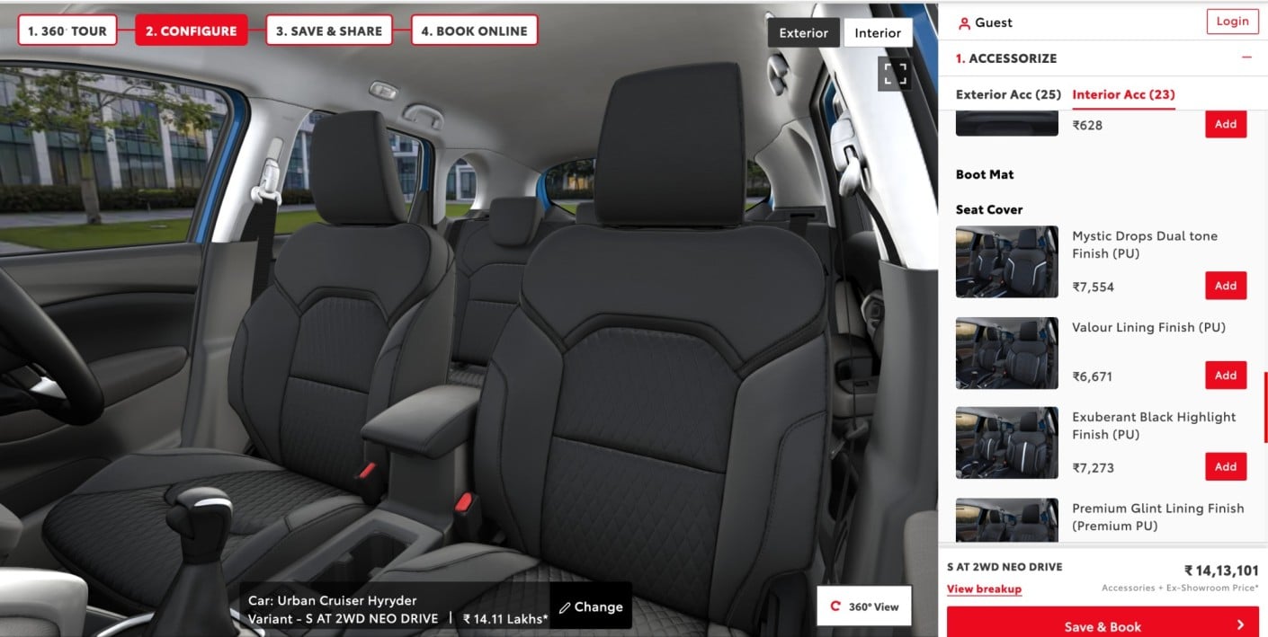
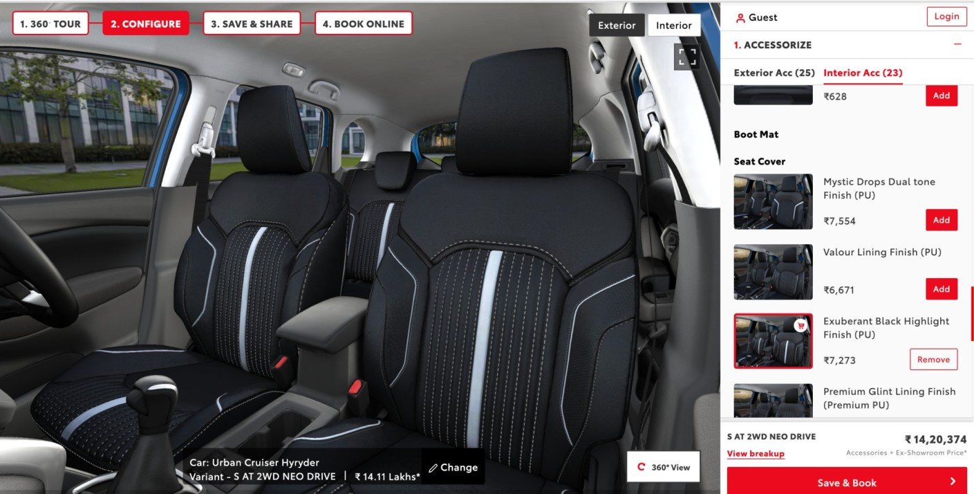 Image source: Toyota Bharat
Toyota’s configurator allows you to add and see how each accessory will look in the final product, prompting more users to add accessories without hesitation.
10. Clean pricing builds more trust (why strikethrough pricing backfires) 💵
Strikethrough pricing vs. straightforward price presentation. Test showing original prices crossed out versus displaying only the current price clearly.
- Why it works: Show value before savings. If everything’s 70% off all the time, it stops feeling like a deal, it starts feeling fake.
- How to implement: Focus on value rather than discounts. If you show savings, make them credible and time-limited.
For example, Dropbox allows users to choose a plan that best fits their requirements.
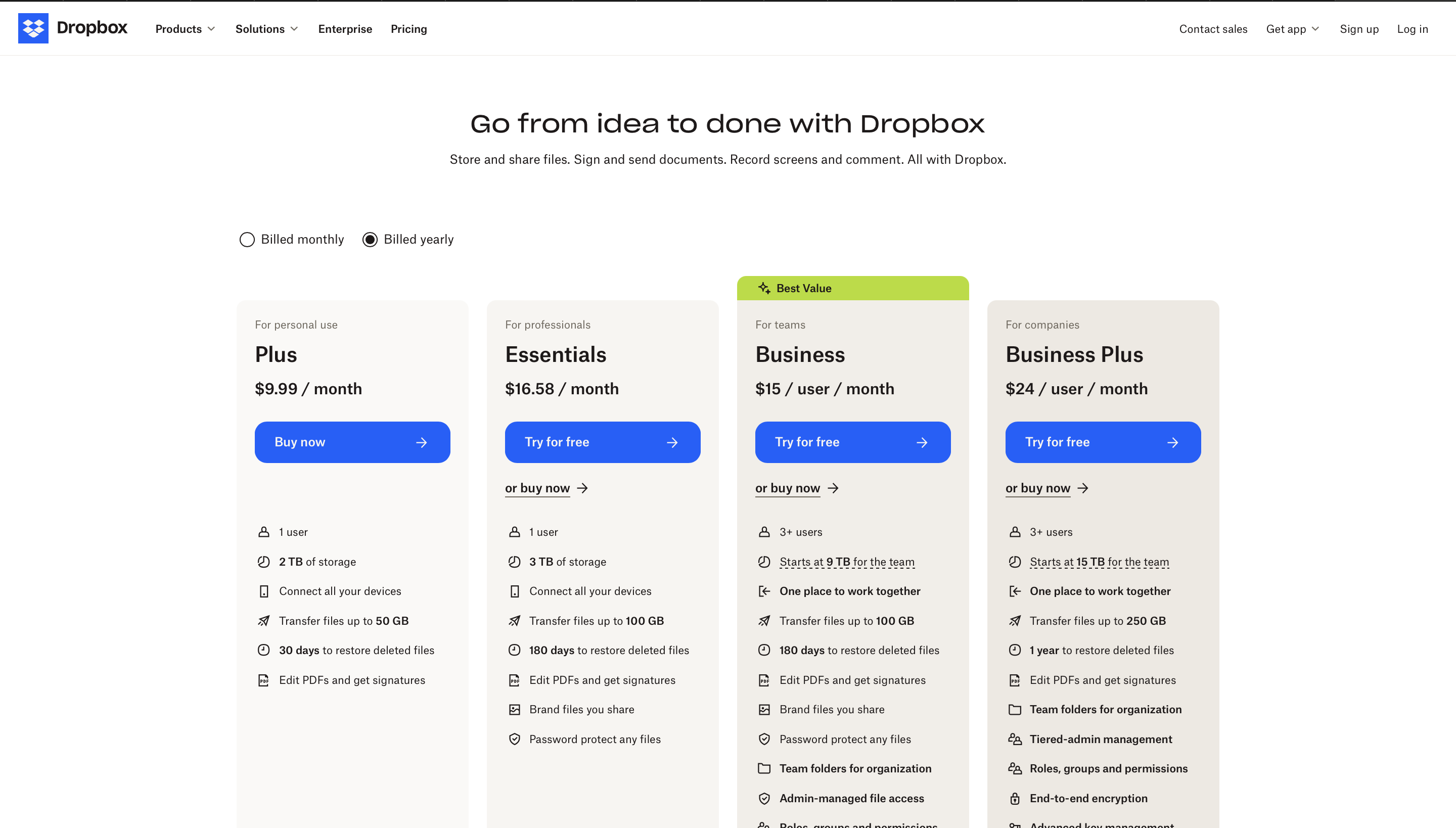
Image source: Dropbox
Also, context is key. Sometimes, it’s hard for your website visitors to know what the right price should be for a product.So you give your shopper context.
Remember, the tests that see the most uplifts focus on reducing friction, improving clarity, and building genuine trust—not manipulating visitors into clicking.
So... how do you pick the right test?
Don't just run what's easy. Run what's likely to move the real business metric.
Most teams pick tests based on what's convenient to implement or what they saw work for someone else. But the highest-impact tests align directly with your biggest business challenges.
Here's a cheat sheet:
Business goal |
Test focus |
Metrics to watch |
Increase revenue |
Pricing displays, upsells, CTAs, checkout flow | Add-to-Cart, AOV, Checkout completion rate |
Generate more leads |
Form fields, lead magnets, CTA placement | Form completion rate, lead quality score, cost per lead |
Improve engagement |
Content layout, navigation, search functionality | Time on page, pages per session, bounce rate |
Boost conversions |
Landing page messaging, trust indicators, social proof | Conversion rate, click-through rate, funnel drop-off |
Reduce churn |
Onboarding flow, feature discovery, user guidance | Feature adoption, time to value, retention rate |
Start with tests that directly impact your biggest bottleneck.
The bottom line...
You don't need to run 200 tests a year. You need to run 10 good ones. 👏
Most tests fail because they’re safe. Or worse... random.
Run fewer. Run braver. Run tests that tackle real business problems. And now you can stack the odds in your favor.
Optimizely helps you run smarter tests with Web Experimentation for frontend optimization, Feature Experimentation for backend testing, and Personalization for targeted experiences.

Yes, a marketer and a copywriter... but more lame than most. I try to use AI and here to be a thinker rather than just a publisher, but really just think with my...
- Last modified: 12/30/2025 7:52:43 PM