5 Actionable Lessons Learned From Real Heat Map Case Studies
I was more than excited when I first heard about the concept of heat maps a couple of years ago.

Karol K
“So you’re telling me I can track all my visitors and then see exactly where they click and how often?!” – is what I was thinking.
What’s truly great about heat maps is that they give you a clear visual representation of the raw data you’d otherwise get from Google Analytics. This allows you to act right away and not waste time trying to understand what all those traffic and click numbers actually mean to your business. Because of this, you can grow your conversions, sales, or whatever else you’ve set to be your goal, all based on the visual insight you get from a heat map. (Note. We’re not going to get into the topic of what heat maps are here, so if you need some additional info, here’s a detailed guide on heat maps from SumoMe, and a blog post about interpreting qualitative data from heat maps.)
So today, I’d like to share with you some of the things we’ve learned from more than 1 million heat map clicks.
But before we get going, I do want to be completely honest with you, so I have to point out one thing:
There are no web-wide rules.
Unfortunately, no matter what case study you’re reading, you have to remember that there aren’t any global, web-wide rules when it comes to heat map tests, or any other kind of web marketing performance tests for that matter.
What I’m saying might not sit well with you, but the fact is that just because something has worked for another person on their site, doesn’t mean that it’s going to work equally well for your site too. And don’t get me wrong, setting up heat maps indeed is a great way to get valuable insights on your site’s performance and possible ways you could improve things, but those insights are rarely applicable to another site in a straight way, so please keep that in mind.
Moving on to the findings.
1. The “F” pattern is still with us.
About a decade ago, there was a Nielsen study looking into how users interact with Google search engine results – where they click and look at. The study provided a then-groundbreaking conclusion that people consume content in an “F” shaped pattern. Like this:
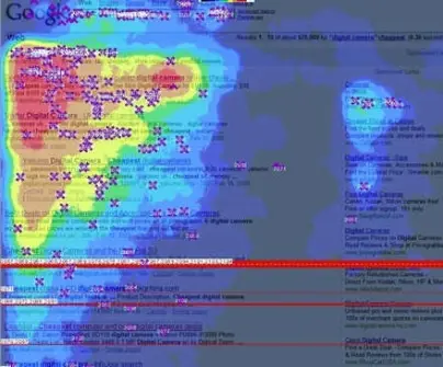
Google Golden Triangle by Amit Agarwal, on Flickr, https://www.flickr.com/photos/amit-agarwal/2052668047
So here we are, a decade later, and the “F” pattern is still alive and kicking. And this is not only about search engine listings. It seems that the pattern also exists for all large blocks of content. For example, take a look at this heat map presenting where readers tend to click on our homepage at SumoMe:

What’s particularly interesting here is the grid presenting our free apps. The grid is a large block of content — each app has similar presentation and the grid itself takes up most of the page’s display area. Notice that the apps on the left get more clicks than those on the right, and the same happens when we compare apps at the top to those further down the page. It’s a standard “F” pattern just like in Nielsen’s study.
How to capitalize on this? Always display your most important content in the top left part of a given content block. It’s quite unfortunate, actually, but the more you have to say, the less people are willing to listen.
2. Clever eye direction gets the job done.
When a first-time visitor comes to your page, they have no idea what you’re about, what you have to offer, or what they should do first. This makes it your job to convey all these messages in just a split second and direct the visitor’s attention straight to where the most important piece of info is.
Eye direction is a powerful weapon and there are many ways in which you can utilize it in your arsenal. For example, you can use:
- people, faces, animals,
- perspective.
It’s been known for years that attractive people, kids, and cute animals grab attention like nothing else. So let’s leave that one and instead focus on the latter.
Try using perspective on a page to “open up” your design so that it points towards the main conversion element. For example, here’s the current homepage at Bluewire Media:

This page is a result of a test done with a heat map. The previous design looked like this:

And here are the results with the new one (notice the hot points on the form):

One of the things that has changed is the perspective of the demo screenshots. On the current page, the screens open up the design and point us directly at the sign-up form.
How to capitalize on this? Align the graphics you have on your page so that they “look at” the most important element on the page – usually your call to action.
3. People want to get something immediately, without waiting.
Many online businesses focus their efforts primarily on building an email list so that they can contact their audiences directly later on. This is a sound strategy. If only the visitors were equally excited about it as well… but oftentimes, they’re not.
For instance, check out the following heat map shared by Joel of Ultimate Paleo Guide.

If you have a look at the site itself, you’ll see that the email subscription box is very visible, with a good call to action color scheme. In a way, everything checks out if we’re discussing this from an online growth hacker point of view. However, the heat map tells us that the most clicked areas are the “start here” link, the “food list” link, the “Paleo recipes” link, and the “meal plans” link. What do all these links have in common?
They give.
They give something right away.
In the visitor’s mind, they expect to receive something as soon as they click the link and get redirected to another subpage. Whereas with the subscription form, people know that after they fill it out, they will have to wait first for the confirmation email and then for the actual content itself.
How to capitalize on this? Try using call-to-action links or buttons instead of embedded forms. For example, you can set the button as a trigger for a pop-up containing your form. This does add an additional step, but the method is surprisingly effective. See how this plays out in your case.
4. Product demo images work exceptionally well.
This sounds cliche, but an image indeed is worth a thousand words, and especially if you’re trying to sell any sort of a physical product. People just want to see it from every angle possible, and they’re even interested in what the product looks like when being used by other people.
This is something that Bros Leather Supply found out when tuning up their product pages. One of the most clicked elements on that page were the small thumbnails of the products — in this case, bags.

Bros Leather Supply introduced more thumbnails after their previous heat map revealed that visitors are highly interested in browsing through them.
How to capitalize on this? Always showcase the actual photos of your product whenever it’s possible. If it’s a physical product then this is pretty straightforward. With digital products, you can try with screenshots or device screens for mobile apps.
5. The game changes constantly – even for the big guys.
On the web, things really change constantly, and unfortunately, the tests you do one year are not always applicable the next year.
Just to prove this point let’s take a look at the biggest web company of them all – Google. Back in 2005, if you wanted to be visible in the search engine, you needed to obtain the #1 spot. These days, however, it’s said that showing up anywhere above the fourth spot is similarly valuable, and that the #1 ranking page does no longer dominate the results in any way.
Heat maps are an extraordinary tool that can help you improve your website and ultimately make it better on a number of levels. And most importantly, heat maps are very easy to use these days. Optimizely integrates with two heat map providers, CrazyEgg and ClickTale. SumoMe has a free plugin for heat map tool.
Finally, if you truly want to utilize the power of heat maps, you need to treat them as a long term strategy, rather than a quick fix. The particular results I’m presenting in this post are often the outcome of weeks or months of testing, with different variations, different goals and different audiences. The key to success has always been asking questions, experimenting relentlessly, not relying on your assumptions and just letting the data speak for itself.
In a nutshell, want to build something great? Test, test, and then test some more.
So tell me, are you planning to give heat maps a shot? Or maybe you’re already using them and want to share your results with us?
About the author