5 Elements of Successful Email Marketing Design [EXAMPLES]
Of all the different ways we have to communicate with customers, email has the potential to be the most effective and engaging. Here are some successful email designs.

Newsletters and email campaigns are powerful content marketing tools, though their potential is easily lost – deleted, unread, or unopened. Average open rates hover at about 25 percent across industries, while click-through rates are under 5 percent. But there are ways to rise to the top, get read, and drive readers to your desired course of action.
That’s where great design comes in.
Effective design grabs attention, directs the eye and – most importantly – motivates your reader to positively respond to calls to action (CTAs). Your email content should educate, inspire, and add value to your subscribers’ inboxes. But the best of the best looks great, too.
To bolster any aesthetic and drive more click-throughs, consider these five design elements in your email newsletters.
Layout
Your layout – the backbone of any design – determines the flow of your content and the order in which your readers consume information. A boring block of text is easy to ignore, while creative design moves the eye where you want it to go.
Email templates are generally broken up into a few horizontal layers, so there’s lots of room to explore and experiment, whether you’re a consumer-facing or B2B brand. Just make sure that what’s above the fold is intriguing enough to keep readers going.
Construction giant Caterpillar immediately grabs a reader’s attention with a strikingly simple hero image and header. An arrow-like graphic pulls the gaze down to eye-catching features and an exciting brand story, before ending with a strong call to action – complete with an attractive CTA button.
The fact that it’s a button is key: Email marketing company Campaign Monitor found that button-based CTAs increased their click-through rate by 28 percent over link-based ones.
Tip: Email marketing company MovableInk’s last U.S. Consumer Device Preference Report found that 66 percent of emails are opened on a mobile device, so make sure your templates are responsive or single column designs that can easily be read on smartphones and tablets. And don’t overdo images and text. With the right balance, a minimal email can look magnificent.
Color
As with any design project you undertake, the use of color in email marketing helps sets the tone of your message and has the potential to elicit a strong emotional response and a deep sense of familiarity.
According to a study from the University of Loyola, Maryland, color even increases brand recognition by up to 80 percent. And it makes sense. Think of the most popular brands you know, and they’ll all have a color association. Starbucks? Green. IBM, Hewlett-Packard, and Dell? Blue. Target? Red.
And easyJet? Orange, of course.
To commemorate its 20th anniversary, the airline sent out an innovative email campaign that leveraged user data to deliver a personalized travel narrative. easyJet’s signature shade directs the eye throughout the creative graphic, made up of fun facts about the reader’s past journeys. Attractive icons, dreamy, blue-toned images, and warm accents complement the brand’s orange beautifully. Rather than a sales pitch to book another holiday, the story’s CTA prompts readers to continue their adventures with a look at easyJet’s top 20 European destinations.
The results of this visually powerful and incredibly successful example of personalized email content marketing? According to the brand, among the 12,473,608 unique emails that were sent, open rates “were more than 100 percent higher than the average easyJet newsletter – with 25 percent higher click-through rates…[and] across all markets, 7.5 percent of easyJet customers who received the fully personalized version went on to make a booking in the next 30 days.”
Tip: Whether you’re featuring one main color or mixing it up, be true to your brand and try to develop consistency to boost that instant recognition. And when it comes to other visuals, take note: “Not all [email service providers] support images in email or they turn off the images by default, so don’t forget to add an alt text to all your images,” writes Kevin George, Head of Marketing at EmailMonks. “For background images, add a fallback color.”
Negative Space
Negative space is a powerful visual tool, defined by white areas, contrasts, and striking silhouettes.
Awareness and smart manipulation of this design element allows your content to breathe, and creates unique forms that keep the eye focused and intrigued. Multiple images and large lines of text can quickly overwhelm a reader in an email setting, especially considering that most people read emails on smartphones or tablets.
A little negative space goes a long way, especially on smaller screens.
“A designer’s main goal is to make an email look simple and to un-clutter the visual frenzy that often pollutes the message,” writes Mike Nelson, Co-founder of Really Good Emails.
Spread out images and text and remember that a healthy amount of white space between headers, characters, blocks of text, and visuals is necessary for smooth content consumption, allowing the brain to easily scan and break down information.
In this example, Sephora goes for a playful composition that is serious about white space. The black and white headlines, striped wrapping paper, and cosmetics containers make the eye dance toward the product information and special offer below. Notice the spacing between the lines and letters of “New at Sephora” and the placement of the powders; none of it’s an accident. Surprising, however, is the fact that the entire email functions as a button leading back to Sephora’s homepage, rendering the many product CTA-lookalikes vague, useless, and potentially frustrating.
Tip: Little extras like the colorful cosmetics smears and spills, as well as the hand-written note and stamp-like graphic only add to the email’s fresh, fun look. Consider how you might apply this kind of creativity to your email content, but remember that the main purpose of your design is to motivate readers to click on your CTA. Make sure as little as possible stands in the way between them and conversion – and ensure that the landing page is relevant to your email’s content.
Typography
It’s amazing how much personality a typeface can infuse into a brand. (And how quickly a wrong choice can sour things.) Brands typically have set fonts, but sometimes there’s room for improvisation for special occasions or campaigns.
When introducing a new product to resellers, Jack Daniels borrowed the signature fonts from its bottle to create a compelling typographic display. The designers limited the “Tennessee” script to the email’s headline and stylish CTA button, while the sub-header plays with capital and lowercase variations. The same serif typeface is used at a smaller size for the body text, keeping the total fonts at just two. Given their flair, any more in the mix would be too much.
Tip: Less is more. Don’t go too crazy; limit yourself to three or four fonts and colors per email. Or, keep it simple and stick to two. Typography should complement your copy, not overpower it, especially when it comes to your CTA. Strive for a mix that stands out and is clearly visible and legible.
Animation
That you need stunning, carefully selected imagery in your email marketing goes without saying.
But what about animation? Movement attracts attention, and since email service providers have yet to support video, including a GIF still reads as a novelty. You can fit a lot of information into five to ten stills, and people tend to watch them all, thanks to the immediacy of the medium.
Whether you’re just adding a bit of sparkle to your campaign, or using the tool to display a lot of information in a small amount of space, GIFs have enormous storytelling and engagement potential.
This example from home goods brand Serena & Lily uses a GIF that combines images and text to alternate between inspiring tips and a gorgeous dose of interior design eye candy. Reading like a luxury fashion magazine brought to life, the beautifully executed campaign invites viewers to explore beyond the confines of an email message. “CREATE THIS LOOK >” in all caps provides an exciting CTA that goes above and beyond the standard “Shop now” or “Learn more” routine. And with an aesthetic like this, it’s hard to say no.
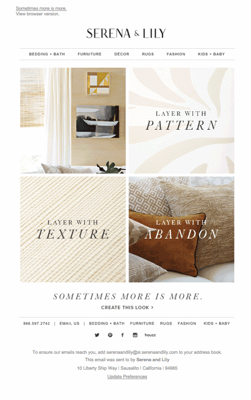
Tip: Anyone can put a GIF together, but that doesn’t mean it’s going to be good. Make sure it’s purposeful and relevant before including one just for the sake of it. When you’re ready, there are lots of tools out there to help you create the perfect GIF.
Best in Show: Plated
This email from Plated, a meal kit delivery company, perfects each design element presented here. Above the fold, a pretty GIF introduces the message, stopping after one round of animation, instead of looping like most. The simple layout uses a gentle zigzag to guide the reader through spring’s finest ingredients, cushioned by ample white space and enhanced by simple, color-forward visuals – each of which functions as a button linking back to further information on the Plated website. Meanwhile, the accent green-colored typewriter font adds a little something extra to the copy, repeating the shade in CTA links at the top and bottom of the message as well as in the large, inviting button at the end.
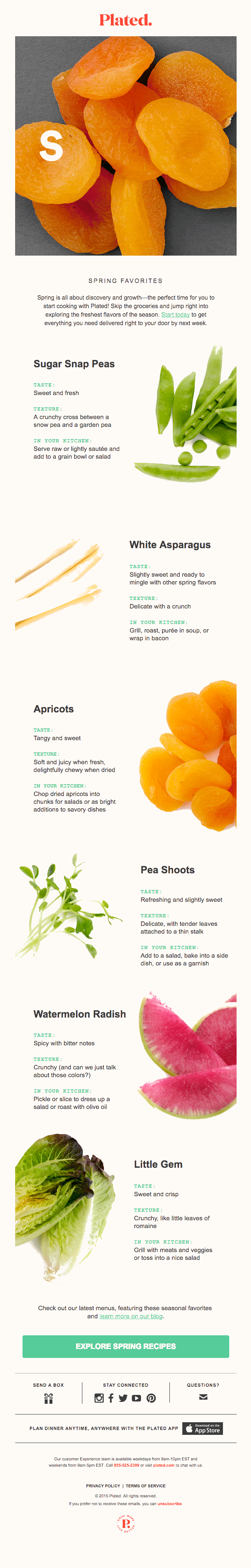
Tip: While the use of several CTAs may be somewhat controversial, email marketing expert Aaron Bolshow found, after years of testing, that “using multiple CTAs routinely lifted engagement by a minimum of 20 percent.” Include visible links and striking buttons where you see fit; just make sure they take readers somewhere specific and relevant – both to you and your would-be customer.