

0:00
0:00
/ 0:00
A/B testing (also known as split testing or bucket testing) is a methodology for comparing two versions of a webpage or app against each other to determine which one performs better. It works by showing two variants of a page to users at random and using statistical analysis to determine which variation achieves better results for your conversion goals.
In practice, this is how A/B testing works:
The changes you test can range from simple adjustments (like a headline or button) to complete page redesigns. By measuring the impact of each change, A/B testing turns website optimization from guesswork into data-informed decisions, shifting conversations from "we think" to "we know."
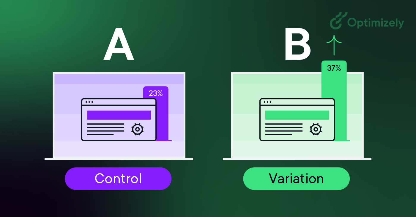
As visitors are served either the control or variation, their engagement with each experience is measured and collected in a dashboard and analyzed through a statistical engine. You can then determine whether changing the experience (variation or B) had a positive, negative or neutral effect against the baseline (control or A).
"The concept of A/B testing is simple: show different variations of your website to different people and measure which variation is the most effective at turning them into customers."
Dan Siroker and Pete Koomen (Book | A/B Testing: The most powerful way to turn clicks into customers)
A/B testing allows individuals, teams, and companies to make careful changes to their user experiences while collecting data on the impact it makes. This allows them to construct hypotheses and to learn what elements and optimizations of their experiences impact user behavior the most. In another way, they can be proven wrong—their opinion about the best experience for a given goal can be proven wrong through an A/B test.
More than just answering a one-off question or settling a disagreement, A/B testing can be used to continually improve a given experience or improve a single goal like conversion rate optimization (CRO) over time.
Examples of A/B testing applications:
A/B testing helps transform decision-making from opinion-based to data-driven, challenging the HiPPO slang (Highest Paid Person's Opinion).
As Dan Siroker notes, "It's about being humble... maybe we don't actually know what's best, let's look at data and use that to help guide us."
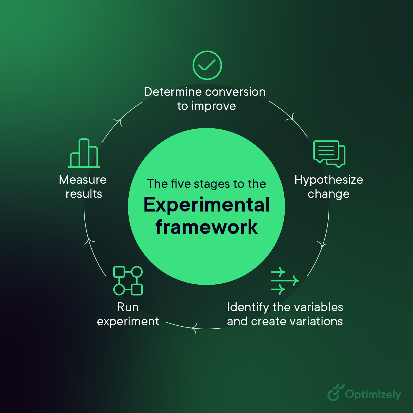
The following is an A/B testing framework you can use to start running tests:
If your variation wins, fantastic! Apply those insights across similar pages and continue iterating to build on your success. But remember - not every test will be a winner, and that's perfectly fine.
More on failed A/B tests: How test failures can lead you to success
In A/B testing, there are no true failures - only opportunities to learn. Every test, whether it shows positive, negative, or neutral results, provides valuable insights about your users and helps refine your testing strategy.
Michiel Dorjee, Director, Digital Marketing discusses how to reach statistical significance
Here are two examples of A/B testing in action.
Felix and Michiel from the digital team decided to add a paw-some surprise to our creative and messaging on our homepage.

Their target was to drive user engagement.
The answer in this case, the team found out, was a lot of woofs.
During the experiment, website visitors who pet the dog on the website's homepage, got a link to our "Evolution of Experimentation" report.
However, you'll only see the dog 50% of the time.
Result: People exposed to the dog consumed the content 3x more than those who didn't see the dog.
Ronnie Cheung, Senior Strategy Consultant, Optimizely, wanted to introduce a facility detail pop-up on the map view as when users were clicking on pins on the map view, they would be taken to a PDP page which added an extra step to complete checkout.
If you’d like to see more, here’s an industry-specific list of A/B testing use cases and examples.
And for success stories, check out the big book of experimentation. It has 40+ case studies showing the challenges and the hypotheses used to solve them.
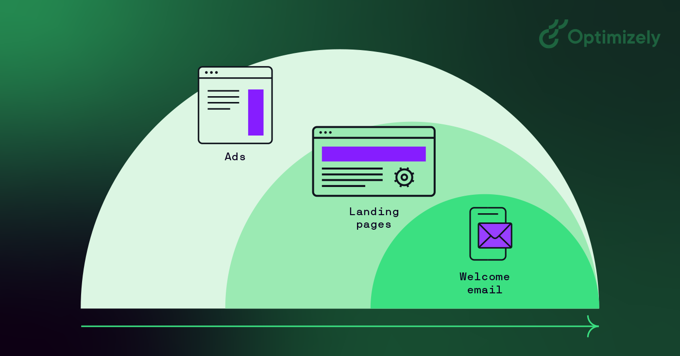
Great digital marketing teams make sure to involve multiple departments in their experimentation program. When testing across different departments and touchpoints, you can increase the confidence level that the changes you’re making to your marketing are statistically significant and making a positive impact on your bottom line.
Use cases include:
But you can only scale your program if it adopts a test-and-learn mindset. Here's how to build a culture of experimentation:
1. Leadership buy-in
2. Team empowerment
3. Process integration
6 measuring pillars for building a culture of experimentation
A/B testing requires analytics that can track multiple metric types while connecting to your data warehouse for deeper insights.
To start, here's what you can measure:
What really makes the difference is warehouse native analytics. It allows you to maintain full control over data location by keeping your test data in-house. Further, you can test against real business outcomes and enable automated cohort analysis. It provides seamless cross-channel testing with a single source of truth while maintaining strict data governance and compliance.
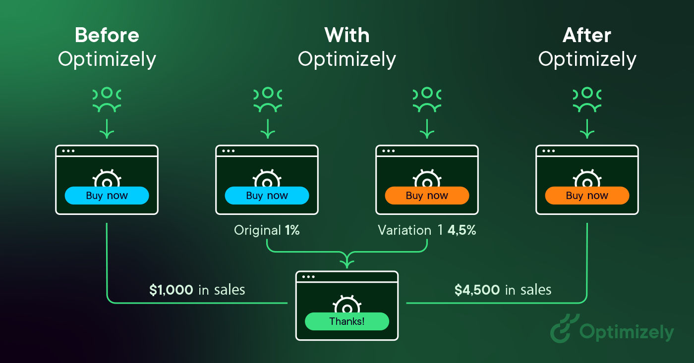
Test results vary based on your business type and goals. For example, while e-commerce sites focus on purchase metrics, B2B companies might prioritize lead generation metrics. Whatever your focus, start with clear goals before launching your test.
For example, if you're testing a CTA button, you'll see:
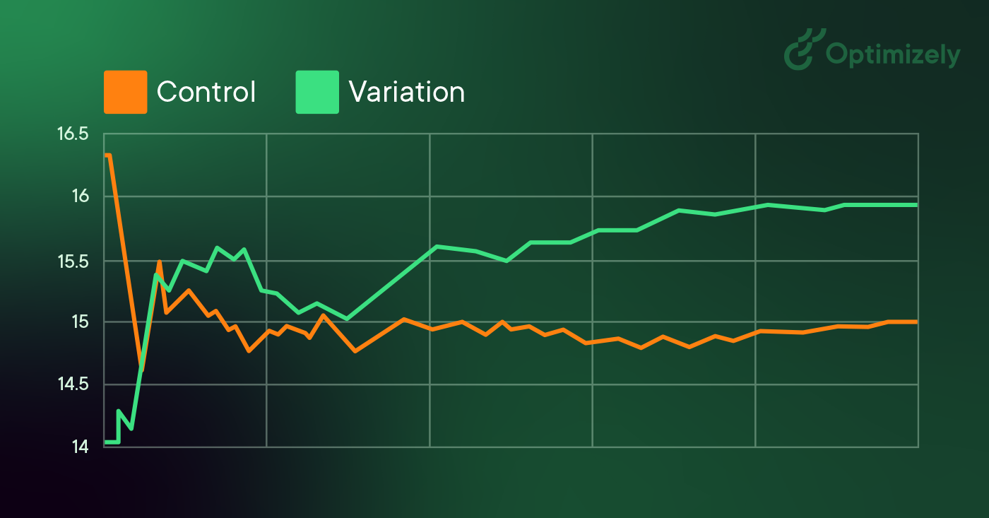
When running A/B tests and analyzing results, statistical significance tells you if your test results are reliable or just random chance.
When analyzing results:
Larger sites and apps often employ segmentation for their A/B tests. If your number of visitors is high enough, this is a valuable way to test changes for specific sets of visitors. A common segment used for A/B testing is splitting out new visitors versus return visitors. This allows you to test changes to elements that only apply to new visitors, like signup forms.
On the other hand, a common A/B testing mistake made is to create audiences for tests that are too small. So:
Google permits and encourages A/B testing and has stated that performing an A/B or multivariate test poses no inherent risk to your website’s search rank. However, it is possible to jeopardize your search rank by abusing an A/B testing tool for purposes such as cloaking. Google has articulated some best practices to ensure that this doesn’t happen:
No cloaking: Cloaking is the practice of showing search engines different content than a typical visitor would see. Cloaking can result in your site being demoted or even removed from the search results. To prevent cloaking, do not abuse visitor segmentation to display different content to Googlebot based on user-agent or IP address.
Use rel="canonical": If you run a split test with multiple URLs, you should use the rel="canonical" attribute to point the variations back to the original version of the page. Doing so will help prevent Googlebot from getting confused by multiple versions of the same page.
Use 302 redirects instead of 301s: If you run a test that redirect the original URL to a variation URL, use a 302 (temporary) redirect vs a 301 (permanent) redirect. This tells search engines such as Google that the redirect is temporary and that they should keep the original URL indexed rather than the test URL.
A media company might want to increase readership, increase the amount of time readers spend on their site, and amplify their articles with social sharing. To achieve these goals, they might test variations on:
A travel company may want to increase the number of successful bookings are completed on their website or mobile app, or may want to increase revenue from ancillary purchases. To improve these metrics, they may test variations of:
An e-commerce company might want to improve their customer experience, resulting in an increase in the number of completed checkouts, the average order value, or increase holiday sales. To accomplish this, they may A/B test:
A technology company might want to increase the number of high-quality leads for their sales team, increase the number of free trial users, or attract a specific type of buyer. They might test:
You can apply to your A/B testing program:
Remember, testing is an incredibly valuable opportunity to learn how customers interact with your website. Start now with Optimizely Web Experimentation.
You may find it interesting: AI experimentation (from ideation to results)