How to Redesign Your Website Redesign
Welcome >back to Conversion Rate Optimism, Jeff Blettner, a web designer and conversion optimization specialist at Formstack.

Cara Harshman
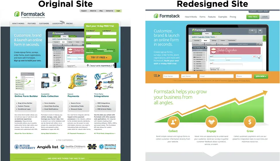
Having just completed a complete redesign of formstack.com, Jeff spoke with me about the role AB testing tools played in the process.

Optimizely: How big of a role did A/B testing – actually doing it, or knowing you were going to do it – play in this redesign for Formstack?
Jeff: Very large role. Everyone has an opinion on what a website should say or include, and sometimes those strong opinions lead to disagreements in planning or design. When we reached those spots, resolution was a lot easier when we knew that post-launch, we could A/B test our different hypotheses to see what is the better approach.
In addition to examining analytics and user testing, how did A/B tests help inform this stage of the redesign process?
From tests that we had performed in the past year, we knew that pages that had more marketing content, such as testimonials, case studies, features, etc, had performed better. However, we also paid close attention to how we were displaying that content to users. We have a high visitor rate, but are low on the amount of pages and time spent on the site. So we designed a site that highlighted our best performing content in simple and scannable ways.
You and the team conversed heavily in the planning and design phase. What was the tone of the rhetoric, knowing A/B testing could help solve any debates on UX?
I think one of the early discussions (or disagreements) was what we we were going to display in the main navigation. The main nav is so important in establishing the flow of traffic and the focus of the site. We all agreed on highlighting our forms, features, examples, and pricing, but we were not sure what would be the best page to use as a lead.
We settled on a page called “Why Use Us” to give users a quick overview on why Formstack is a better choice. Part of the reason to redesign the website, besides technical reasons and better design, was to focus on retelling the Formstack story. The “Why Use Us” and the “Examples” pages were completely new pages and were part of that push to try telling people about Formstack in a new way. “Why Use Us” was untested, but we felt that it might be a big win for convincing visitors. After successfully launching the new site design, we noticed visitors weren’t going to the page as much as we would expect. So that prompted a follow-up test where we changed the page name to see if that would prompt more visits.

We changed the name to “How It Works” which we had tested earlier in the year, and as another variable removed it entirely from the nav and tested a link to our “Integrations” page. What we found was that renaming it to “How It Works” increased page views by nearly 50% and overall site conversions (2 week free trial sign-ups) by 8%. The “Integrations” version lost overall conversions, indicating that the “How / Why” page had effective content on it.

When selecting content, did you know you’d test it?
Yes, eventually. I think that was a great motivator to keep moving on the site discussions and redesign. Instead of getting bogged down in disagreements, we moved forward on the content that we felt most strong about. And if there were disagreements, we knew that we would be able to come back after launch and test our hypotheses.
Did you develop the new site differently to enable easier A/B testing?
ABSOLUTELY! Having better organized and accessible site templates not only make updating the site easier, but makes us super agile in launching new tests.
What metrics are you most concerned about measuring in the redesign?
Overall site conversions, which in our case are 2 week free trials. After launch, we saw conversions go up 21%! We also made sure that there was not a shift in paid plans that visitors were choosing that might decrease our revenue. Luckily, all plans saw a high increase in conversion. Last we took a look at Engagement to see how visitors were interacting with completely different homepages. We saw that through thousands of visitors, there was a 13% increase in user interaction. Not only were people showing more interest, they were converting more. A solid success.

ReStory was Formstack’s code name for the site redesign.
“How It Works” on the top navigation did almost 50% better than “Why Use Us”!
About the author